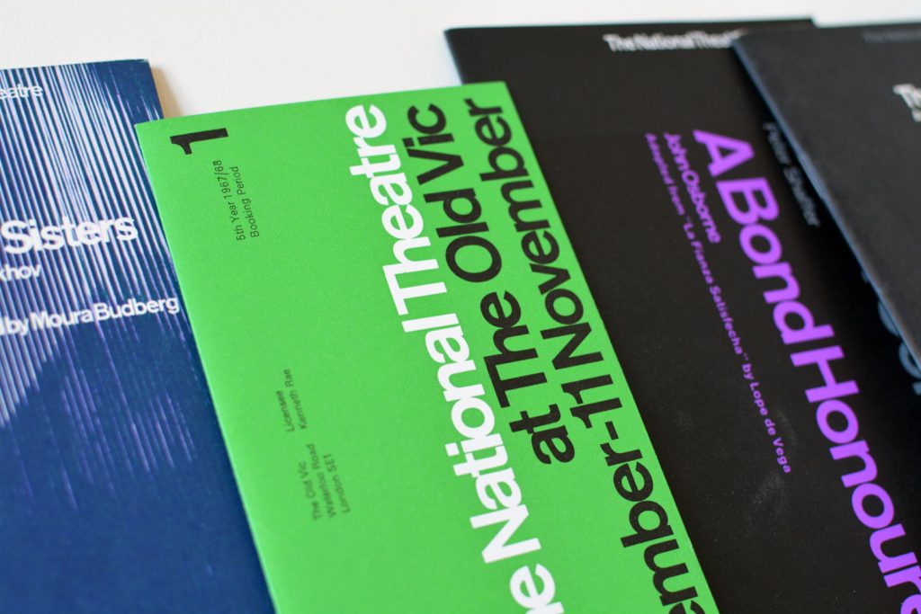
Ken Briggs and his iconic designs for the National Theatre
The typographic designs produced for the National Theatre by Ken Briggs are not only iconic and depict the Swiss typographic style of the time, but remain a key example of the creation of a cohesive brand style.
Share:
Members Content
This is a members-only article, gain access and support the archive for £1.99 a month. Memberships help grow the design collection and share research on the history of graphic design.
Joseph Binder established his studio, Wiener Graphik, in Vienna. One of the first clients was the City of Vienna’s Music and Theater Festival, followed by many other posters and logos for clients in Austria and beyond.
Ezio Bonini's work for "Società del Linoleum" in Milan, showcasing advertisements designed for various Italian newspapers aimed at expanding the linoleum market
Wolfgang Bäumer's advertising design for Bayer, Klöckner Works and the Lottery. His adaptable design aesthetic alongside his skills of convening messaging through visuals are fantastic examples of mid-century German graphic design.
Bäumer gave the company a unique brand image amplifying its graphical image after a time of post-war economic recovery. This style of advertising composition can be seen across many 1960s campaigns, especially from other German designers such as Anton Stankowski.