Advertising Pharmaceuticals, A Comparison of German and American Advertising in 1950
As a chemist, I have an obligation to be curious – I grab a stack of our chemical journals and start with the advertising section. I start it, the walk through the sand. I don’t want to deny some oases. But soon I’m bored and tired.
Share:
Members Content
This is a members-only article, gain access and support the archive for £1.99 a month. Memberships help grow the design collection and share research on the history of graphic design.
Joseph Binder established his studio, Wiener Graphik, in Vienna. One of the first clients was the City of Vienna’s Music and Theater Festival, followed by many other posters and logos for clients in Austria and beyond.
Ezio Bonini's work for "Società del Linoleum" in Milan, showcasing advertisements designed for various Italian newspapers aimed at expanding the linoleum market
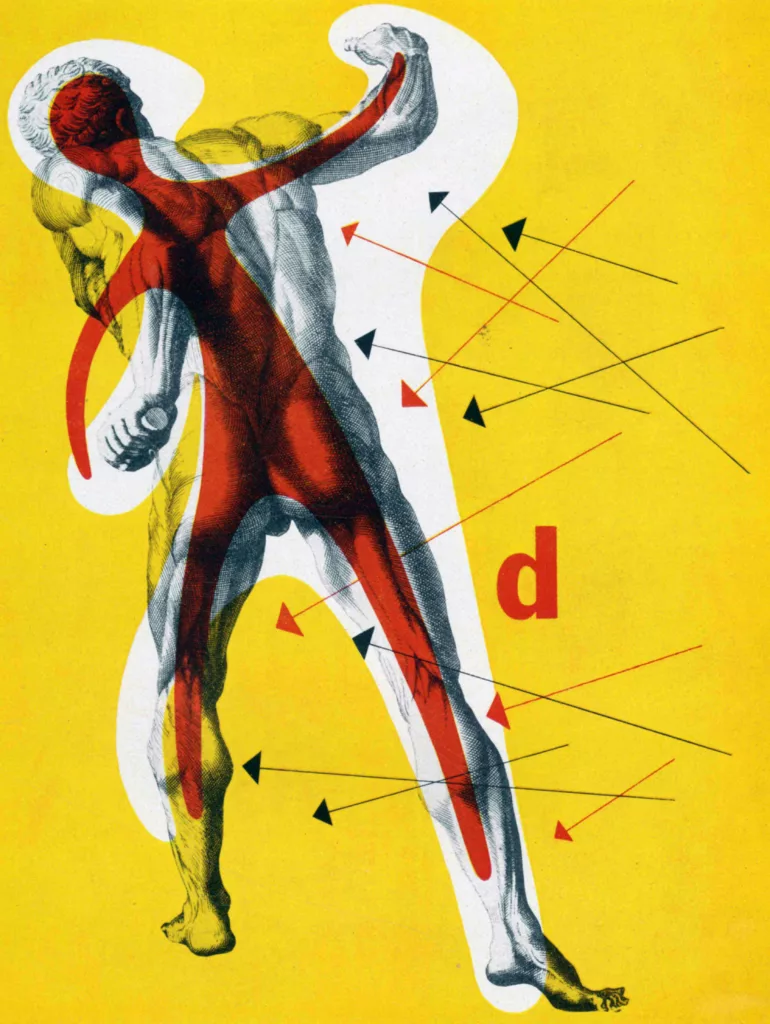
Wolfgang Bäumer's advertising design for Bayer, Klöckner Works and the Lottery. His adaptable design aesthetic alongside his skills of convening messaging through visuals are fantastic examples of mid-century German graphic design.
Bäumer gave the company a unique brand image amplifying its graphical image after a time of post-war economic recovery. This style of advertising composition can be seen across many 1960s campaigns, especially from other German designers such as Anton Stankowski.