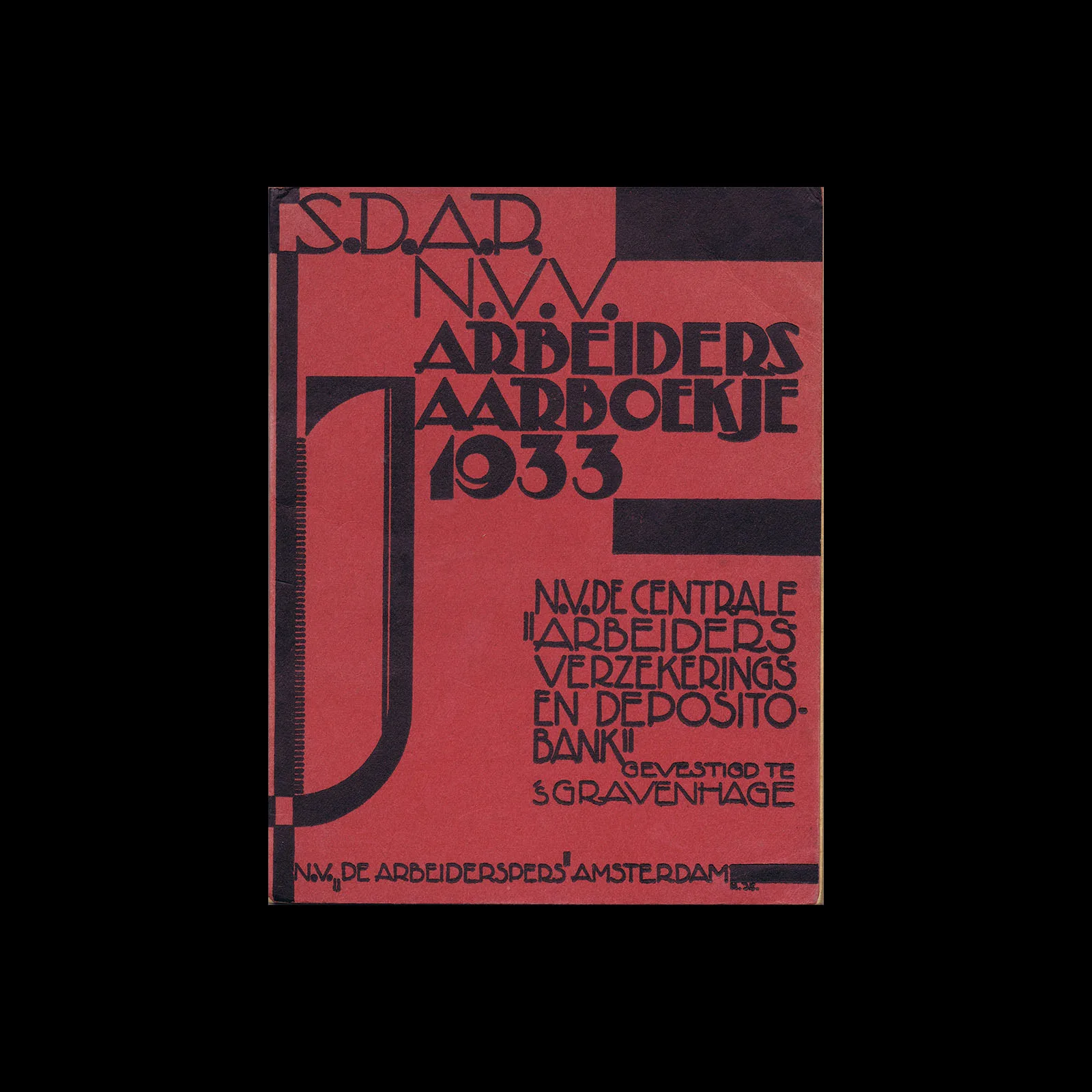


From the graphic design archive:

From the graphic design archive:

From the graphic design archive:

From the graphic design archive:
Design Archive Feature, Designer Profiles, Members Only Content, Regional Histories
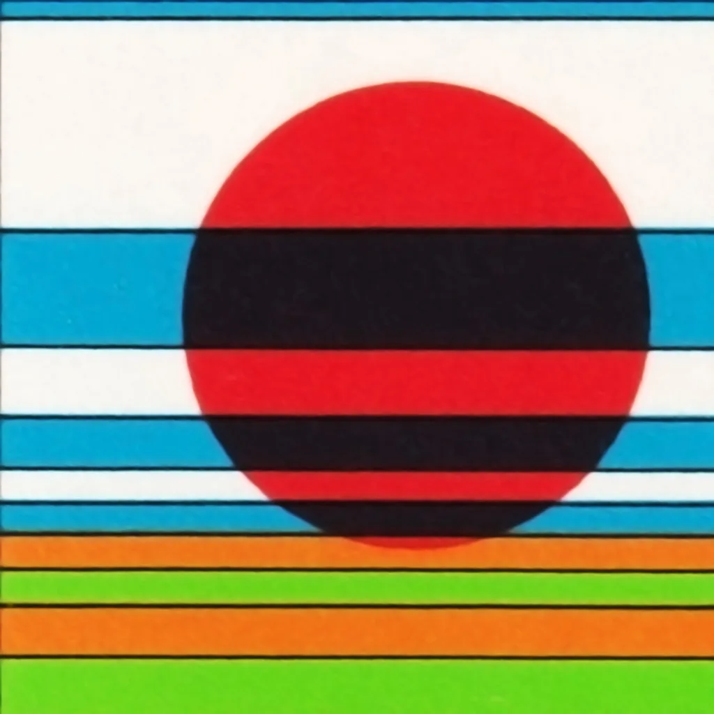
Dick Elffers, had been the chosen designer for the printed matter of the Holland Festival for much of the festival's years, he used a painterly style for his work with the festival between 1954 and 1965 and later a more abstract style between 1969 and 1972. As well as publicity design, Elffers was commissioned to design the summer stamps to promote the Holland Festival in 1972.
Read Article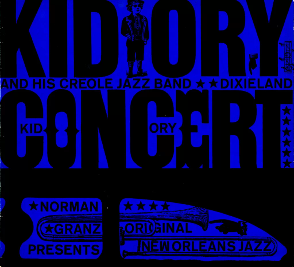
Design Archive Feature, Illustration, Members Only Content, Studios & Collectives
After researching further into the work designed by their practice, I found ten programmes designed between 1958 and 1960. These programmes were designed for a variety of live jazz events in Germany and all followed the same format.
Read Article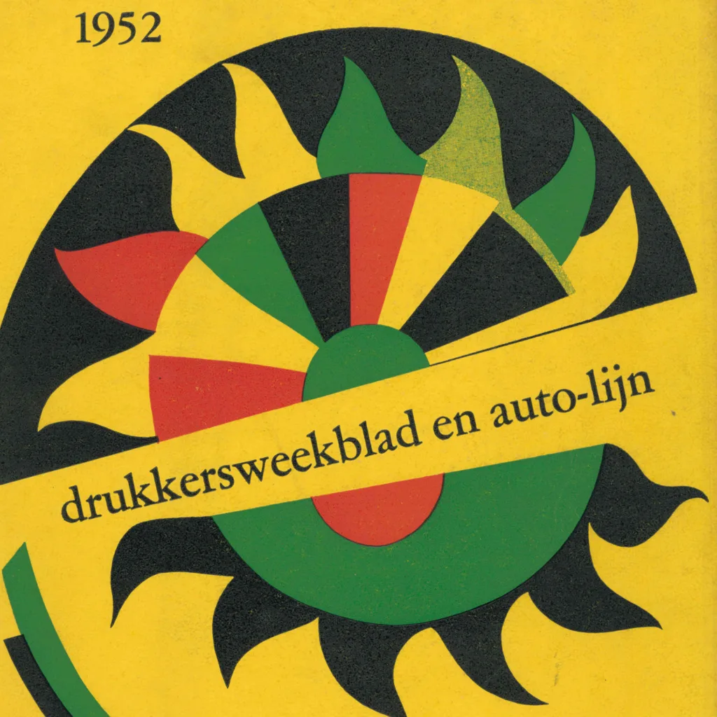
Design Archive Feature, Magazines & Publishing, Members Only Content, Regional Histories
Each year, leading Dutch artists were commissioned to design the covers and inner pages of Drukkersweekblad en Autolijn. Including designers included Dick Elffers, Willem Sandberg, Jan van Toorn, Wim Crouwel, and Jurriaan Schrofer. The journal documented important design trends and developments in The Netherlands.
Read Article