
From the graphic design archive:

From the graphic design archive:

From the graphic design archive:
From the graphic design archive:

Design Archive Feature, Design Education, Members Only Content, Regional Histories, Typography & Type Design
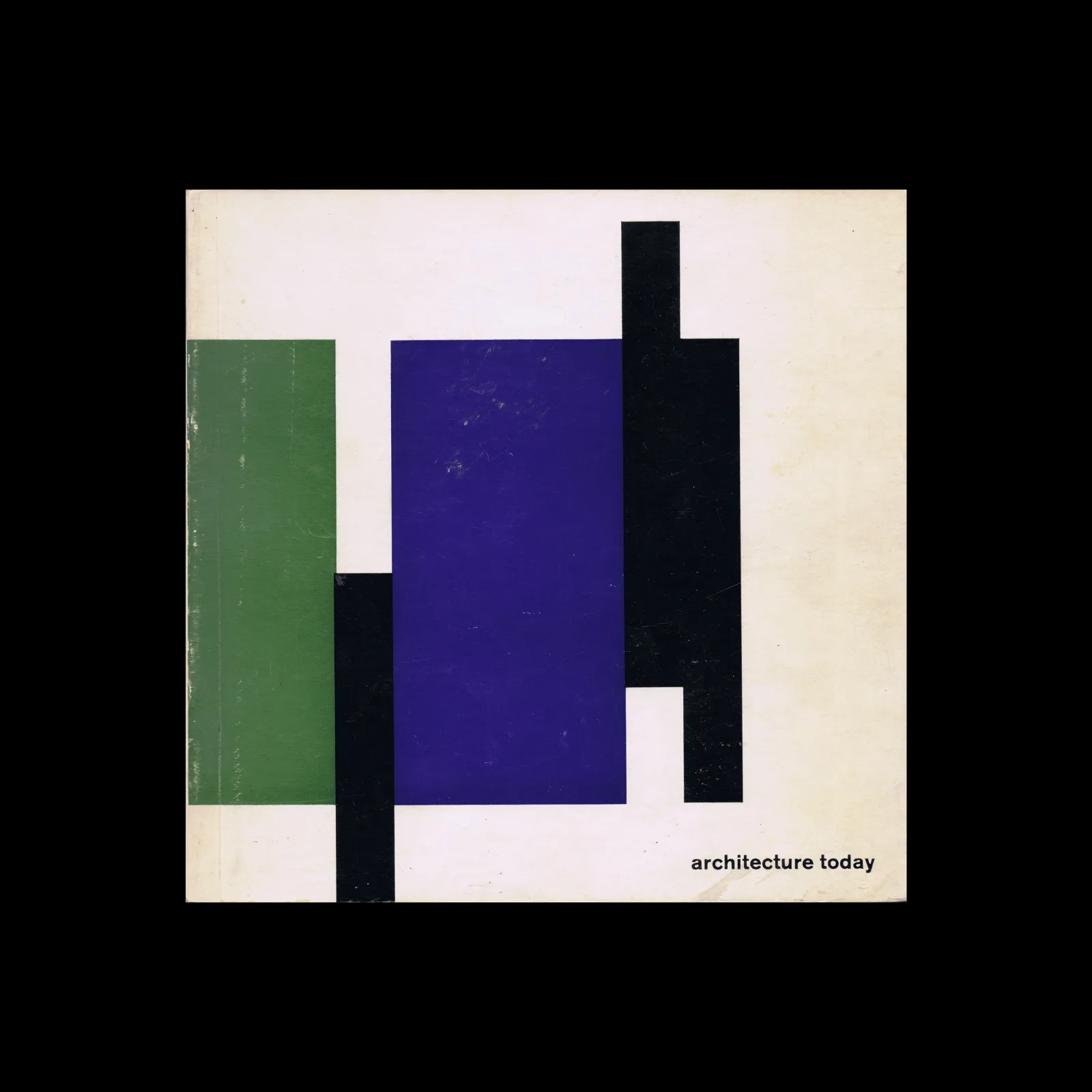
The August 1964 issue highlights the Typography class at the Pratt Institute in New York, a relatively new course at the time. Pratt, one of the most renowned art schools in the United States, had departments for graphic design, painting, art education, industrial design, and applied graphics in the 1960s. The typography course combined theoretical lectures with practical workshops, aimed at students beginning their journey into the discipline.
Read Article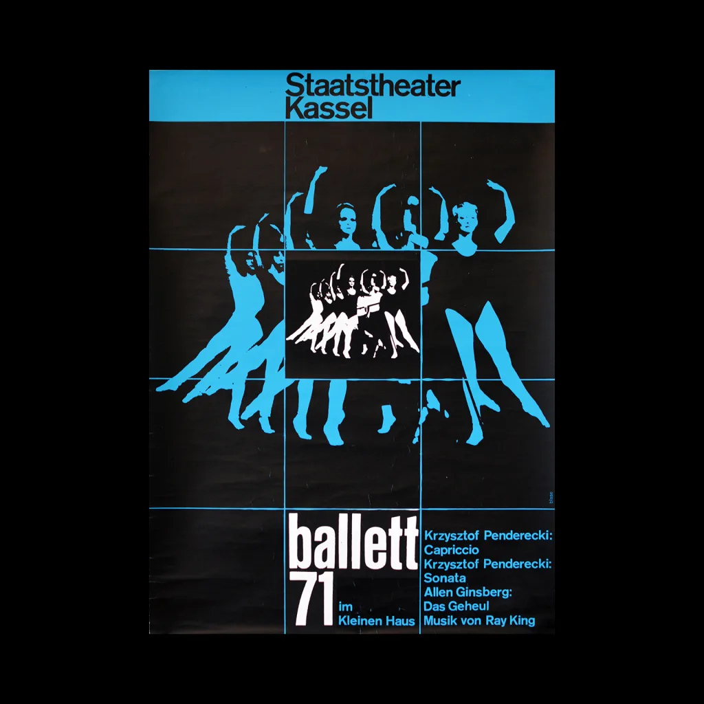
Design Archive Feature, Designer Profiles, Members Only Content, Poster Design
Blase’s long-term clients were Staatstheater Kassel (Kassel State Theater) and Atlas Films. Karl Oskar Blase produced countless posters for these two organisations. It’s not surprising considering Blase designed posters for the Staatstheater for twelve years between 1966 and 1978.
Read Article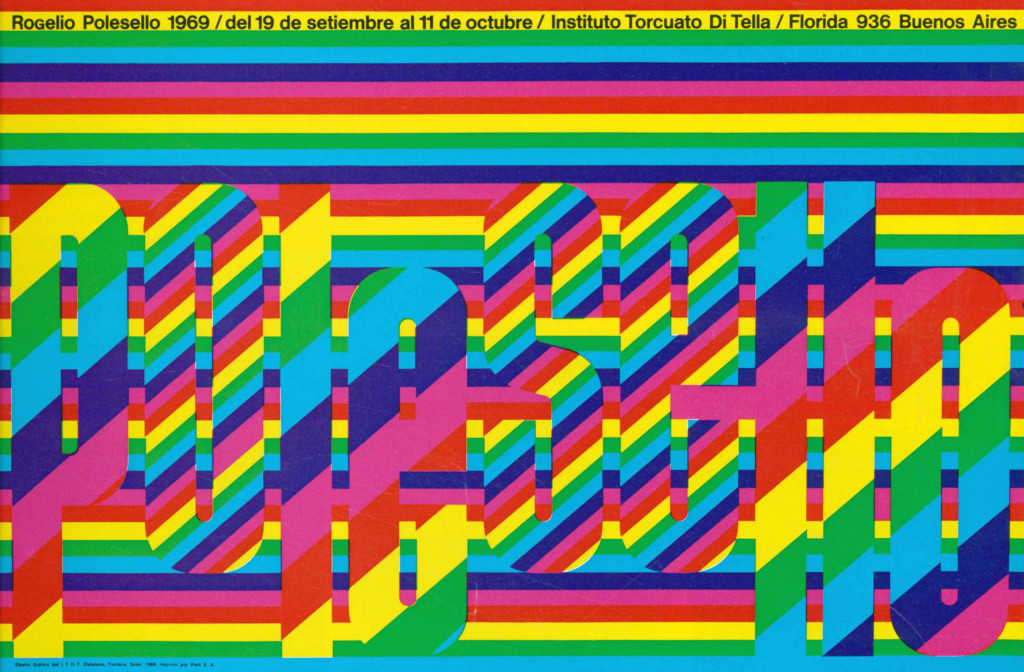
Design Archive Feature, Members Only Content, Regional Histories, Studios & Collectives
In my previous article about the design work produced for Insituto di Tella, I touched upon the artists Juan Carlos Distéfano, Ruben Fontana and Juan Andralis. After further research, I found a suite of other designs they had produced, including exhibition posters, concert programmes and record sleeves.
Read Article