

Design Archive Feature, Advertising Design, Designer Profiles, Members Only Content, Regional Histories
Nikon commissioned Yusaku Kamekura to design numerous posters, packaging designs and advertisements for Nikon. He used abstract forms, an impactful use of colours, along with his skilful reduction of messaging.
Read Article
Design Archive Feature, Designer Profiles, Members Only Content, Poster Design
Scanned posters by the great Michele Spera. Many use a strong use of geometric form, often paired with sans-serif typefaces like Helvetica. Their simplification of form and use of colour create timeliness, recognisable posters that would have stood out alongside the posters of the 1970s which tended to have a heavy use of photography.
Read Article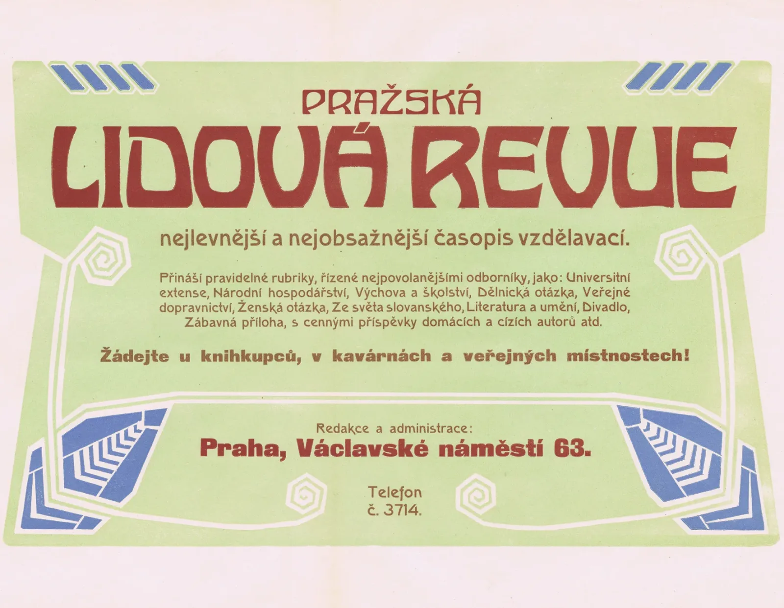
Design Archive Feature, Members Only Content, Regional Histories, Typography & Type Design
40 examples of Czech typography from Typografia Vol. 18 (1907). Czech commercial printing at the crossroads of Art Nouveau and early modernism, with work by Otokar Císař, Method Kaláb, and Mořic Novotný.
Read Article