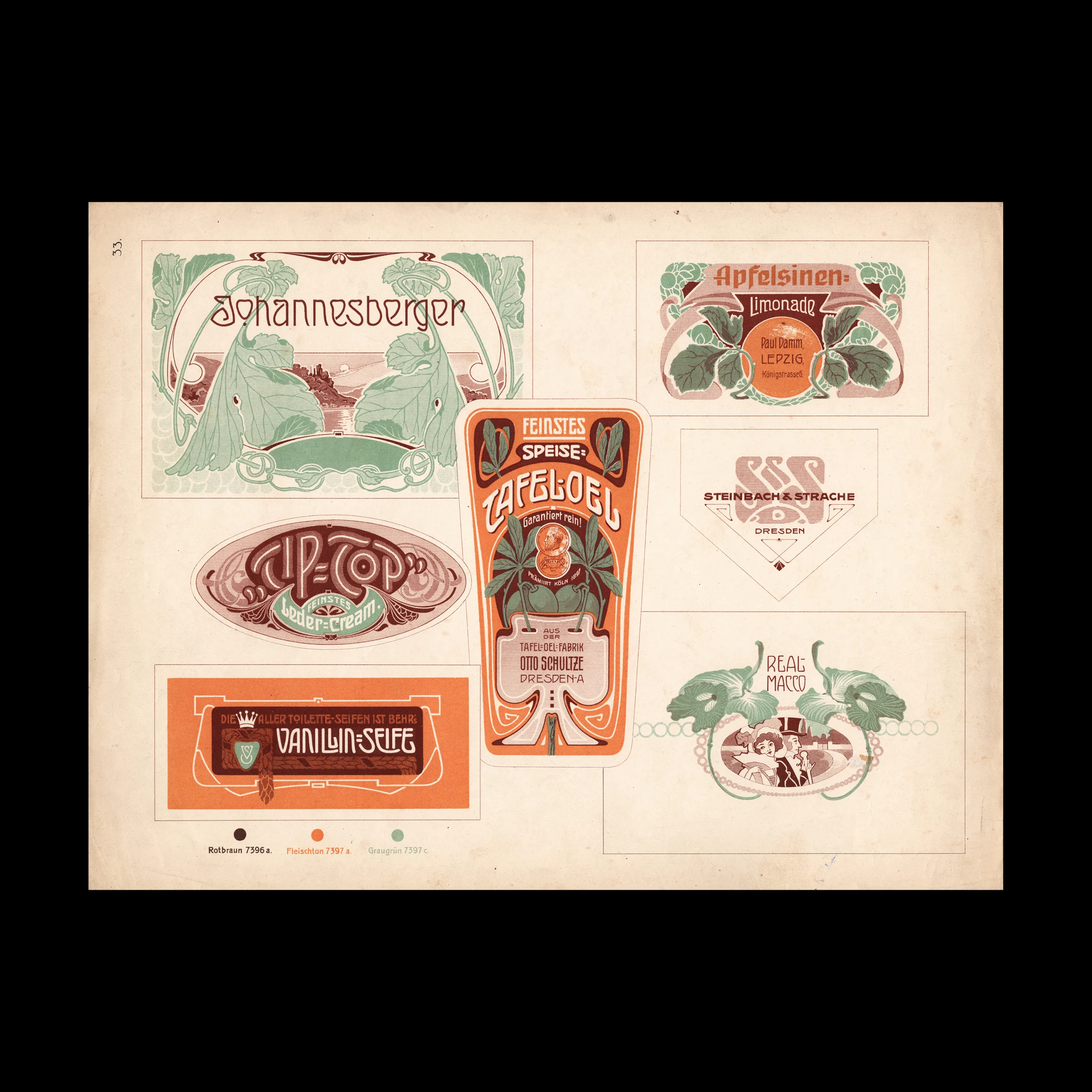


From the graphic design archive:

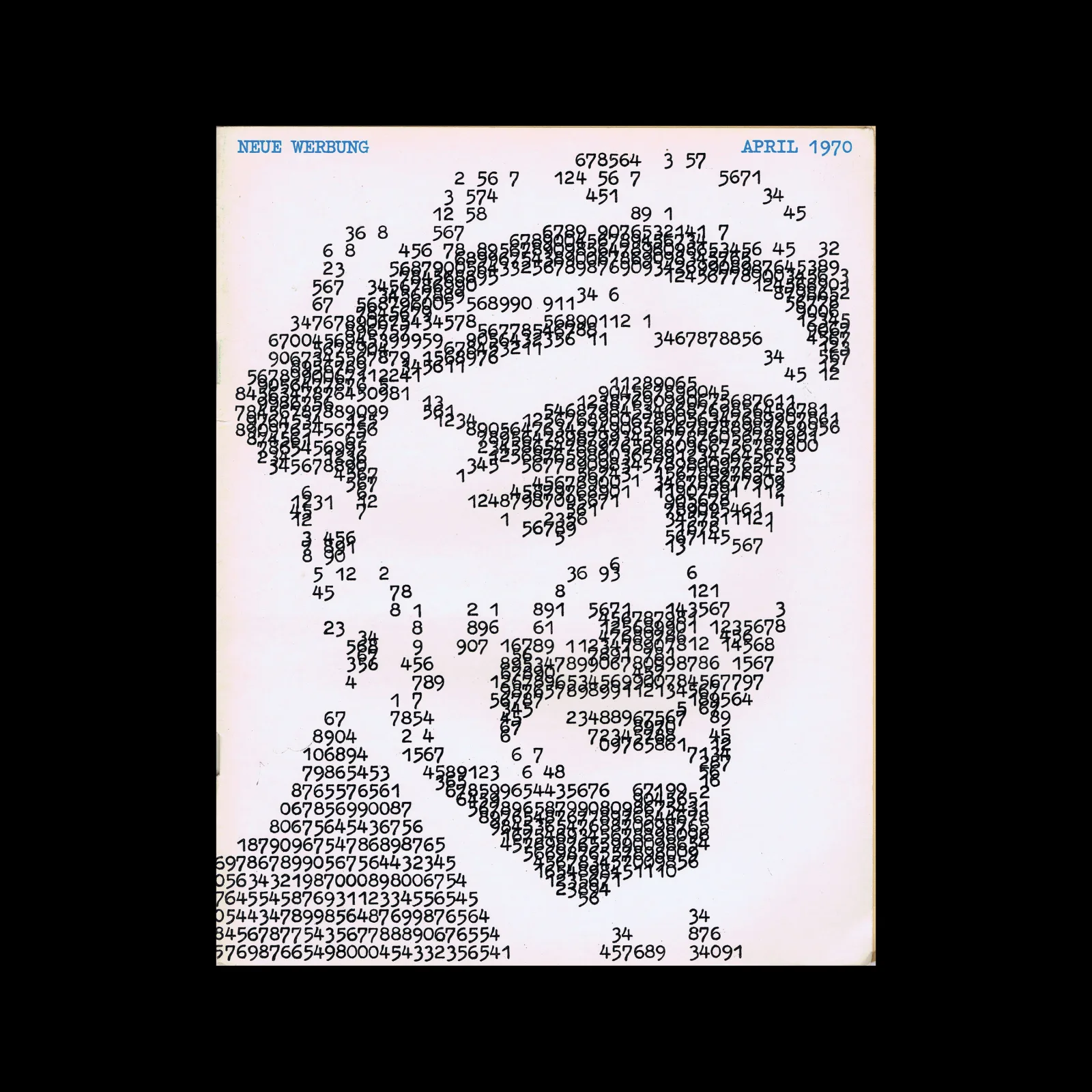
From the graphic design archive:
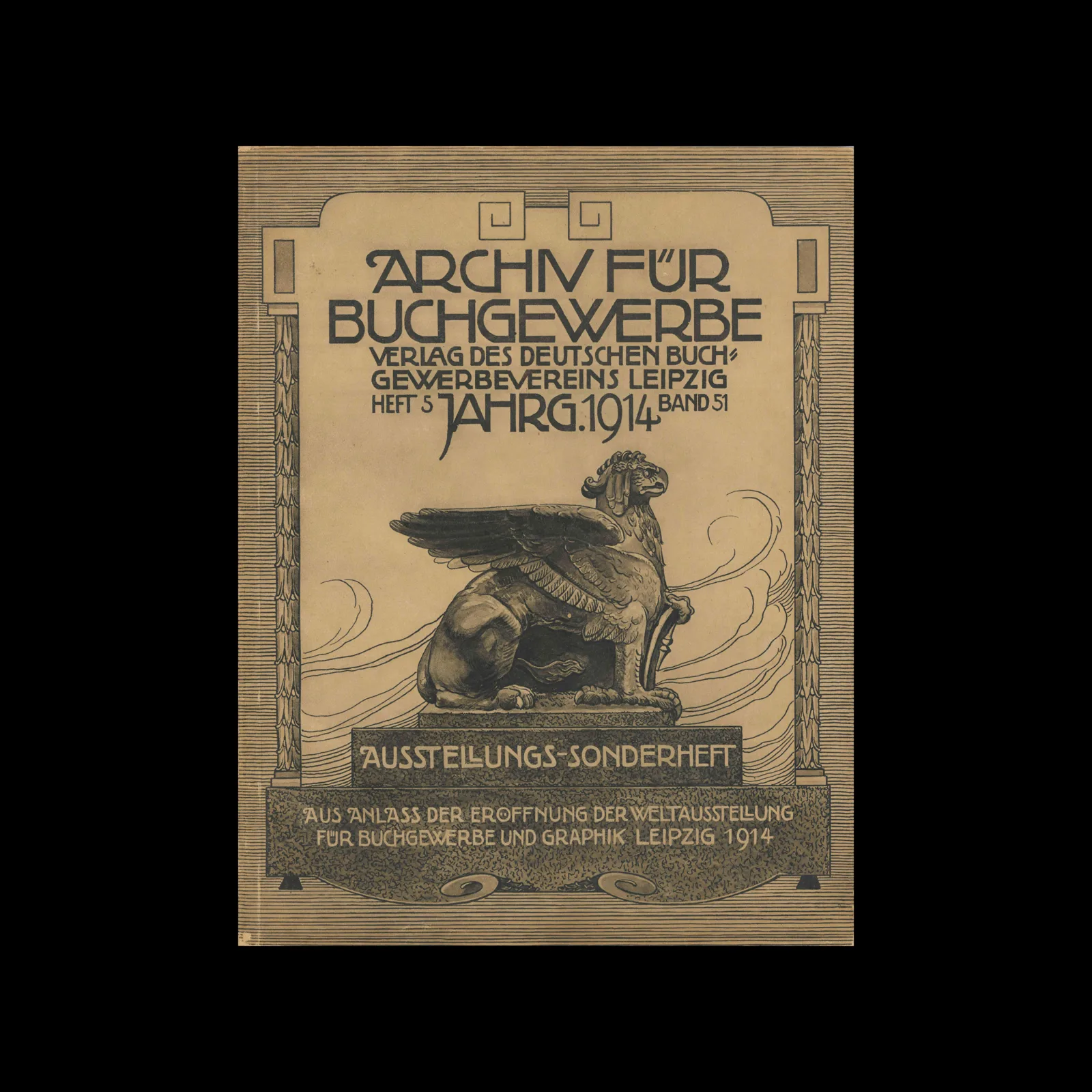
From the graphic design archive:
From the graphic design archive:

Design Archive Feature, Members Only Content, Poster Design, Regional Histories, Studios & Collectives
A total of 24 posters were created for the campaign during 1964, using the arrow symbol as a key features, representing power, motion and speed. The handmade lithographs use up to 19 colours, which were individually printed at large scale. The posters also utilise the brand colours red and yellow from Shells corporate identity.
Read Article
Design Archive Feature, Designer Profiles, Members Only Content, Regional Histories
Yūsaku Kamekura had a long list of clients and as well as cover designs, he worked across logo and brand design, packaging, book design, and other printed matter, but he is particularly known for his poster design. His clients included Nikon, Tokyo 1964 Olympics, Meiji and TDK.
Read Article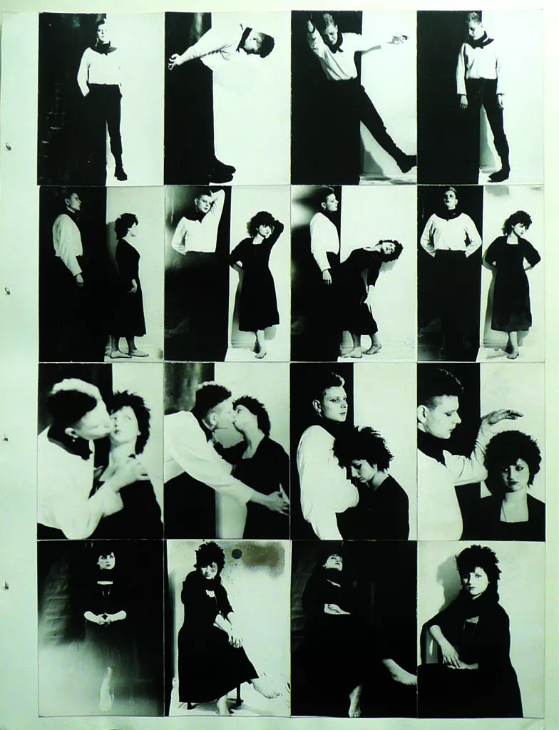
Parallel Public is a new publication by Sara Blaylock, published by MIT Press. The book documents the East German artists pioneering work that made their country’s experimental art scene a form of (counter) public life.
Read Article