
British Magazine Design, V&A, 2016

By Anthony Quinn

‘This book is an investigation into the design and history of British magazines over the past 170 years. It identifies turning points and new directions in one of the most sensitive barometers of mass-market design taste, from the advent of two periodicals – Punch and the Illustrated London News – that changed publishing fundamentally, through to the beginnings of digital distribution. A magazine flourishes or folds according to its audience’s response to its look and feel – sometimes more so than its written content – and this study of a developing history encompasses discussion of graphic design, typography, photography and innovative print technology. It explores why magazines have looked how they do. Published with full access to the National Art Library’s unparalleled archive of periodicals, British Magazine Design is a definitive history.’

Details

  • Format Book
  • Year 2016
  • Client/Publisher V&A
  • Size 21.91 x 2.54 x 31.12 cm

Linked Information

British Magazine Design, V&A, 2016
British Magazine Design, V&A, 2016 is an investigation into the design and history of British magazines over the past 170 years
More graphic design artefacts
More graphic design history articles
A 1938 Analysis of Paris Poster Hoardings by Dr. E. G. Paulus

Design Archive Feature, Members Only Content, Poster Design, Regional Histories

A 1938 Analysis of Paris Poster Hoardings by Dr. E. G. Paulus

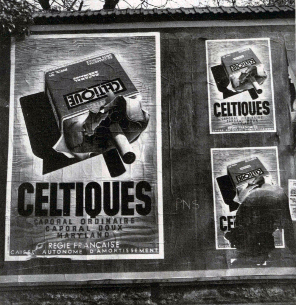
The Paris Poster Hoardings of 1938. Posters gleam forth accentuating the melody of this city as they direct the eye to articles of everyday use and above all to people who are the talk of the hour.

Read Article
Friendliness and Efficiency. 1970s Postcards for the British Job Centre

Design Archive Feature, Ephemera, Members Only Content, Regional Histories

Friendliness and Efficiency. 1970s Postcards for the British Job Centre

The designer is unstated on these postcards, which were designed during the mid to late 1970s, but these playful illustrations alongside what looks to be Frankfurter Bold definitely fit the criteria of friendliness and efficiency

Read Article
Herbert Bossin and his Typographic Compositions with Folio

Design Archive Feature, Members Only Content, Typography & Type Design

Herbert Bossin and his Typographic Compositions with Folio

The typographic supplement from Der Druckspiegel, October, 1961 features typographic compositions designed by Herbert Bossin. Bossin has solely used the typeface Folio, to illustrate its flexibility and versatility alongside imagery provided by Lothar Blanvalet Verlag.

Read Article