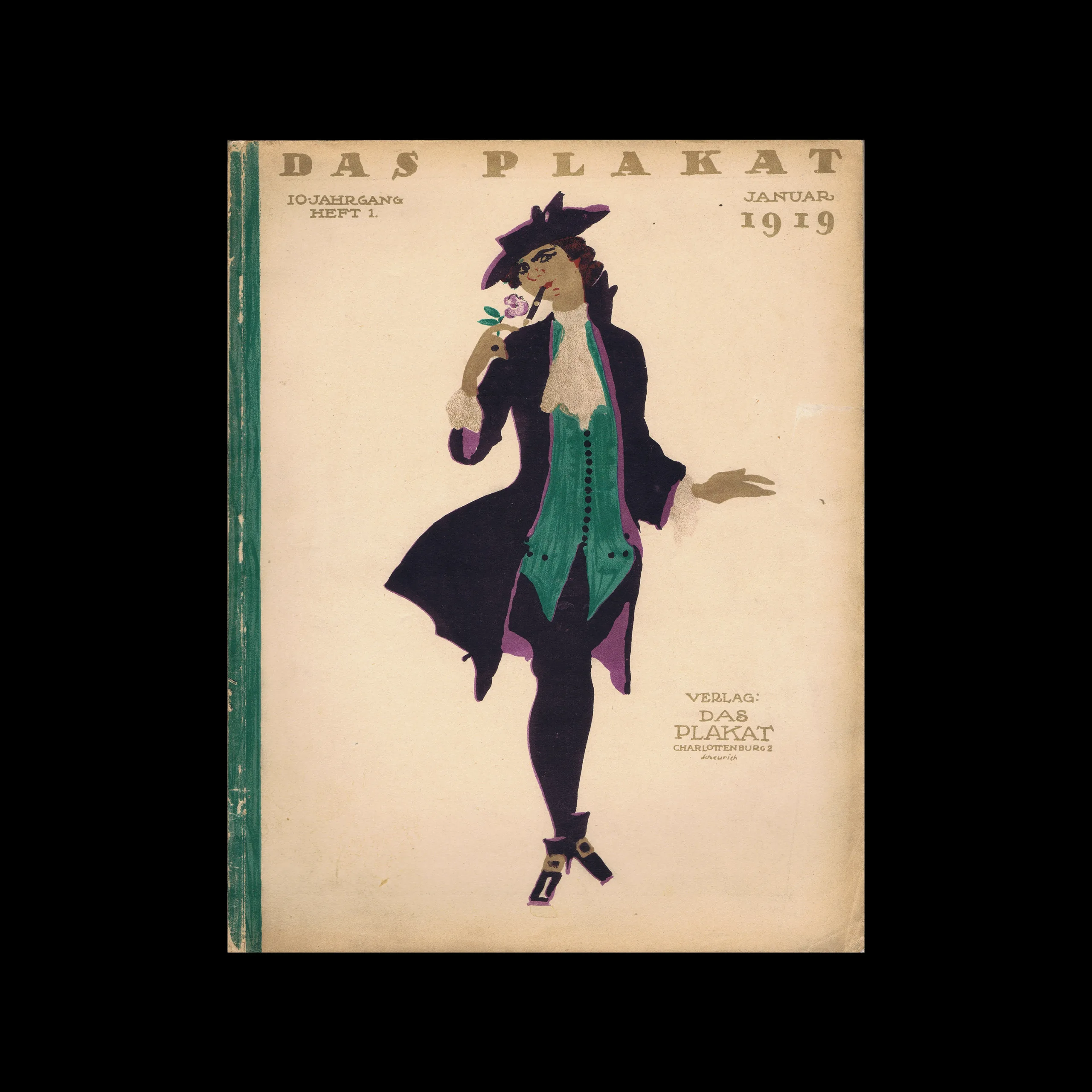

CONTENTS
ART IN ADVERTISING
Editor-in-Chief: Dr. HANS SACHS, Berlin-Nikolassee
Paul Scheurich. By Privy Councillor Dr. Peter Jessen. With 40 partly colored illustrations and 7 colored supplements
“The New Poster.” By Dr. F. Rudolf Uebe.
Reply to the preceding article. By Hanns Kropf.
Nature Studies of the Advertising Artist. By Prof. Oscar Schwindrazheim.
Pioneers of German Poster Art
Bruno Paul. By Dr. Richard Heßberg. With 6 illustrations and 2 color supplements
Franz Stuck. By Alexander Hellmeyer. With 6 illustrations and one color supplement
The Beauty Value of Postage Stamps. By Prof. Dr. Gustav
Albert Schaefer. By Konrad Gubalke. With 8 illustrations, some in color
Artistic War Emergency Money. By Hermine C. Schützinger. With 18 illustrations and 4 color supplements
Frank Brangwyn’s War Posters. By Dr. W. Kurth.
From Other Papers. By Ernst Collin.
The Berlin Poster Year 1918. By Heinrich Inheim
THE CULTURE OF ADVERTISING
Editor: HERMANN RECKENDORF, Berlin-Wilmersdorf
From Advertising to Creation. By Dr. Alfred Heller.
The Psychology of Advertising on an Experimental Basis, Its Tasks and Its Methods. By Dr. Walter Moede.
The Advertising Work of the 9th War Loan, By Hermann Reckendorf. With 5 Pictures and 8 Colored Pages.
Paper Shortage – Paper Waste. By Erich Lauenburger.

From the graphic design archive:
Typography & Type Design, Design Archive Feature, Members Only Content, Regional Histories
60 examples of Czech typography from Typografia Vol. 23 (1912). Czech commercial printing and book design as Secession ornament progressed to early modernist typography, with work by Jindra Dvořáček, Methoděj Kaláb, Alois Chvála and many more.
Read Article
Design Archive Feature, Design Translated, Members Only Content, Typography & Type Design
A 1928 article on typographic carnival posters, originally in German, published in Typographische Mitteilungen, Vol 25, No 02, February 1928
Read Article
Design Archive Feature, Designer Profiles, Members Only Content, Poster Design
Scanned posters by the great Michele Spera. Many use a strong use of geometric form, often paired with sans-serif typefaces like Helvetica. Their simplification of form and use of colour create timeliness, recognisable posters that would have stood out alongside the posters of the 1970s which tended to have a heavy use of photography.
Read Article