

From the graphic design archive:
From the graphic design archive:

From the graphic design archive:
From the graphic design archive:

Design Archive Feature, Members Only Content, Poster Design, Regional Histories, Studios & Collectives
A total of 24 posters were created for the campaign during 1964, using the arrow symbol as a key features, representing power, motion and speed. The handmade lithographs use up to 19 colours, which were individually printed at large scale. The posters also utilise the brand colours red and yellow from Shells corporate identity.
Read Article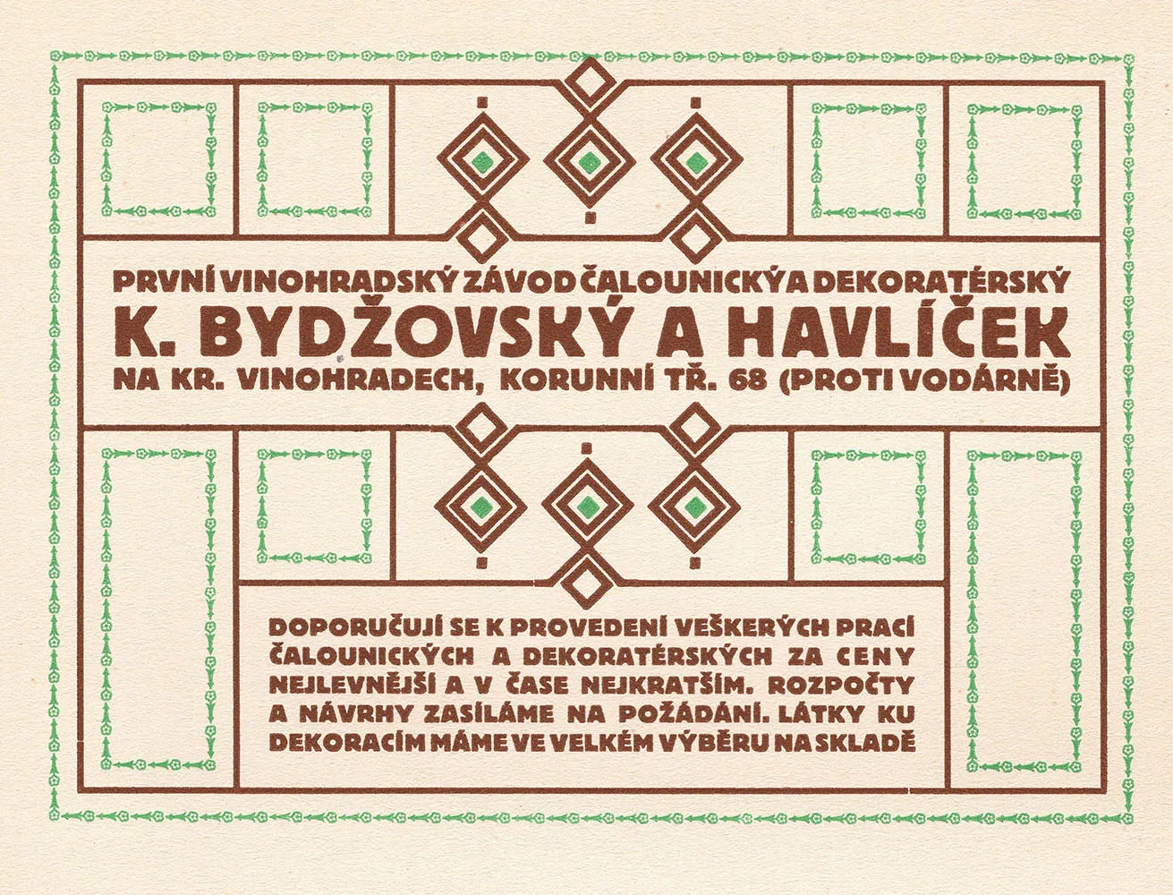
Design Archive Feature, Members Only Content, Regional Histories, Typography & Type Design
60 examples of Czech typography from Typografia Vol. 21 (1910). Czech commercial printing and book design as Secession ornament progressed to early modernist typography, with work by Alois Rieger, Methoděj Kaláb, Alois Chvála and many more.
Read Article
Design Archive Feature, Designer Profiles, Ephemera, Members Only Content
He designed stamps from around 1955 and in the book Karl Oskar Blase, Briefmarken-Design, Verlag für Philatelistische Literatur, 1981, he was described as one of the most influential stamp designers in Germany.
Read Article