



From the graphic design archive:

From the graphic design archive:
From the graphic design archive:

Design Archive Feature, Illustration, Members Only Content, Studios & Collectives
Winter + Bischoff’s work blends fine art and graphic design and is a fine example of commercial design featuring a heavy use of stylistic illustration. In fact a lot of German graphic design in the 1960s has this strong relationship of commercial and professional typographic layout with the roughness and organicness of art.
Read Article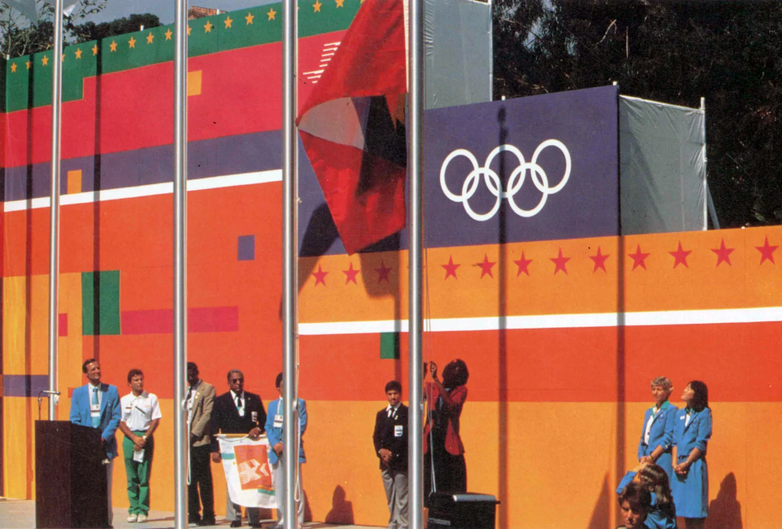
Advertising Design, Design Archive Feature, Members Only Content, Regional Histories
This article is part of my ongoing effort to spotlight the unsung heroes of design history. I'm especially passionate about sharing voices and designs that have been overlooked or forgotten. In this piece, I focus on the work of 1980s American graphic designers, in particular, the women who broke boundaries and shaped American visual culture.
Read Article
Design Archive Feature, Magazines & Publishing, Members Only Content, Regional Histories
A great way to visualise these stylistic variations and their progression is by looking through magazine covers and interior pages produced during the movement. The covers of Typografia that best represent the Czech Secese style of Art Nouveau were produced between 1907 and 1911.
Read Article