

Eye, Issue 034, Winter 1999

Opinion:
Editorial Eye 34 – Editorial, John L. Walters
Though we have designated this edition a ‘Public realm special issue’, it could be argued…
The univernacular rules – Screen, Jessica Helfand
Contradiction and comformity
Growing up in public – Agenda, David Heathcote
To tackle bigger projects and take more responsibility, graphic designers will have to get together and…
Anti-advertising shows its teeth – Rick Poynor
The media became squeamish when confronted with a gory anti-burger ad. Who are they trying to protect? Critique by Rick Poynor
Features:
A design (to sign roads by) by Phil Baines
As an exemplary rational design programme, the road signs of Jock Kinneir and Margaret Calvert demand careful study. Despite poor application, inconsistent additions and muddle over the past four decades, their robust, flexible system – with its humane typeface and quirky pictograms – still functions throughout the length and breadth of Britain
Reputations: Jean Widmer by Ursula Held
‘Signage reflects both the complexity of space and the way a place is organised. And it is very satisfying’
A virtual city in a global square by John Warwicker
Reflections on a new project in Australia, where graphic elements provide the interface between the electronic world and the physical environment
Virtual city: sidebar 1 by John Warwicker
The cultural palace
Virtual city: sidebar 2 by John Warwicker
A postmodern state?
Virtual city: sidebar 3 by John Warwicker, Eye editors
Global language
Big book, little buildings by David Heathcote
In its first edition, this seminal book was a groundbreaking collision between architecture and graphic design, emphasising ‘image’ over ‘form’
Here, there and nowhere by Emily King
Pictures of non-places, the grubby and eroded gaps between the real spaces of the urban realm, make a spectacle of the unspectacular
Neon by Russell Holmes
The properties of this medium make it the plaything of artists, a cinematic cliche and a familiar, endlessly renewable element of the urban nightscape.
Tart art by Tom Phillips
Despite regular attempts to suppress this unique ‘folkart’, London’s public phone booths remain eclectic galleries of erotic vernacular.
Out of town shopping by David Heathcote
Though its public lettering reassures customers with poetry and fiction this shimmering mall is, at heart, a three dimensional shopping catalogue
Surface wreckage by Rick Poynor
Three books showing accidental collages of torn posters an other random marks revive interest in a style of image-making drawn from the city streets

Details

Eye Magazine
Eye Magazine is an international quarterly journal of graphic design offering criticism, history, and practice published in the UK.

Linked Information

Eye, Issue 034, Winter 1999
More graphic design artefacts
More graphic design history articles
Unimark International and the visual identity of South-African manufacturer, DEFY.

Corporate Identity & Branding, Design Archive Feature, Members Only Content, Regional Histories, Studios & Collectives

Unimark International and the visual identity of South-African manufacturer, DEFY.

The identity manual consisted of 130 pages of information and brand usage with Arie J. Geurts heading up the project as design director, (who later headed up his own design studio in Los Angeles). The identity uses minimal colour and focuses on a consistent brand blue in all communications.

Read Article
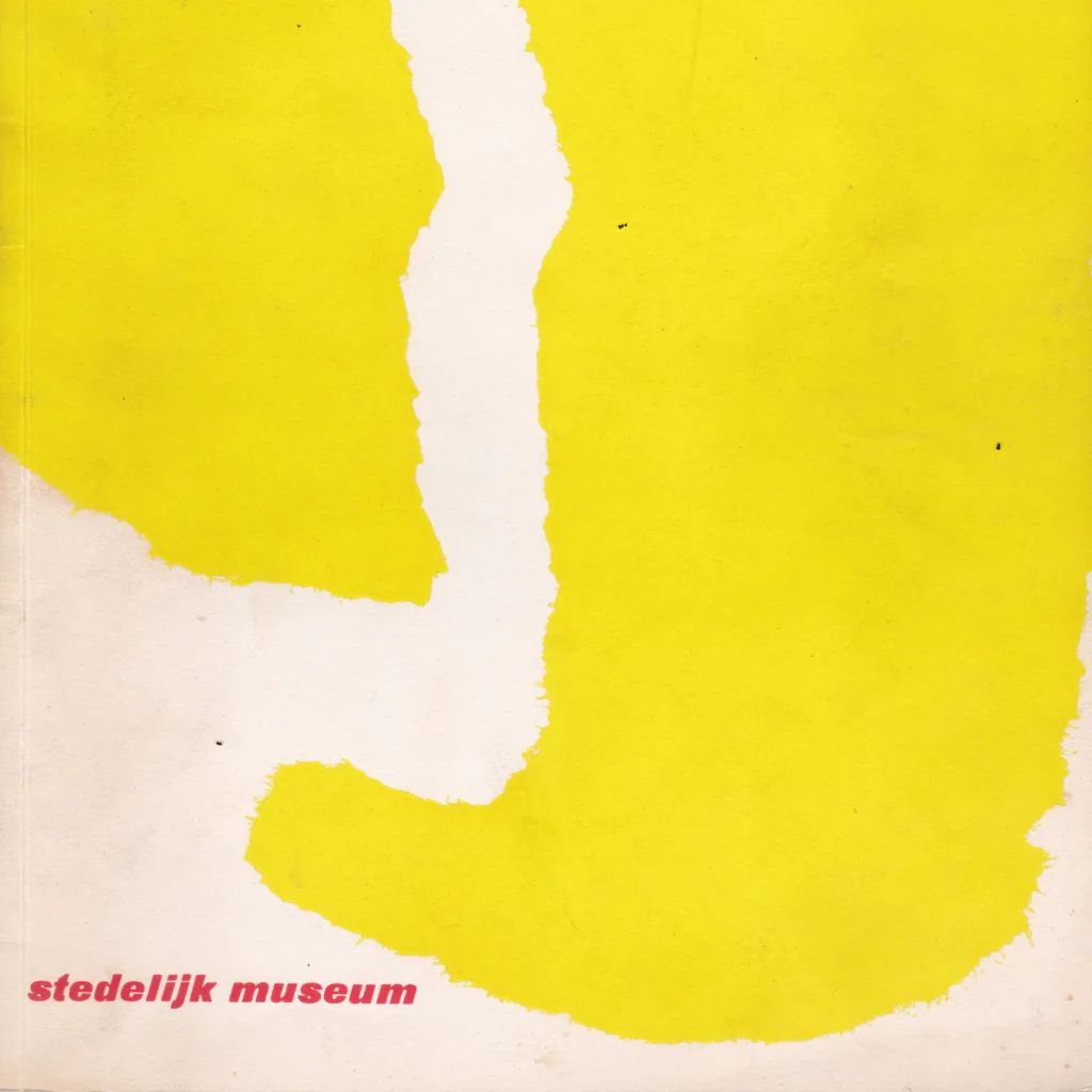
Willem Sandberg – Life and Legacy

Design Archive Feature, Designer Profiles, Members Only Content, Regional Histories

Willem Sandberg – Life and Legacy

This 1,500 word essay is about the life and work of Willem Sandberg and is illustrated with part of my collection of over 100 pieces of Sandberg’s work, including books, Stedelijk Museum catalogues, and various individual printed items.

Read Article
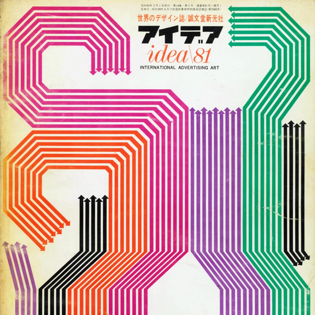
Yūsaku Kamekura. Japanese Graphic Designer | 1915 – 1997

Design Archive Feature, Designer Profiles, Members Only Content, Regional Histories

Yūsaku Kamekura. Japanese Graphic Designer | 1915 – 1997

Yūsaku Kamekura had a long list of clients and as well as cover designs, he worked across logo and brand design, packaging, book design, and other printed matter, but he is particularly known for his poster design. His clients included Nikon, Tokyo 1964 Olympics, Meiji and TDK.

Read Article