



From the graphic design archive:

From the graphic design archive:

From the graphic design archive:

From the graphic design archive:
Advertising Design, Design Archive Feature, Members Only Content, Regional Histories
As a chemist, I have an obligation to be curious – I grab a stack of our chemical journals and start with the advertising section. I start it, the walk through the sand. I don’t want to deny some oases. But soon I’m bored and tired.
Read Article
Book Reviews & Press Releases, Magazines & Publishing
As a champion of graphic design history, I was thrilled to find the upcoming book "Penrose 1964-73: The Herbert Spencer Years," a captivating visual anthology dedicated to honouring Spencer's legacy as a trailblazer in modern typography. Spanning 288 pages, this book commemorates Spencer's influential editorship at the Penrose Annual from 1964 to 1973.
Read Article
Design Archive Feature, Members Only Content, Poster Design, Regional Histories, Studios & Collectives
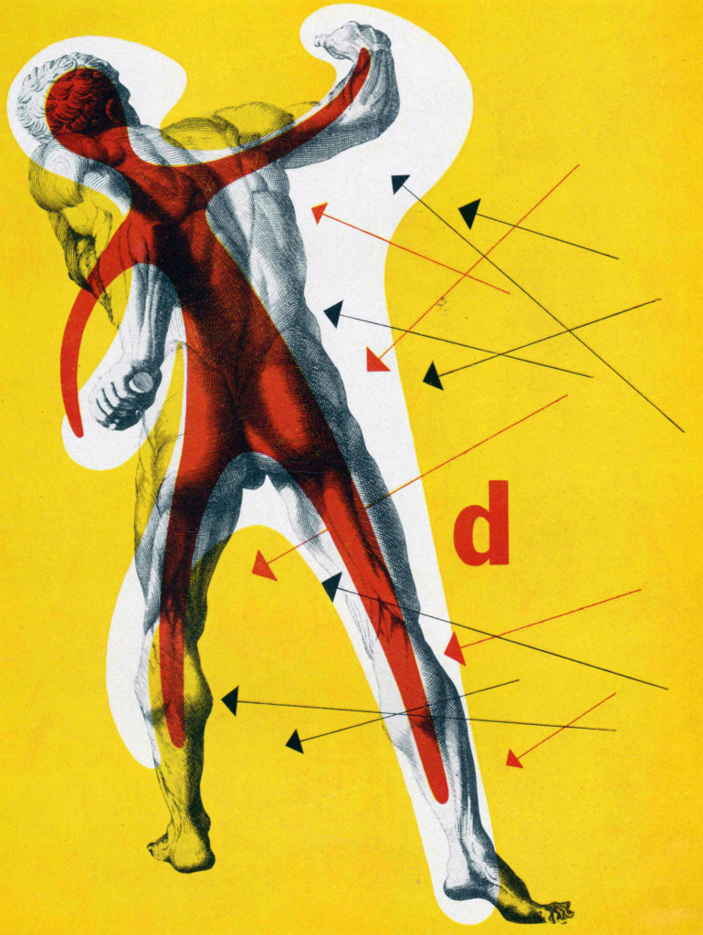
A total of 24 posters were created for the campaign during 1964, using the arrow symbol as a key features, representing power, motion and speed. The handmade lithographs use up to 19 colours, which were individually printed at large scale. The posters also utilise the brand colours red and yellow from Shells corporate identity.
Read Article