Wim Crouwel

Fodor 8, 1972 – Jan van Toorn

Details

Wim Crouwel
Willem Hendrik Crouwel was born in 1928 in Groningen, Netherlands. He studied at the Academy of Arts and Crafts in Groningen and took evening classes at the Institute of Arts and Crafts, now the Rietveld Academy. His teacher, Charles Jongejans, was trained by notable Dutch designers Paul Schuitema and Gerard Kiljan. In 1952, Crouwel began his design career at Enderberg, designing exhibitions and trade stands, gaining valuable experience. After leaving Enderberg in 1956, he founded a studio with industrial designer Kho Liang Ie, working on various projects across design disciplines, including graphic and exhibition design. Influenced by mid-century Swiss typography, Crouwel explored letterforms and graphic systems, using fonts like Helvetica and Univers. His early clients included the Van Abbe Museum, where he designed catalogues and posters. In 1963, he co-founded the influential design agency Total Design and also started working for the Stedelijk Museum, collaborating with Edy de Wilde until 1986. Explore the Design Reviewed archive to discover artefacts connected to Wim Crouwel. The Dutch Modernism movement, the Netherlands and the 1960s and 1970s decade pages.
Fodor
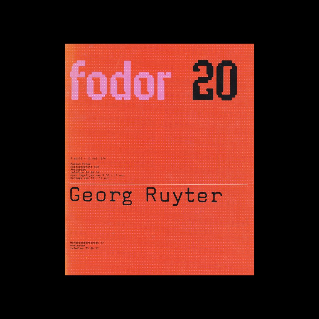
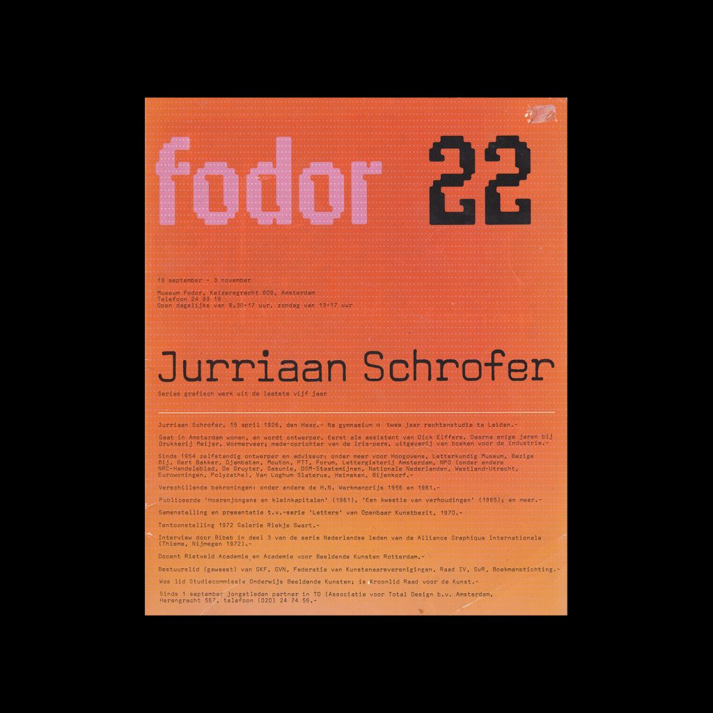
Fodor was a Dutch exhibition catalogue series designed by Wim Crouwel. They were a total of 40 issues published, each following Crouwel's design system.

Linked Information

Fodor 8, 1972 - Jan van Toorn. Designed by Wim Crouwel
Fodor 8, 1972 – Jan van Toorn. Designed by Wim Crouwe
More graphic design artefacts
More graphic design history articles
Wim Crouwel and the Stedelijk Museum

Corporate Identity & Branding, Design Archive Feature, Designer Profiles, Members Only Content, Regional Histories

Wim Crouwel and the Stedelijk Museum

Crouwel was the successor to Willem Sandberg who used an avant-garde approach in his work, utilising torn-paper montage, mixing of sans serif and old Egyptian typefaces and often off-center positioning. Crouwel steered away from this artistic approach and implemented a cohesive design system and a strong identity that emulated the corporate identity boom of the 1950s and 60s.

Read Article

Visual identity and branding at Olivetti published by Triest Verlag

Book Reviews & Press Releases, Corporate Identity & Branding

Visual identity and branding at Olivetti published by Triest Verlag

I have always loved the design work created for Olivetti. The colourful midcentury designs by Italian designer Giovanni Pintori, the minimal typographic poster by Swiss designer Walter Ballmer and my personal favourite the 1959 poster for Olivetti designed by Herbert Bayer. I recently found out Triest Verlag released a new book, Visual identity and branding at Olivetti which contains further work by Xanti Schawinsky, Renato Zveteremich, Ettore Sottsass, Hans von Klier, Egidio Bonfante and Walter Ballmer.

Read Article
Network Maps and Timetable Design: Navigating the Complex Cityscape

Design Archive Feature, Members Only Content

Network Maps and Timetable Design: Navigating the Complex Cityscape

Notes on transit and network map design, including the iconic London Underground map by Harry Beck, the importance of visual clarity, and the role of accessible design in timetable design.

Read Article