
From the graphic design archive:

From the graphic design archive:

From the graphic design archive:
From the graphic design archive:

Advertising Design, Design Archive Feature, Members Only Content, Regional Histories
Following on from my previous article on publicity design from 1957-58, an additional annual from 1959-60 showcases another year of great advertising and design from Italy.
Read Article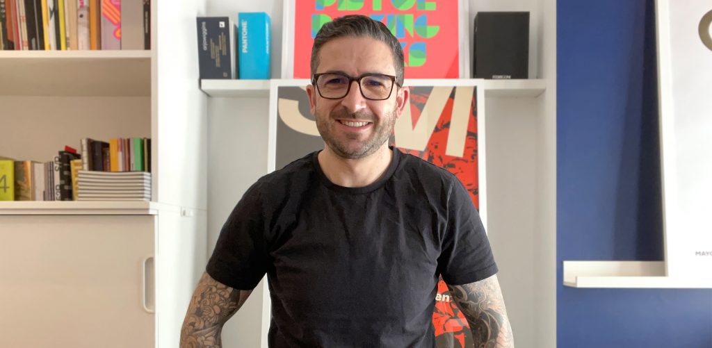
Mark Bloom has designs for globally recognised brands, produces some of the finest, most accessible modern typefaces and heads up Mash Creative and CoType Foundry. His type foundry has always been a port of call for our studio's brand projects and he continues to develop these, each with a fantastic print specimen.
Read Article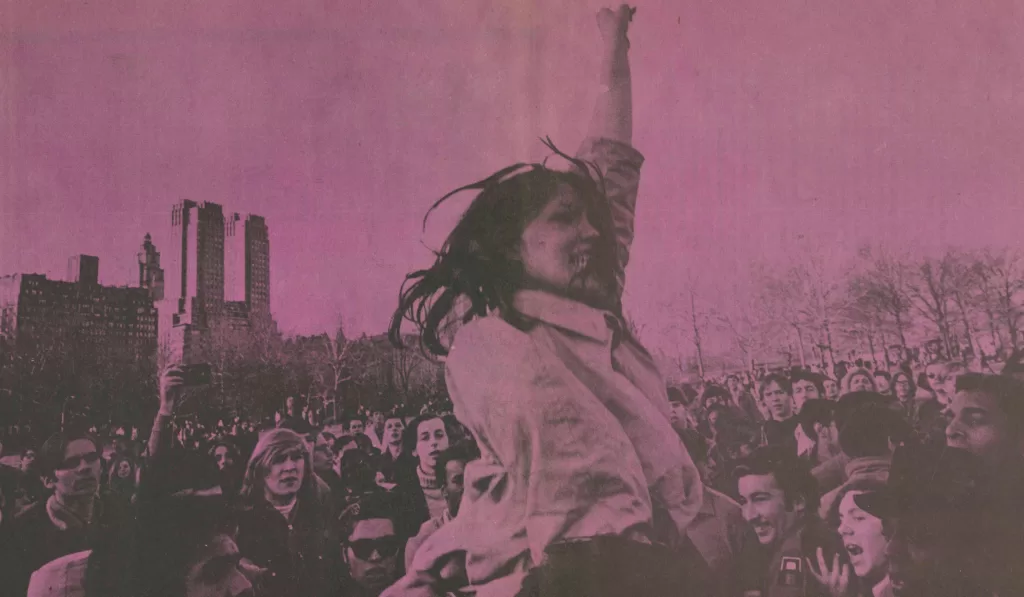
Design & Politics, Design Archive Feature, Members Only Content, Movements, Regional Histories
The 1960s was an era characterised by political, social, and cultural shifts. The counterculture movement emerged as a response to the perceived failures of the mainstream establishment, sparking a wave of activism and alternative ideologies. And with these an array of printed matter. Counterculture publications, often referred to as the "underground press," became powerful platforms for dissent, expression, and the exploration of new ideas.
Read Article