


From the graphic design archive:

From the graphic design archive:
From the graphic design archive:

From the graphic design archive:
Design Archive Feature, Design Education, Magazines & Publishing, Members Only Content
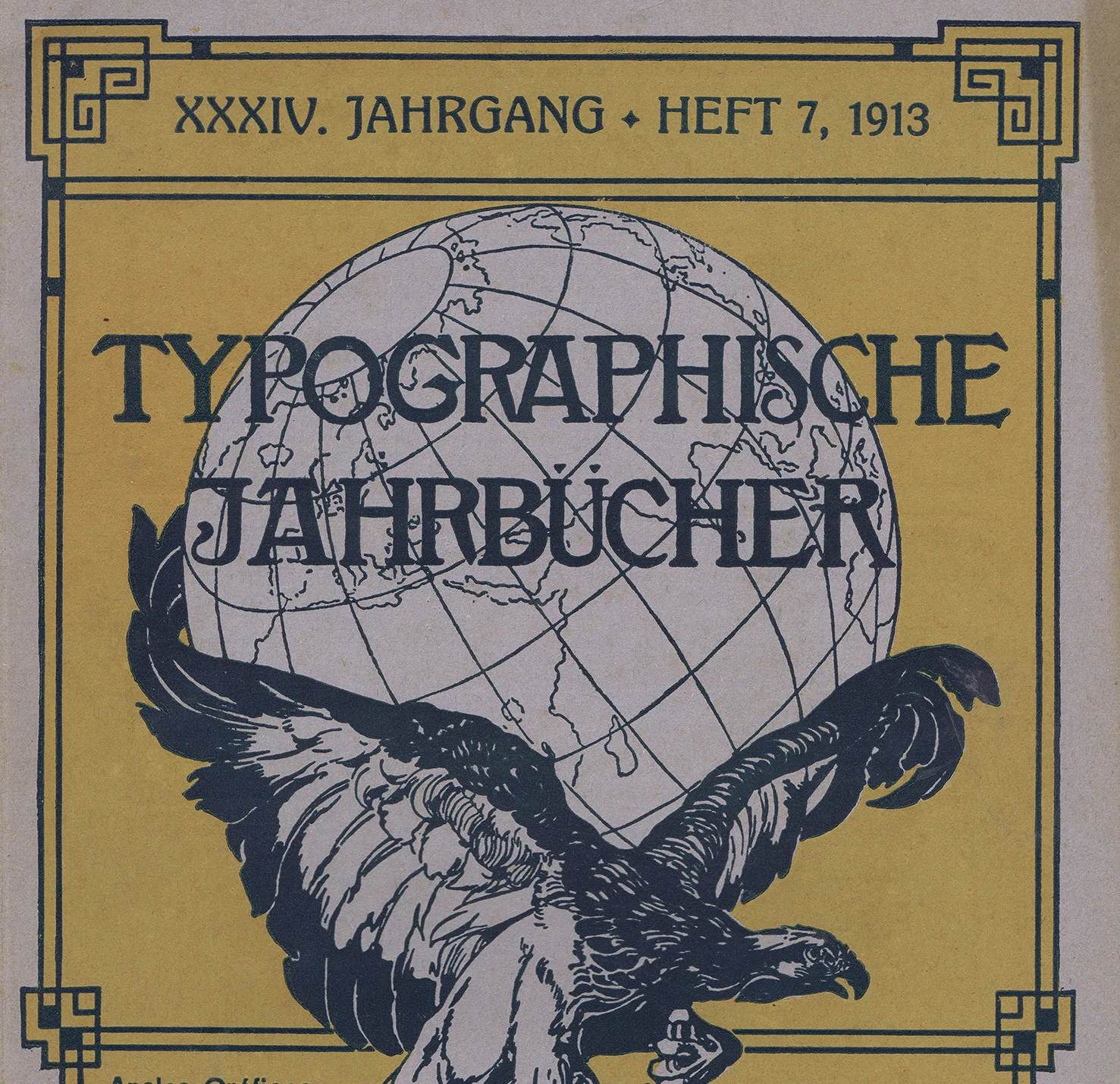
Across Europe, industry unions and trade journals shaped the professionalisation of graphic design between 1890 and 1930. Journals such as Typografia, Das Plakat, The Penrose Annual and Typographische Jahrbucher.
Read Article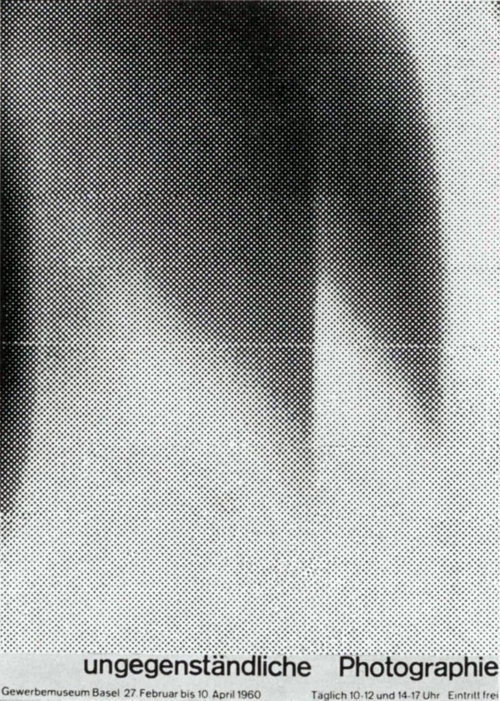
Design Archive Feature, Members Only Content, Poster Design, Regional Histories
The Best Swiss Posters Award was an annual competition, judged by a Swiss Jury. They selected a range of posters, showcasing a range of poster styles from completely typographic designs such as the work of Robert Büchler, to the illustrated posters of Donald Brun.
Read Article
Design Archive Feature, Members Only Content, Poster Design, Regional Histories, Studios & Collectives
A total of 24 posters were created for the campaign during 1964, using the arrow symbol as a key features, representing power, motion and speed. The handmade lithographs use up to 19 colours, which were individually printed at large scale. The posters also utilise the brand colours red and yellow from Shells corporate identity.
Read Article