

From the graphic design archive:
From the graphic design archive:
From the graphic design archive:

From the graphic design archive:

Corporate Identity & Branding, Design Archive Feature, Designer Profiles, Members Only Content, Regional Histories
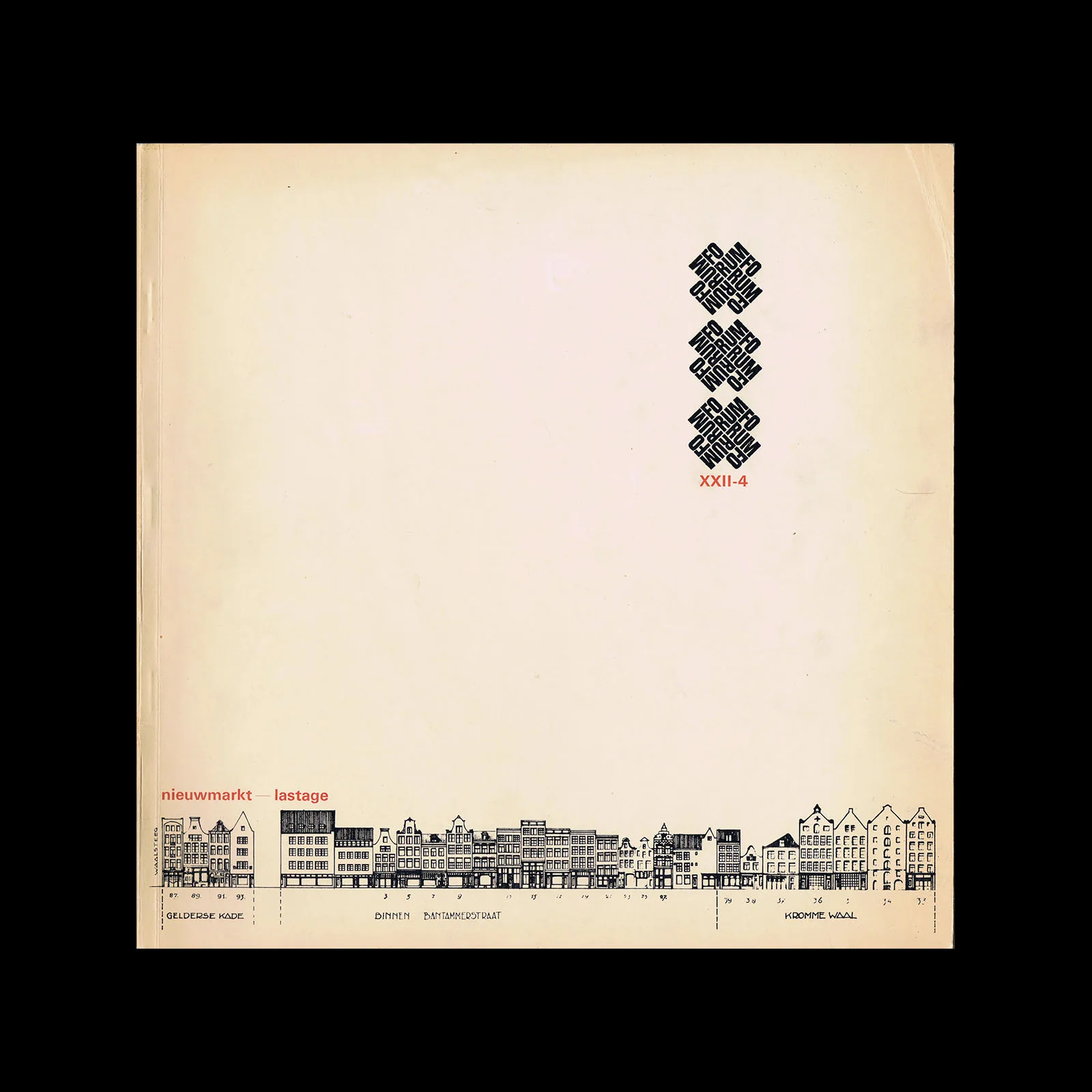
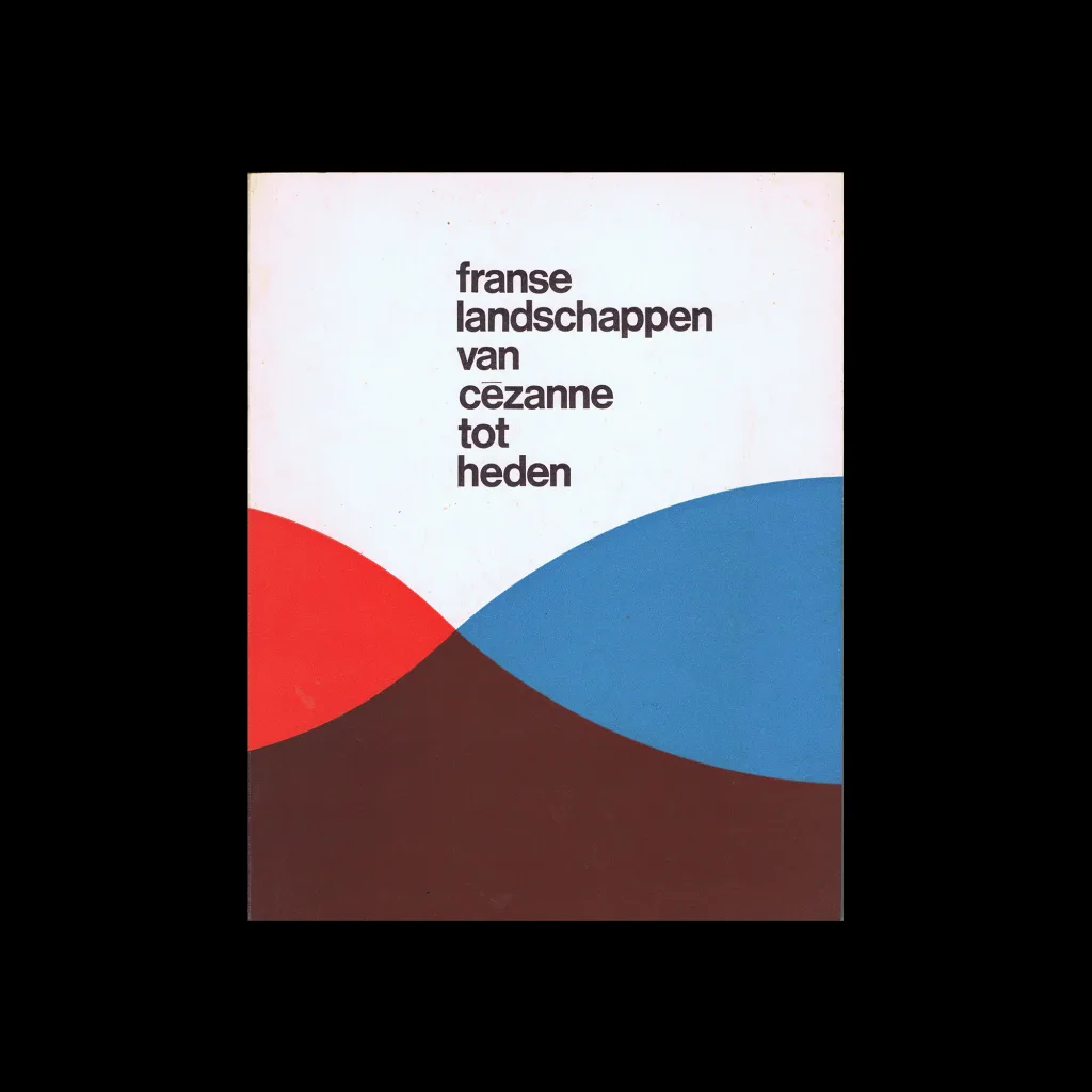
Crouwel was the successor to Willem Sandberg who used an avant-garde approach in his work, utilising torn-paper montage, mixing of sans serif and old Egyptian typefaces and often off-center positioning. Crouwel steered away from this artistic approach and implemented a cohesive design system and a strong identity that emulated the corporate identity boom of the 1950s and 60s.
Read Article
Advertising Design, Design Archive Feature, Members Only Content, Regional Histories
These one-colour forms have a playful but structured aesthetic through their geometric forms, they remind me of the abstract line drawings of Picasso blended with Jan Tschichold and the New Typography.
Read Article
Design Archive Feature, Designer Profiles, Members Only Content, Movements, Regional Histories
Wolfgang Weingart's artistic design delved into the intricacies of Swiss typography, skillfully dissecting its elements while venturing into texture and type experimentation. His layered montages radiated dynamic kinetic energy, standing in stark contrast to the minimalist approach of his instructors, embracing a more maximalist aesthetic.
Read Article