

Advertising Design, Corporate Identity & Branding, Design Archive Feature, Regional Histories
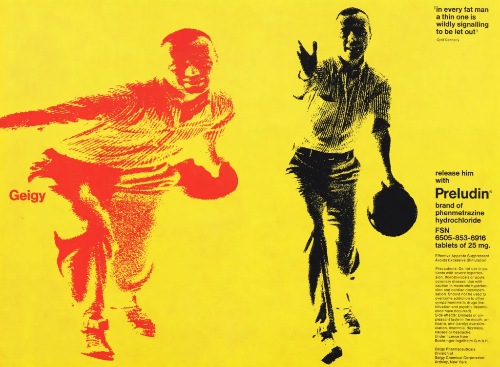
An advertising programme is fully integrated only when its effect is powerful enough to play a major part in determining a corporate image. Geigy advertising is an example of this successful integration.
Read Article
Design Archive Feature, Members Only Content, Poster Design, Regional Histories, Studios & Collectives
A total of 24 posters were created for the campaign during 1964, using the arrow symbol as a key features, representing power, motion and speed. The handmade lithographs use up to 19 colours, which were individually printed at large scale. The posters also utilise the brand colours red and yellow from Shells corporate identity.
Read Article
Advertising Design, Design Archive Feature, Members Only Content
The collection of works I've gathered, designed for Olympia-Werke, showcases the height of mid-century German commercial artistry. The work was collated in a branded folder and contained forty brochures, advertisements and manuals.
Read Article