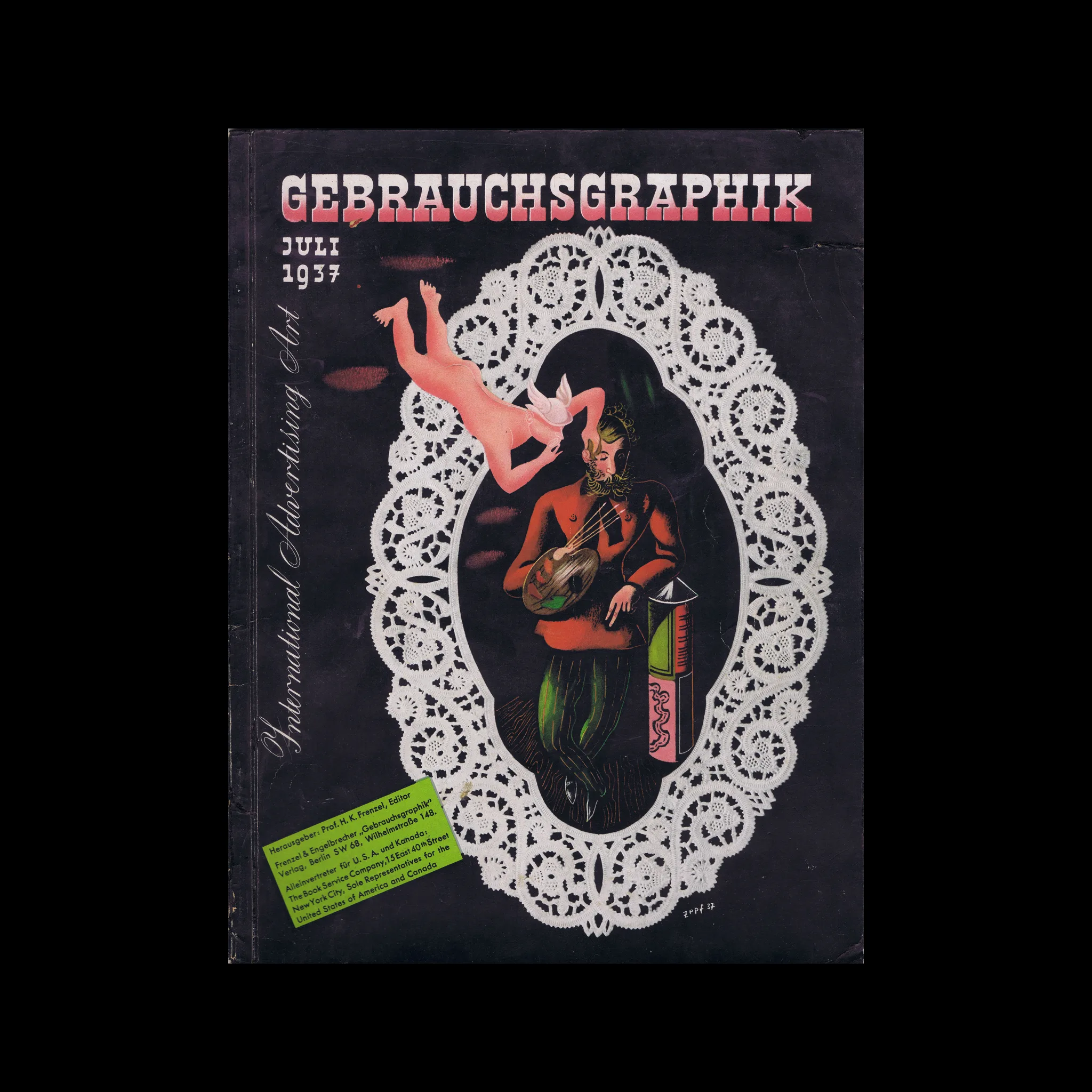

Gebrauchsgraphik, 07, 1937

Selected Contents: Advertising in Holland, Karl Mahr, K. Th. Gremmler: A Master of the Advertising Photography, The New Examples of Futura; Karl Bertsch

Selected Artists: Otto Arpke, Karl Bertsch, Albert Fuss, Olaf Gulbransson, E. McKnight Kauffer, Karl Mahr, Paul Renner, Oswald Voh, Jupp Wiertz, Paul Wolff

Details

Toni Zepf
Toni Zepf was born in Augsburg, Germany, in 1902. Zepf worked extensively in publicity and display design, and his work was featured on the covers of many magazines, including the early issues of Gebrauchsgraphik. He also designed many advertisements for Container Corporation in America. Explore related designers including Jan Tschichold and Herbert Bayer. See also New Typography and 1930s graphic design history.
Gebrauchsgraphik
A German design magazine published from 1924 onwards, devoted to commercial art and advertising design.

Linked Information

Gebrauchsgraphik, 07, 1937. Cover design by Toni Zepf
More graphic design artefacts
More graphic design history articles
To Have and To Hold: A visual collection of paper bag ephemera from a bygone era

Book Reviews & Press Releases

To Have and To Hold: A visual collection of paper bag ephemera from a bygone era

To Have and To Hold, contains hundreds of bag designs collected during over half a century. The book is a must-buy for anyone interested in ephemera, the history of design or British high street history.

Read Article
Helmut Schmid Typography –  A new monograph published by Lars Müller Publishers

Book Reviews & Press Releases

Helmut Schmid Typography – A new monograph published by Lars Müller Publishers

Helmut Schmid Typography explores the typographer’s oeuvre in its entirety. The book’s generous design allows each image to breathe, and the accompanying texts narrate Schmid’s life and career in an informative and pleasant manner.

Read Article
Student work from the 1964 Class of Typography, at Pratt Institute, New York

Design Archive Feature, Design Education, Members Only Content, Regional Histories, Typography & Type Design

Student work from the 1964 Class of Typography, at Pratt Institute, New York

The August 1964 issue highlights the Typography class at the Pratt Institute in New York, a relatively new course at the time. Pratt, one of the most renowned art schools in the United States, had departments for graphic design, painting, art education, industrial design, and applied graphics in the 1960s. The typography course combined theoretical lectures with practical workshops, aimed at students beginning their journey into the discipline.

Read Article