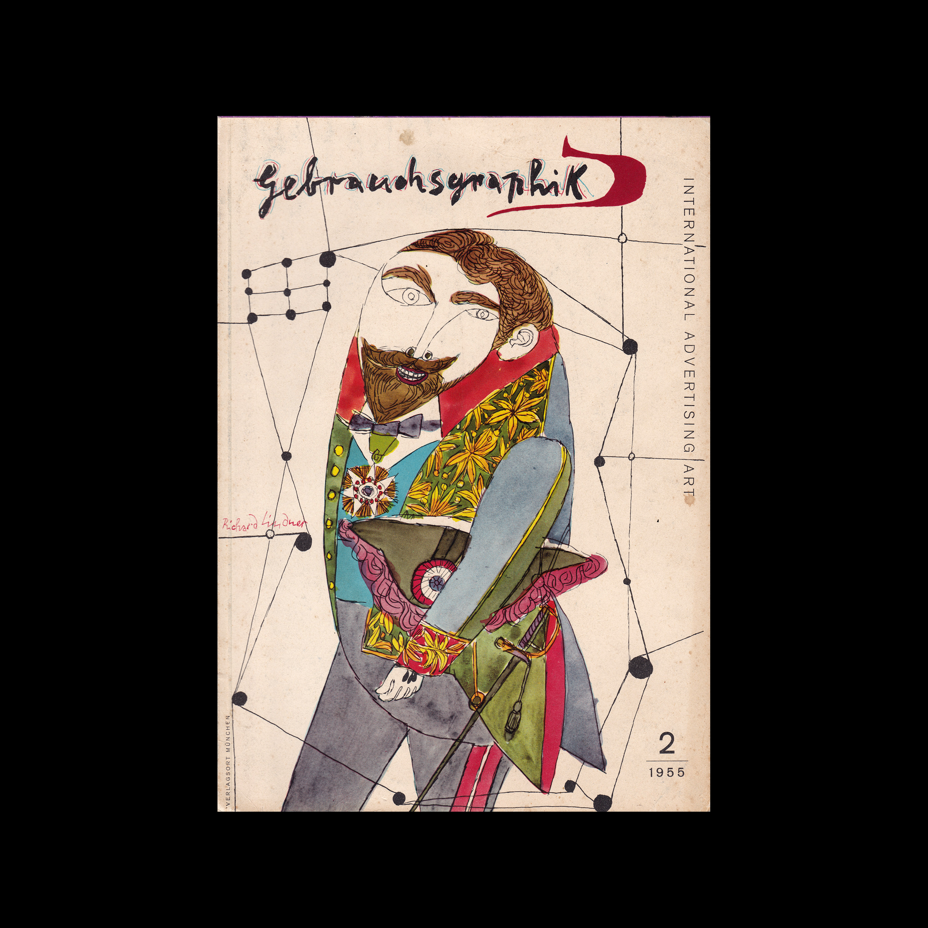

Gebrauchsgraphik, 02, 1955

Content includes:
Eberhard Hölscher: Pharmaceutical prospectuses by Claus Hansmann
Alexandre Alexandre: A humoristic pack of cards by Albert Dubout
Anton Sailer: Elegance placarded. Posters by Walter Schnackenberg
Remigius Netzer: The wood engraver Otto Rohse. Illustrations and featuring of books
Eberhard Hölscher: Exhibition posters by Danilo di Prete, Brazil
Ludwig Ebenhöh: Self-advertising of an american printing plant
Eberhard Hölscher: Advertising of the «Bayerische Motorenwerke» (Bavarian Motor Plants)
Anton Sailer: Drawings for the press by Herbert Pothorn
Carl Heußner: The young generation in Finland
Robert Henry: Art in show-windows

Details

Richard Lindner
Gebrauchsgraphik
A German design magazine published from 1924 onwards, devoted to commercial art and advertising design.

Linked Information

Gebrauchsgraphik, 2, 1955 cover design by Richard Lindner
More graphic design artefacts
More graphic design history articles
Systematic Surface Design by Tobias Christoph, 1980

Corporate Identity & Branding, Design Archive Feature

Systematic Surface Design by Tobias Christoph, 1980

Systematic Surface Design eliminating the hindrance of searching for strategies and starting points, allowing designers to quickly find optimal solutions.

Read Article
60 Examples of Czech Typography from 1912, Typografia

Typography & Type Design, Design Archive Feature, Members Only Content, Regional Histories

60 Examples of Czech Typography from 1912, Typografia

60 examples of Czech typography from Typografia Vol. 23 (1912). Czech commercial printing and book design as Secession ornament progressed to early modernist typography, with work by Jindra Dvořáček, Methoděj Kaláb, Alois Chvála and many more.

Read Article
Student work from the 1964 Class of Typography, at Pratt Institute, New York

Design Archive Feature, Design Education, Members Only Content, Regional Histories, Typography & Type Design

Student work from the 1964 Class of Typography, at Pratt Institute, New York

The August 1964 issue highlights the Typography class at the Pratt Institute in New York, a relatively new course at the time. Pratt, one of the most renowned art schools in the United States, had departments for graphic design, painting, art education, industrial design, and applied graphics in the 1960s. The typography course combined theoretical lectures with practical workshops, aimed at students beginning their journey into the discipline.

Read Article