


Design Archive Feature, Members Only Content, Poster Design, Regional Histories, Studios & Collectives
A total of 24 posters were created for the campaign during 1964, using the arrow symbol as a key features, representing power, motion and speed. The handmade lithographs use up to 19 colours, which were individually printed at large scale. The posters also utilise the brand colours red and yellow from Shells corporate identity.
Read Article
I have been reproached for this, and I will surely be reproached again. I have also been reproached for reading more and more obscure works whose readership must be limited to a handful of specialists and a few hobbyists like myself. It’s a heavy passion or a passion that sucks.
Read Article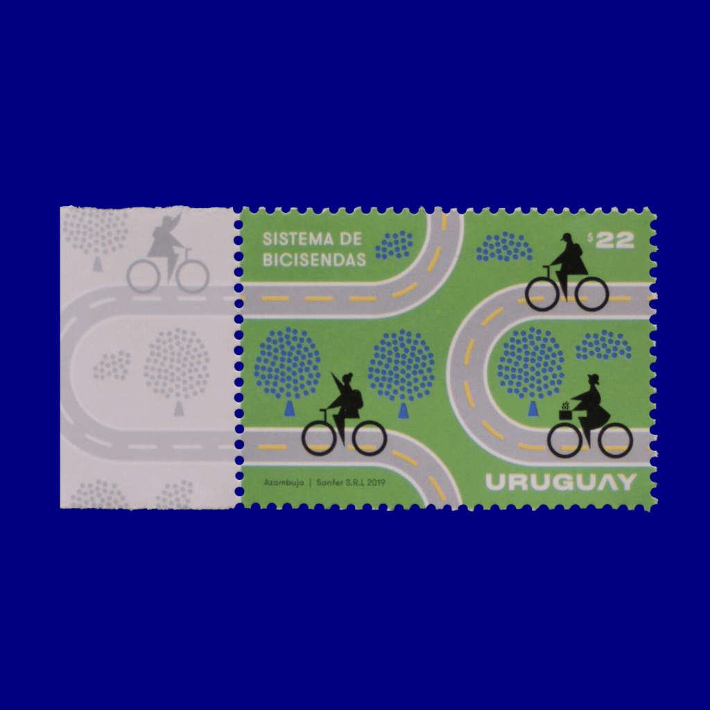
Designer Interview, Regional Histories
Gabriel sent me a link to his amazing Uruguayan Graphic Design Archive when I launched Design Reviewed. The content was so amazing, I ended up spending a good hour looking through the content and it has definitely made it to my bookmarks.
Read Article