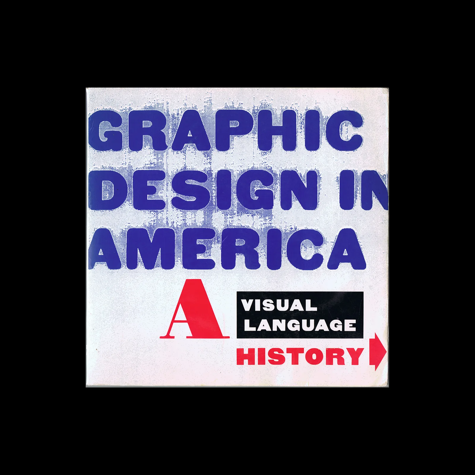

Design Archive Feature, Members Only Content, Movements
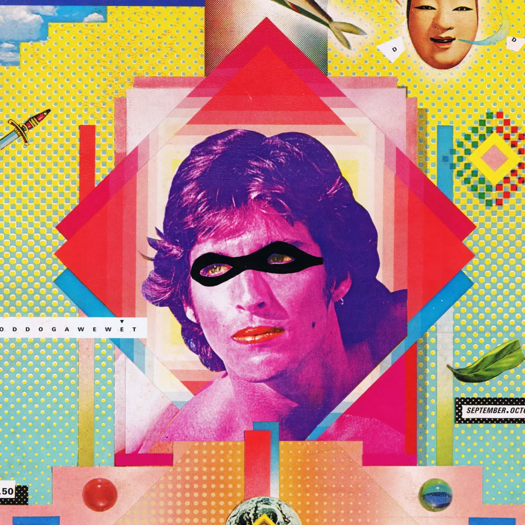
A 1,500 essay on the transformative era of graphic design from the 1970s to the 1990s. Moving beyond the constraints of modernism, designers like Wolfgang Weingart and April Greiman redefined visual communication through bold experimentation with type, colour, and early computer graphics. This essay highlights how postmodernism and New Wave design introduced complexity, individuality, and digital innovation in to graphic design.
Read Article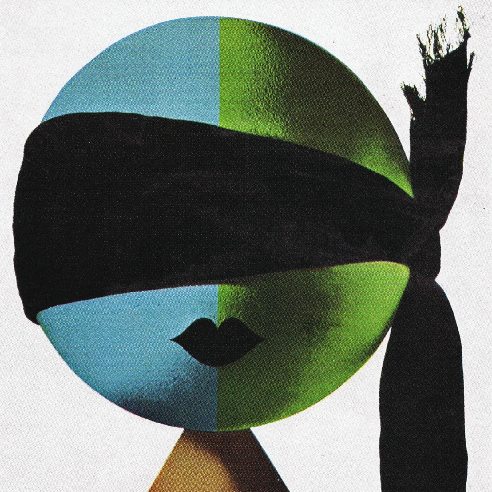
Design Archive Feature, Members Only Content, Poster Design, Regional Histories
Gebrauchsgraphik 08, 1964 features a selection of the German Posters entered into the 1963/64 awards. 22 posters were awarded by the Association of German Commercial Artists and the awards showcased some of the best poster designs of the year, that still remain effective and stylish today.
Read Article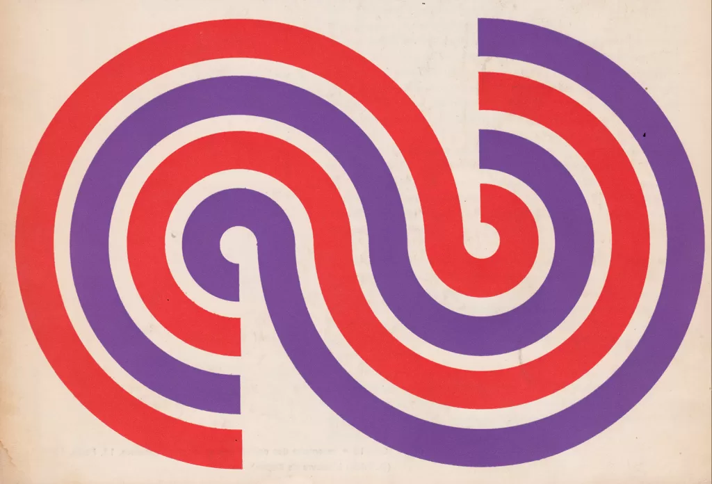
Corporate Identity & Branding, Design Archive Feature, Designer Profiles, Members Only Content, Regional Histories
Crouwel was the successor to Willem Sandberg who used an avant-garde approach in his work, utilising torn-paper montage, mixing of sans serif and old Egyptian typefaces and often off-center positioning. Crouwel steered away from this artistic approach and implemented a cohesive design system and a strong identity that emulated the corporate identity boom of the 1950s and 60s.
Read Article