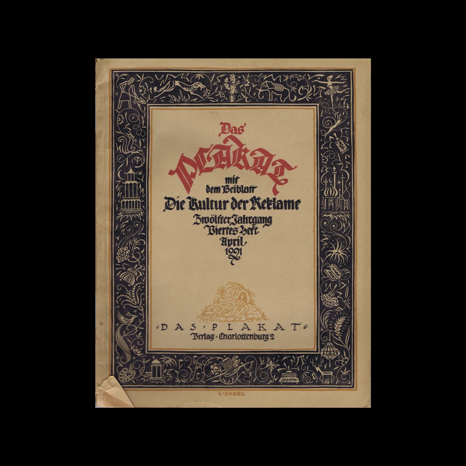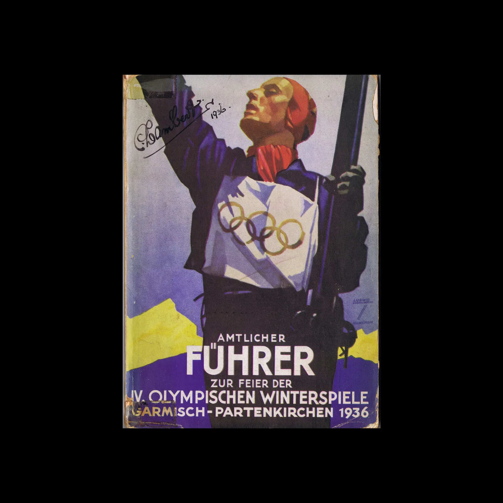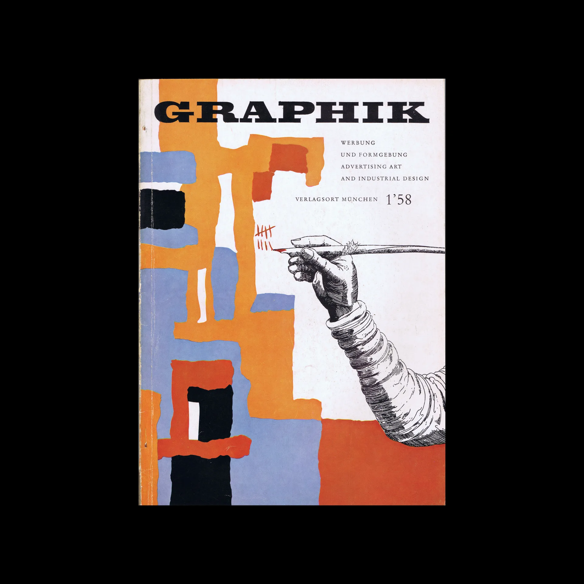

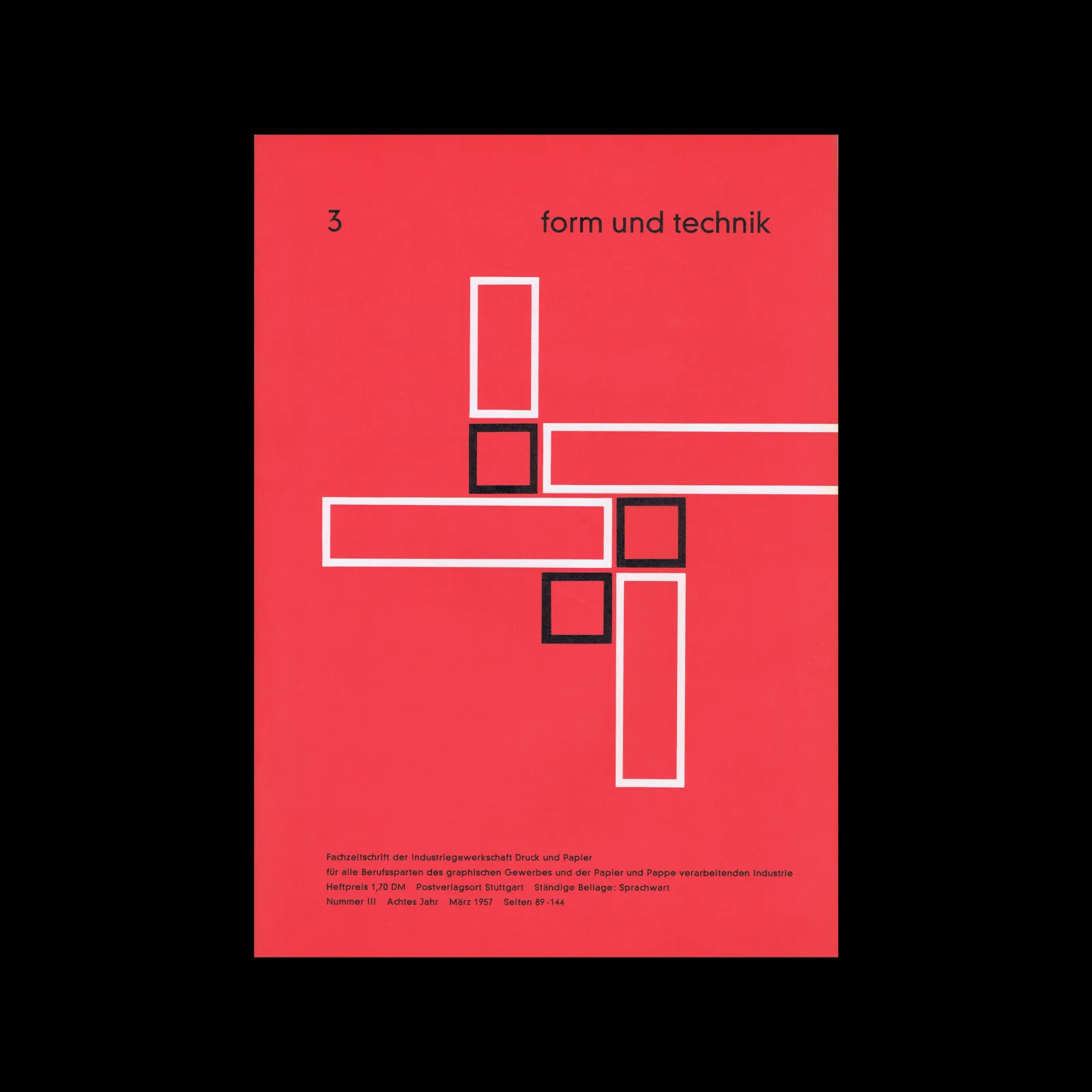
Graphik – Werbung + Formgebung, 01, 1958

Content includes:
ADVERTISING ART
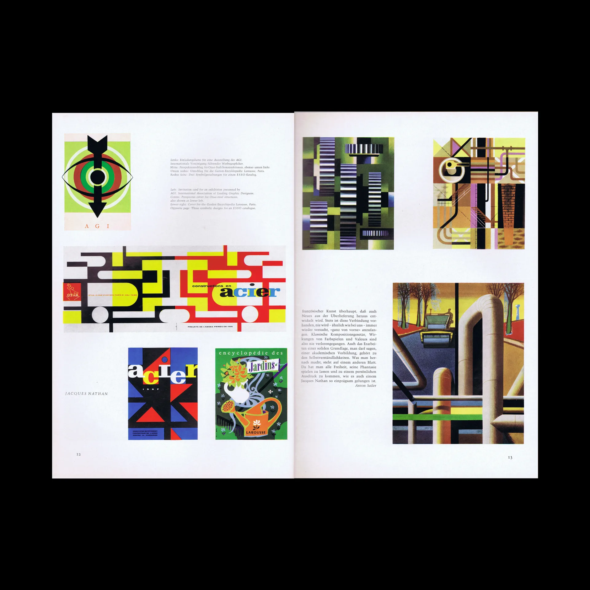
Greetings from Paris, Jacques Nathan
Magazine titles from the Setzke studio
Here’s how the Americans draw
INDUSTRIAL DESIGN
A word about reporting on industrial design
The desire for prices in advertisements
Advertising picture atlas
Presentation of Automobiles, Volkswagen and Daimler Benz
PRACTICAL ADVERTISING
The emotional values of type faces
The practical design of cinema diapositives
THIS AND THAT
Not only financial, but ethical values too
Glance at the Air France revue

The hand drawing the five-day week shown on our cover illustration, was drawn by Johann Neudörffer in 1538.
(Selected from the bibliophile work »Johann Neudörffer and his School«, Prestel Verlag Munich.)
Composition of the cover: Georg Tisch, Munich.

Details

Graphik – Werbung + Formgebung
Graphik – Werbung + Formgebung was a German magazine published in the 1950s and 1960s,  focused on graphic design, advertising art, typography, exhibition/display design, and applied graphics.

Linked Information

Graphik – Werbung + Formgebung, 01, 1958


The work of Jacques Nathan. Scanned from Graphik – Werbung + Formgebung, 01, 1958
More graphic design artefacts
More graphic design history articles
Visual identity and branding at Olivetti published by Triest Verlag

Book Reviews & Press Releases, Corporate Identity & Branding

Visual identity and branding at Olivetti published by Triest Verlag

I have always loved the design work created for Olivetti. The colourful midcentury designs by Italian designer Giovanni Pintori, the minimal typographic poster by Swiss designer Walter Ballmer and my personal favourite the 1959 poster for Olivetti designed by Herbert Bayer. I recently found out Triest Verlag released a new book, Visual identity and branding at Olivetti which contains further work by Xanti Schawinsky, Renato Zveteremich, Ettore Sottsass, Hans von Klier, Egidio Bonfante and Walter Ballmer.

Read Article
Friendliness and Efficiency. 1970s Postcards for the British Job Centre

Design Archive Feature, Ephemera, Members Only Content, Regional Histories

Friendliness and Efficiency. 1970s Postcards for the British Job Centre

The designer is unstated on these postcards, which were designed during the mid to late 1970s, but these playful illustrations alongside what looks to be Frankfurter Bold definitely fit the criteria of friendliness and efficiency

Read Article
A New Visual Aesthetic. Hermann Rastorfer and the advertising for Volkswagen

Advertising Design, Design Archive Feature, Members Only Content

A New Visual Aesthetic. Hermann Rastorfer and the advertising for Volkswagen

Rastorfer transformed the advertising of Volkswagen and his work contrasted with that of the previously commissioned designers. It reiterates the importance of finding a designer who can transform your vision and adverting and how the significance of consistent messaging across advertisements, contributes to the creation of a memorable campaign 

Read Article