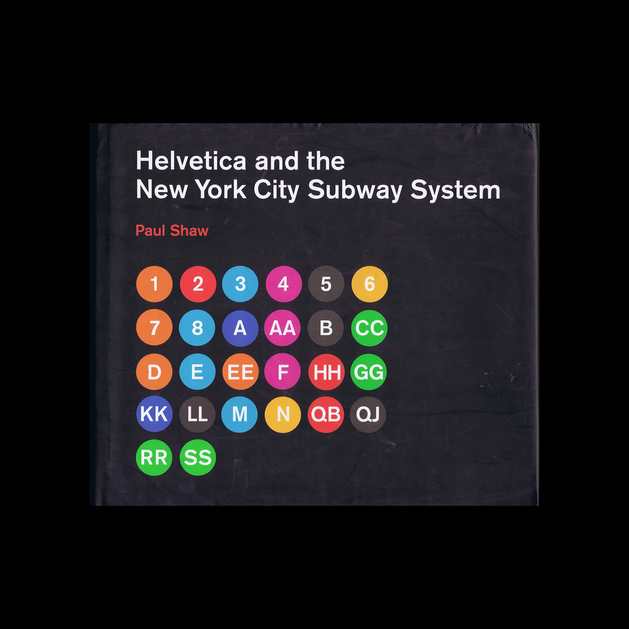

Helvetica and the New York City Subway System, The MIT Press, 2011

‘How New York City subways signage evolved from a “visual mess” to a uniform system with Helvetica triumphant. For years, the signs in the New York City subway system were a bewildering hodge-podge of lettering styles, sizes, shapes, materials, colors, and messages. The original mosaics (dating from as early as 1904), displaying a variety of serif and sans serif letters and decorative elements, were supplemented by signs in terracotta and cut stone. Over the years, enamel signs identifying stations and warning riders not to spit, smoke, or cross the tracks were added to the mix. Efforts to untangle this visual mess began in the mid-1960s, when the city transit authority hired the design firm Unimark International to create a clear and consistent sign system. We can see the results today in the white-on-black signs throughout the subway system, displaying station names, directions, and instructions in crisp Helvetica. This book tells the story of how typographic order triumphed over chaos.’

Details

  • Format Book
  • Year 2011
  • Client/Publisher MIT Press
  • Size 287mm x 249mm

Linked Information

Helvetica and the New York City Subway System, The MIT Press, 2011
More graphic design artefacts
More graphic design history articles
Bauhaus Principles Today

Design Archive Feature, Design Education, Members Only Content, Movements

Bauhaus Principles Today

The Bauhaus approach to design emphasised simplicity, functionality, and the integration of modern technologies and materials. A century later, many of the principles taught at the school remain fundamental to contemporary design practices.

Read Article
Advertising 16mm Film. The work of Günter Heil

Advertising Design, Design Archive Feature, Members Only Content

Advertising 16mm Film. The work of Günter Heil

Little is known about the designer Günther Heil. he established his graphic studio in Berlin and designed many advertisements for 8mm and 16mm film distributor Bruno Schmidt in the 1960s. These were created in the same era as the film distributor Atlas Films was sending films to art-house theatres and were hiring designers Hans Hillmann, Hans Michel, Günther Kieser, Wolfgang Schmidt and Karl Oskar Blase.

Read Article

1960s Counter-Culture Publications: Voices of Change, Rebellion, and Liberation

Design & Politics, Design Archive Feature, Members Only Content, Movements, Regional Histories

1960s Counter-Culture Publications: Voices of Change, Rebellion, and Liberation

The 1960s was an era characterised by political, social, and cultural shifts. The counterculture movement emerged as a response to the perceived failures of the mainstream establishment, sparking a wave of activism and alternative ideologies. And with these an array of printed matter. Counterculture publications, often referred to as the "underground press," became powerful platforms for dissent, expression, and the exploration of new ideas.

Read Article