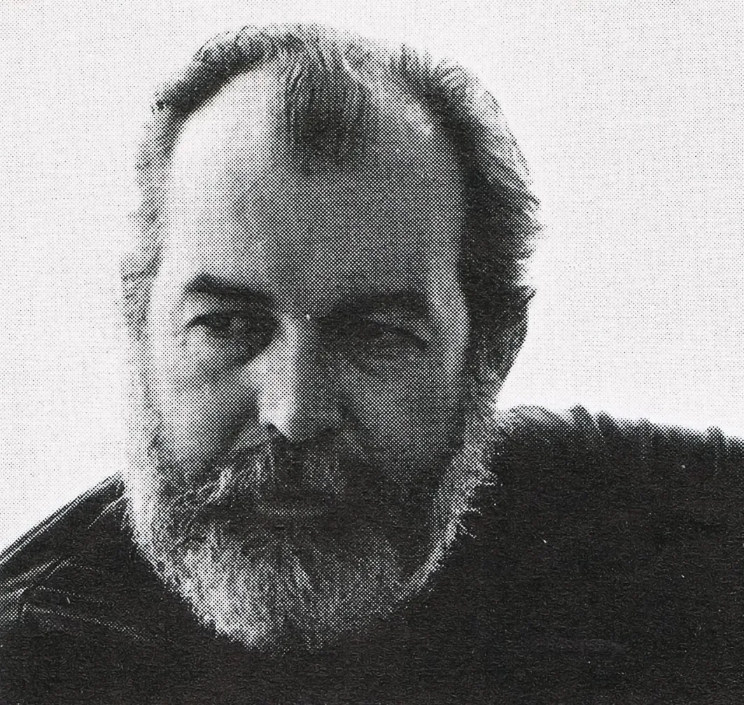
Rudolph de Harak

Hermann Scherchen conducts Trumpet Concerti Haydn / Vivaldi Handel / Torelli

Information

Rudolph de Harak designed over 50 record covers for Westminster Records as well as designing covers for Columbia, Oxford and Circle record labels. His bright, geometric graphics can easily be distinguished and recognised.

Details

Rudolph de Harak ran his own design studio in New York, where he worked across design disciplines including the design of  trademarks, posters, brochures, book, magazine and record covers, wall graphics, institutional advertising, industrial design, furniture and street decorations, sculptures, exhibitions; environmental graphics and signs.  He taught at many American institutes and also created the United States pavilion for Expo 70 in Osaka; the series «Man, his planet, his space» (Canada at Expo 67) and the entire decoration of the ground floor of an office skyscraper in New York (127, John Street), including the facade writings, external decorations, benches and steel sculptures.

Linked Information

Hermann Scherchen conducts Trumpet Concerti Haydn / Vivaldi Handel / Torelli designed by Rudolph de Harak

Hermann Scherchen conducts Trumpet Concerti Haydn / Vivaldi Handel / Torelli designed by Rudolph de Harak
Rudolph de Harak ran his own design studio in New York, where he worked across design disciplines including the design of  trademarks, posters, brochures, book, magazine and record covers, wall graphics, institutional advertising, industrial design, furniture and street decorations, sculptures, exhibitions; environmental graphics and signs.  He taught at many American institutes and also created the United States pavilion for Expo 70 in Osaka; the series «Man, his planet, his space» (Canada at Expo 67) and the entire decoration of the ground floor of an office skyscraper in New York (127, John Street), including the facade writings, external decorations, benches and steel sculptures.
More graphic design artefacts
From the design archive:
More graphic design history articles

Members Content

As a chemist, I have an obligation to be curious – I grab a stack of our chemical journals and start with the advertising section. I start it, the walk through the sand. I don’t want to deny some oases. But soon I’m bored and tired.
Gabriel sent me a link to his amazing Uruguayan Graphic Design Archive when I launched Design Reviewed. The content was so amazing, I ended up spending a good hour looking through the content and it has definitely made it to my bookmarks.

Members Content

The stamps for the 1970 editions were designed by Jan Slothouber and William Graatsma in collaboration with the Centre for Cubic Constructions (CCC) in Heerlen.  Every stamp displays a different corner point of the same block, highlighting eight distinct corner points, with four chosen for their unique identities.
My lectures and workshops also help bridge the gap between academia and industry. Through my lectures and collecting, I strive to promote design as a ever-changing dynamic industry that has the power to shape and improve the world we live in.