


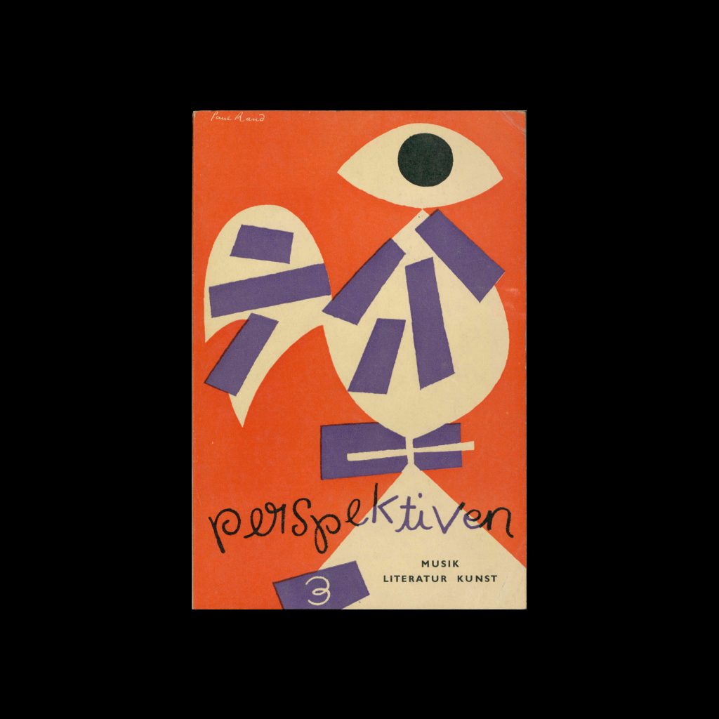
From the graphic design archive:

From the graphic design archive:

From the graphic design archive:

From the graphic design archive:

Members Only Content, Design Archive Feature, Designer Profiles
An article on Valentin Zietara , originally in German, published in Gebrauchsgraphik, 10, 1930, written by H K Frenzel translated by E. T. Scheffauer
Read Article
A new interpretation of the work of Bramante, suggesting an agenda for contemporary architectural practice.
Read Article
Design Archive Feature, Designer Profiles, Members Only Content, Regional Histories
Ryuichi Yamashiro (山城隆) was a Japanese graphic designer and artist, born in Osaka in 1920. He belonged to the same generation of pioneering Japanese designers as Kohei Sugiura, Kiyoshi Awazu, Yoshio Hayakawa, Yūsaku Kamekura, Kazumasa Nagai, and Ikko Tanaka.
Read Article