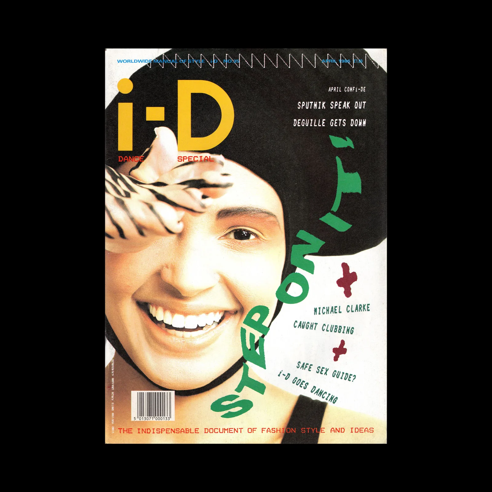
Idea 261, 1997-03

Special Feature: Trance Design –Analysis into 8 factors which evoke “trance” in the graphics. Trance Patterns / Hyper Texture / Colour Combination / Moving Image / Images of Illusion / Perspective / Continuation and Aggregation / Noise and Accumlations Planning and Arrangement: IDEA Editorial Staff
David Carson –Shift of Power / Devolution Text: Yoshifumi Fujii
Osamu Fukushima –The Messages from Deep Inside His Body and Soul Text: IDEA Editorial Staff
Yusaku Kamekura –The Course of Japanese Modern Design Interview with Yusaku Kamekura by IDEA Editorial Staff
Graphic Design in China ’96 Text: Keizo Matsui
Elements – Re・Elements Part 9 Keiji Ito → Hiroki Taniguchi
Tokyo Typodirectors Club ’97 Annual Award Text: Katsumi Asaba
A Tribute to the Memory of Paul Rand –The Footprints of Great Master in This Century Text: Yusaku Kamekura, Minoru Morita, John Maeda

Details

David Carson
David Carson is an American graphic designer and design director known for his experimental typographic work and distinct style. He worked as an art director for various magazines, including Self and Musician, Transworld Skateboarding, Beach Culture and Ray Gun. He now runs his design firm, David Carson Design, which has attracted clients such as Pepsi, Nike, American Airlines, Atlantic Records, Audi, Levi's, MTV, Nike, Pepsi and Ray Ban. Explore related designers including Neville Brody and Rudy VanderLans. See also Postmodernism and 1990s graphic design history.
IDEA (Japan)
Idea is a Japanese design magazine that has been published since 1953, covering typography, visual identity, and contemporary graphics.

Linked Information

Idea 261, 1997-03. Cover design by David Carson
More graphic design artefacts
More graphic design history articles
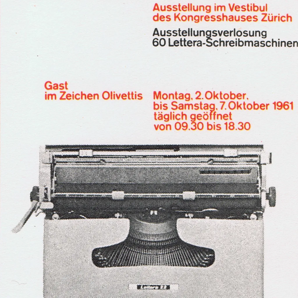
Swiss Posters from the 1961 Best Poster Award (Die besten Plakate des Jahres 1961)

Design Archive Feature, Members Only Content, Poster Design, Regional Histories

Swiss Posters from the 1961 Best Poster Award (Die besten Plakate des Jahres 1961)

As part of an ongoing series showcasing Swiss poster designs from the 1950s and 1960s, this article features 1961 poster entries of Die besten Plakate des Jahres (The Best Posters of the Year) 1961. Originating in 1941, Die besten Plakate des Jahres initially served as a platform for the evaluation and showcase of Swiss posters.

Read Article
Scanned Posters Designed by Michele Spera

Design Archive Feature, Designer Profiles, Members Only Content, Poster Design

Scanned Posters Designed by Michele Spera

Scanned posters by the great Michele Spera. Many use a strong use of geometric form, often paired with sans-serif typefaces like Helvetica. Their simplification of form and use of colour create timeliness, recognisable posters that would have stood out alongside the posters of the 1970s which tended to have a heavy use of photography.

Read Article
Ornament and Identity: German Commercial Graphics from the 1900s

Design Archive Feature, Members Only Content

Ornament and Identity: German Commercial Graphics from the 1900s

German printer's plates from the early 1900s revealing how commercial graphic design shifted from Jugendstil ornament to modern identity design.

Read Article