

From the graphic design archive:

From the graphic design archive:
From the graphic design archive:
From the graphic design archive:
Design Archive Feature, Designer Profiles, Magazines & Publishing, Members Only Content, Regional Histories
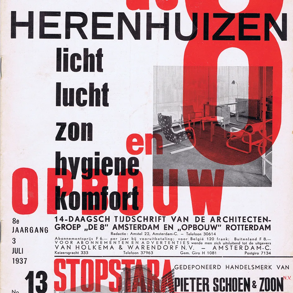
Throughout the 1920s and 1930s, Paul Schuitema emerged as one of the Dutch pioneers of new typography. This article features a selection of the cover designs and a few inner spreads from my collected issues of De 8 en Opbouw.
Read Article
Corporate Identity & Branding, Design Archive Feature, Designer Profiles, Members Only Content, Regional Histories
Crouwel was the successor to Willem Sandberg who used an avant-garde approach in his work, utilising torn-paper montage, mixing of sans serif and old Egyptian typefaces and often off-center positioning. Crouwel steered away from this artistic approach and implemented a cohesive design system and a strong identity that emulated the corporate identity boom of the 1950s and 60s.
Read Article
I have been reproached for this, and I will surely be reproached again. I have also been reproached for reading more and more obscure works whose readership must be limited to a handful of specialists and a few hobbyists like myself. It’s a heavy passion or a passion that sucks.
Read Article