Lance Wyman

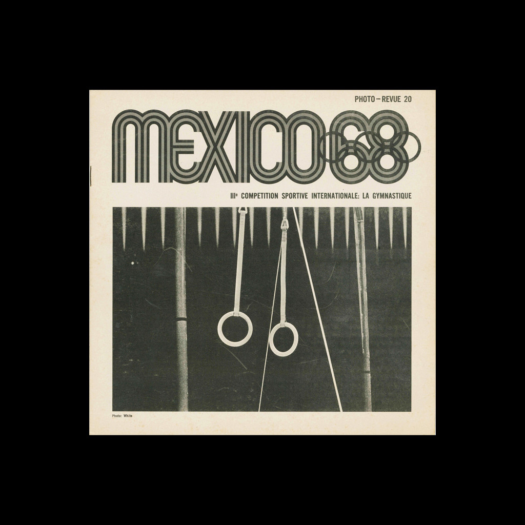
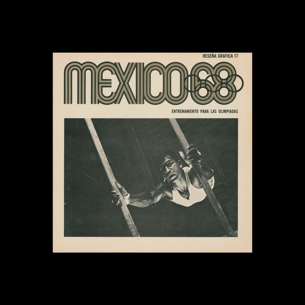
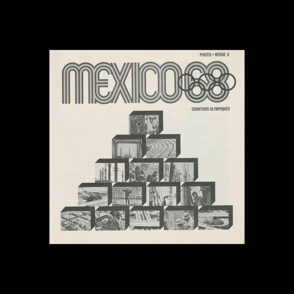
Mexico 1968, Photo – Revue 5, 1968

Le Stade Olympique De La Cite Universitaire

Details

  • Format Brochures and Guides
  • Designer/s Lance Wyman
  • Year 1968
  • Client/Publisher 1968 Summer Olympics
  • Size 222mm x 220mm
Lance Wyman
Lance Wyman was born in New Jersey in 1937 and studied industrial design at Pratt Institute. He came to international attention after winning the competition to design the visual identity for the 1968 Mexico City Olympic Games, developing a comprehensive system that drew on pre-Columbian and Huichol visual traditions alongside optical art influences. He also designed the signage system for the Mexico City Metro, creating pictogram-based station identities that allowed navigation without literacy. Returning to New York in the 1970s, he established Lance Wyman Ltd, working across urban signage and wayfinding for clients including the National Zoo in Washington DC and the city of Ottawa. He received the AIGA Medal in 2008. Explore related designers including Paul Rand and Otl Aicher. See also Rise of Corporate Identity and 1960s graphic design history.

Linked Information

Mexico 1968, Photo - Revue 5, 1968. Designed by Lance Wyman
Mexico 1968, Photo – Revue 5, 1968. Designed by Lance Wyman
More graphic design artefacts
More graphic design history articles
The IBM Poster Program: Visual Memoranda

Book Reviews & Press Releases, Corporate Identity & Branding

The IBM Poster Program: Visual Memoranda

In the late 1960s, IBM was one of the world’s pre-eminent corporations, employing over 250,000 people in 100 countries. While Paul Rand’s creative genius has been well documented, the work of the IBM staff designers who executed his intent outlined in the IBM Design Guide has often gone unnoticed.

Read Article
Victorian Graphic Design in Britain and America

Design Archive Feature, Magazines & Publishing, Members Only Content, Movements

Victorian Graphic Design in Britain and America

Victorian Graphic Design left a mark on both British and American design history. In Britain, the ornate embellishments served as a symbol of prosperity and cultural values. Meanwhile, America embraced the combination of various design elements to navigate the complexities of a rapidly changing society driven by industrialisation and consumerism.

Read Article
50 Examples of Czech Typography from 1908, Typografia

Design Archive Feature, Members Only Content, Regional Histories, Typography & Type Design

50 Examples of Czech Typography from 1908, Typografia

50 examples of Czech typography from Typografia Vol. XIX (1908). Czech commercial printing at the crossroads of Art Nouveau and early modernism, with work by Otokar Císař, Method Kaláb, and Mořic Novotný.

Read Article