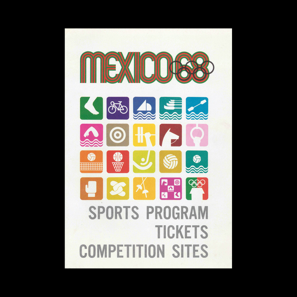
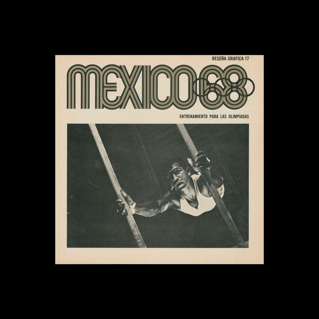
Lance Wyman

Mexico 1968, Photo – Revue 8, 1968

Chantiers Olympiques

Details

  • Format Brochures and Guides
  • Designer/s Lance Wyman
  • Year 1968
  • Client/Publisher 1968 Summer Olympics
  • Size 222mm x 220mm
Lance Wyman
Lance Wyman was born in New Jersey in 1937 and studied industrial design at Pratt Institute. He came to international attention after winning the competition to design the visual identity for the 1968 Mexico City Olympic Games, developing a comprehensive system that drew on pre-Columbian and Huichol visual traditions alongside optical art influences. He also designed the signage system for the Mexico City Metro, creating pictogram-based station identities that allowed navigation without literacy. Returning to New York in the 1970s, he established Lance Wyman Ltd, working across urban signage and wayfinding for clients including the National Zoo in Washington DC and the city of Ottawa. He received the AIGA Medal in 2008. Explore related designers including Paul Rand and Otl Aicher. See also Rise of Corporate Identity and 1960s graphic design history.

Linked Information

Mexico 1968, Photo - Revue 8, 1968. Designed by Lance Wyman
Mexico 1968, Photo – Revue 8, 1968. Designed by Lance Wyman
More graphic design artefacts
More graphic design history articles
Swiss Posters from the 1960 Best Poster Award (Die besten Plakate des Jahres 1960)

Design Archive Feature, Members Only Content, Poster Design, Regional Histories

Swiss Posters from the 1960 Best Poster Award (Die besten Plakate des Jahres 1960)

The 1960 awards presented 420 poster entries from Swiss designers. Notable winners included Robert Büchler's typographic poster for the Museum of Applied Arts Basel and J. Müller-Brockmann’s Der Film poster for the Museum of Applied Arts and Gerstner + Kutter's asymmetric typographic poster for National-Zeitung SA Basel.

Read Article
Pubblicità in Italia 1962-63. An Overview of Italian Advertising

Advertising Design, Members Only Content, Regional Histories

Pubblicità in Italia 1962-63. An Overview of Italian Advertising

Following on from my previous articles on post-war Italian publicity design, an additional annual from 1962-63 showcases more examples of Italian advertising.

Read Article
Jan Slothouber and William Graatsma’s Cubic Children’s Stamps of 1970.

Design Archive Feature, Members Only Content, Regional Histories

Jan Slothouber and William Graatsma’s Cubic Children’s Stamps of 1970.

The stamps for the 1970 editions were designed by Jan Slothouber and William Graatsma in collaboration with the Centre for Cubic Constructions (CCC) in Heerlen.  Every stamp displays a different corner point of the same block, highlighting eight distinct corner points, with four chosen for their unique identities.

Read Article