
Neue Werbung, Vol 17, No 03, March 1970

Contents:
DAHW
Noted for you
Advertising shapes consumer habits
With momentum into the third decade of our Republic
New books
What do you think about this question?
The political poster of the Soviet Union
Fashionable glamour offered with sophistication
Standardized design?
Level increased, yet still not sufficient
Best title of 1969
Interim report (student projects for the 3rd Central Performance Exhibition)
Models for paper machine construction
Design of standardized letterheads

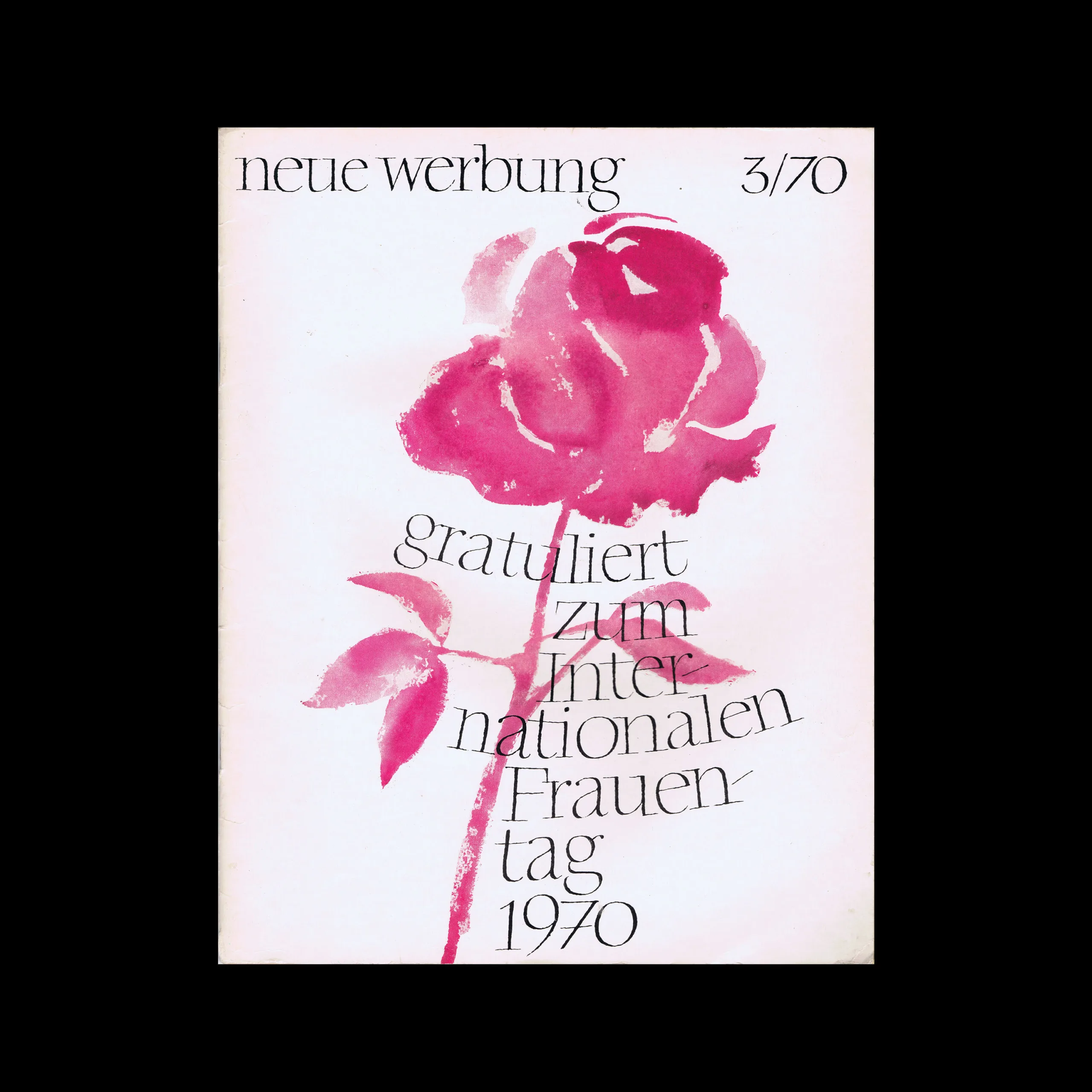
‘Cover design by Joachim Thamm, Leipzig, chose a watercolor style for this title, befitting the occasion of “International Women’s Day,” and together with the festive typographic solution, found a title composition that may seem unusual to the reader of “neue werbung,” but no less graphically appealing.’

Details

Joachim Thamm
Neue Werbung
Neue Werbung was an East German advertising trade journal published in Berlin from the 1950s, covering the theory and practice of socialist advertising design.

Linked Information

Neue Werbung, Vol 17, No 03, March 1970. Cover design by Joachim Thamm
More graphic design artefacts
More graphic design history articles
Advertising in Your Pocket. Matchbox Labels

Advertising Design, Design Archive Feature, Ephemera, Members Only Content

Advertising in Your Pocket. Matchbox Labels

A collection of matchbox labels from around the world. Graphic design history of one of advertising's smallest and most overlooked formats.

Read Article
Hans Geipel’s Brochure Designs for Süddeutsche Rundfunk (SDR)

Advertising Design, Design Archive Feature, Members Only Content

Hans Geipel’s Brochure Designs for Süddeutsche Rundfunk (SDR)

A collection of letterpresses German brochures from 1959/1960 designed by Hans Geipel for Süddeutsche Rundfunk (SDR), the South German Radio Network based in Stuttgart.

Read Article
Wim Crouwel and the Stedelijk Museum

Corporate Identity & Branding, Design Archive Feature, Designer Profiles, Members Only Content, Regional Histories

Wim Crouwel and the Stedelijk Museum

Crouwel was the successor to Willem Sandberg who used an avant-garde approach in his work, utilising torn-paper montage, mixing of sans serif and old Egyptian typefaces and often off-center positioning. Crouwel steered away from this artistic approach and implemented a cohesive design system and a strong identity that emulated the corporate identity boom of the 1950s and 60s.

Read Article