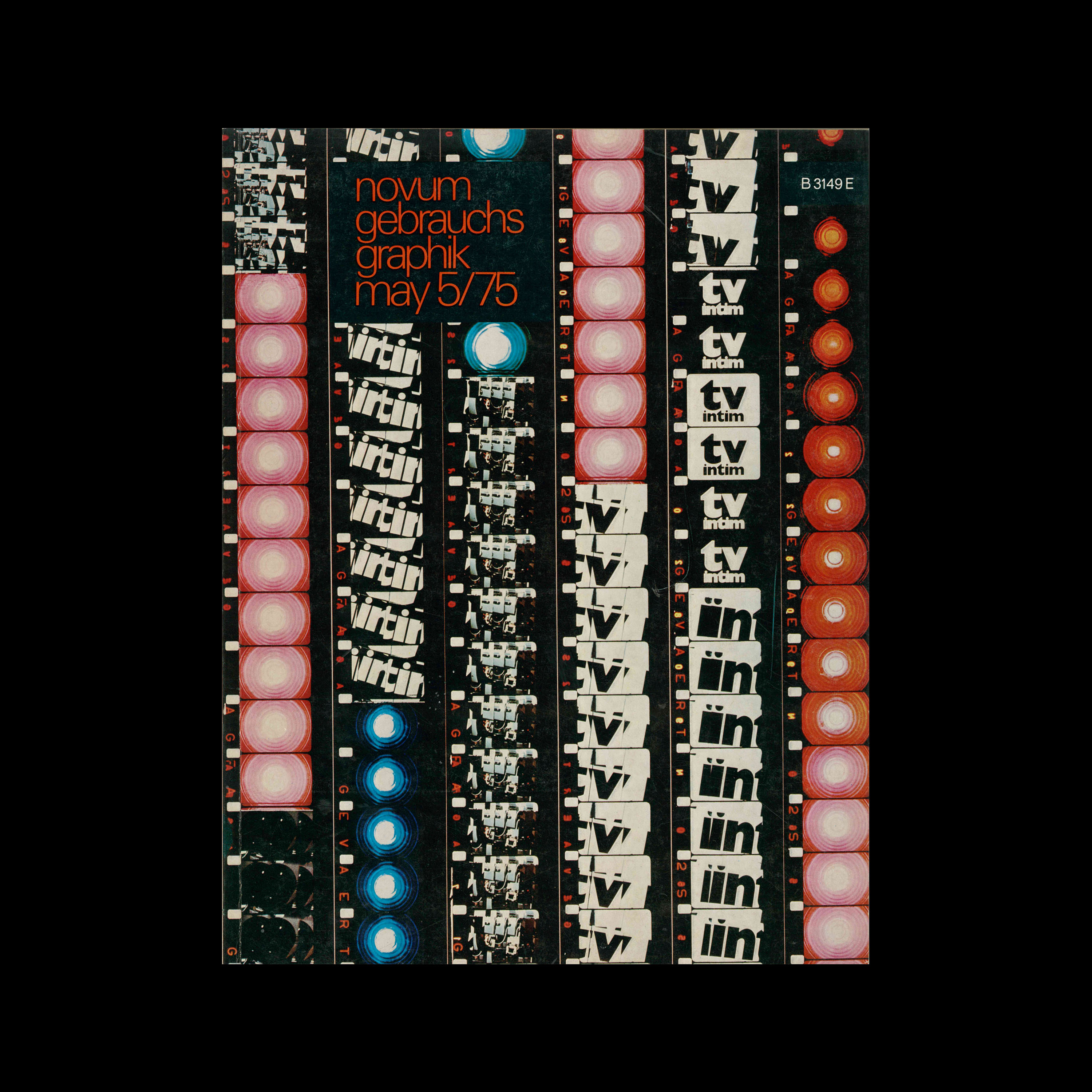



Frieder Grindler

Novum Gebrauchsgraphik, 5, 1975

Content includes:
John Halas – Graphics in motion II, television graphics today
Hans Wichmann – Mendell & Oberer, stereometric sculptures form exemplary accents in a new town
Christof Michaels – Helmut Langer, Marina Langer-Rosa, individual design for institutions and enterprises
Alexandre Alexandre – Franciszek Starowieyski, film posters
Liselotte Hansmann – Jazz Power, an advertising campaign of the ’Deutsche Grammophon Gesellschaft’
Remigius Netzer – ’Der Schöne Grosse Alexandre’,a picture-book by Erhard Göttlicher

Details

  • Format Magazine / Periodical / Journal
  • Designer/s Frieder Grindler + Dieter Zimmermann
  • Year 1975
  • Client/Publisher Verlag F. Bruckmann KG
  • Size 230mm x 297mm
Frieder Grindler + Dieter Zimmermann
Gebrauchsgraphik, Novum Gebrauchsgraphik
A German design magazine published from 1924 onwards, devoted to commercial art and advertising design.

Linked Information

Novum Gebrauchsgraphik, 5, 1975. Cover design by Frieder Grindler + Dieter Zimmermann
More graphic design artefacts
More graphic design history articles
The Year 1900 – An Overview of Graphic Design History

Design Archive Feature, Members Only Content

The Year 1900 – An Overview of Graphic Design History

An overview of graphic design in 1900, exploring Art Nouveau, the Eckmann-Schrift typeface, the Steglitz Workshop, the Doves Press and more, illustrated with artefacts from the Design Reviewed archive.

Read Article
Why Graphic Culture Matters by Rick Poynor

Book Reviews & Press Releases

Why Graphic Culture Matters by Rick Poynor

Why Graphic Culture Matters is a compilation of 46 thought-provoking essays by renowned design critic Rick Poynor, delving into the realms of art, design, and visual communication.

Read Article
Student work from the 1964 Class of Typography, at Pratt Institute, New York

Design Archive Feature, Design Education, Members Only Content, Regional Histories, Typography & Type Design

Student work from the 1964 Class of Typography, at Pratt Institute, New York

The August 1964 issue highlights the Typography class at the Pratt Institute in New York, a relatively new course at the time. Pratt, one of the most renowned art schools in the United States, had departments for graphic design, painting, art education, industrial design, and applied graphics in the 1960s. The typography course combined theoretical lectures with practical workshops, aimed at students beginning their journey into the discipline.

Read Article