


From the graphic design archive:

From the graphic design archive:

From the graphic design archive:

From the graphic design archive:

Design Archive Feature, Design Education, Members Only Content, Regional Histories, Typography & Type Design
The August 1964 issue highlights the Typography class at the Pratt Institute in New York, a relatively new course at the time. Pratt, one of the most renowned art schools in the United States, had departments for graphic design, painting, art education, industrial design, and applied graphics in the 1960s. The typography course combined theoretical lectures with practical workshops, aimed at students beginning their journey into the discipline.
Read Article
Design Archive Feature, Designer Profiles, Members Only Content
Bob Salpeter was trained by Paul Rand at IBM and educated in New York, at the School of Visual Arts and the School of Industrial Art. Salpeter went on to build an extensive and impressive career working with clients such as the American Museum of Natural History, the World Golf Hall of Fame, the American Cancer Society, Scott Printing and IBM.
Read Article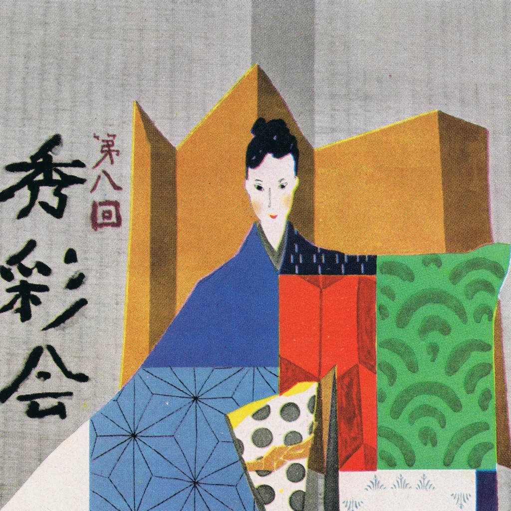
Design Archive Feature, Designer Profiles, Members Only Content, Regional Histories
Yoshio Hayakawa was born in Osaka, Japan, in 1917 and became a leading designer and artist in postwar Japan. His work was a harmonisation of traditional Japanese art with Western art.
Read Article