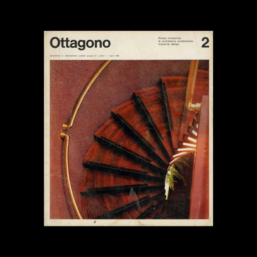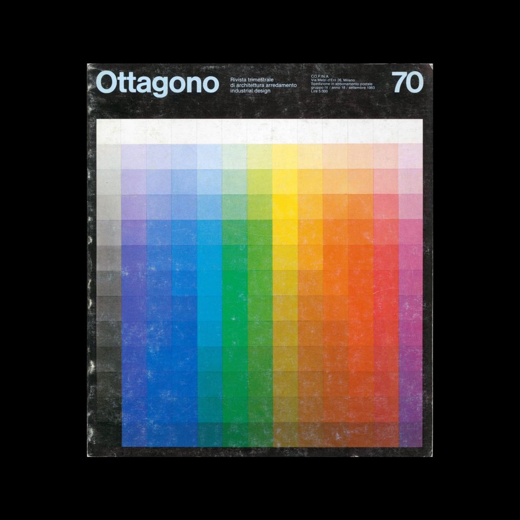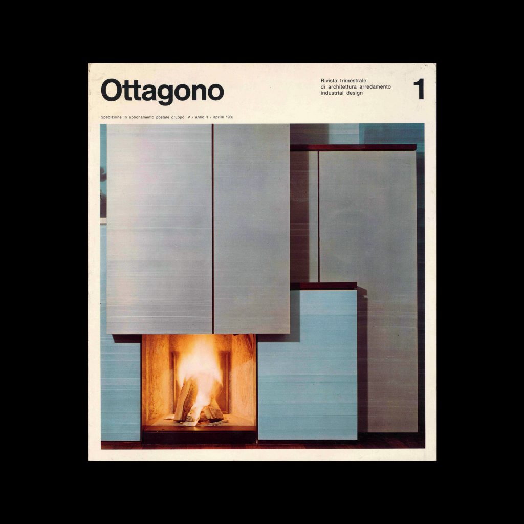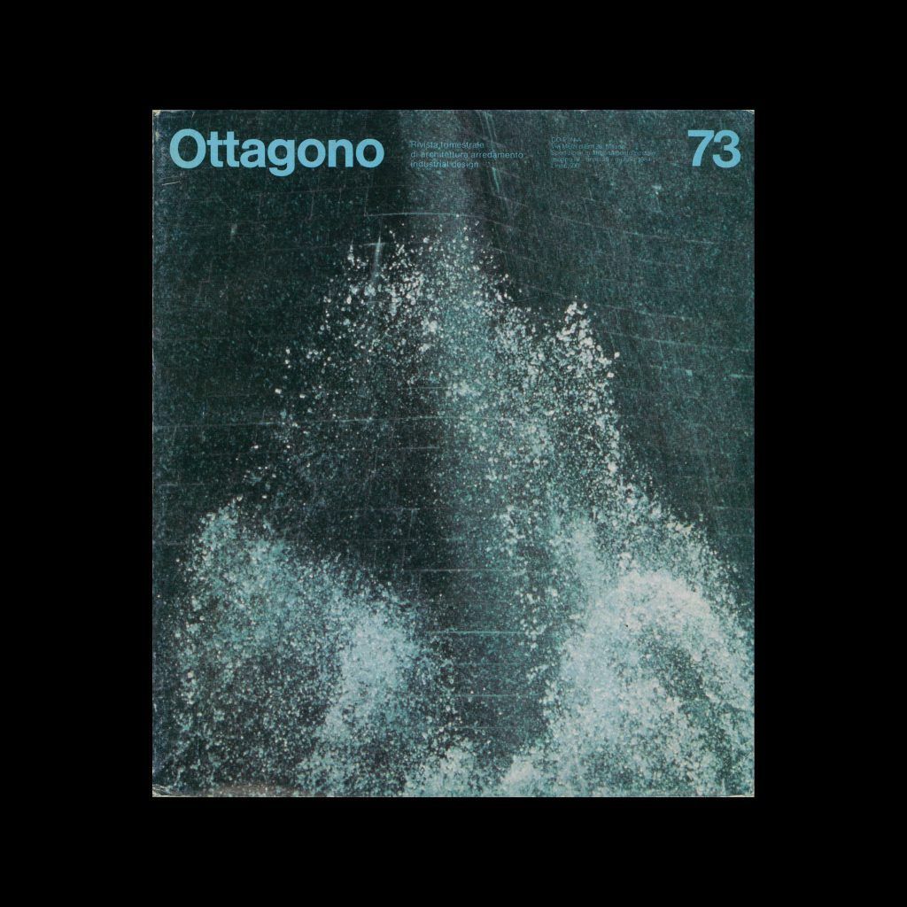
Ottagono 27, 1972

Content includes:
Guido Ballo – Sculptures in the street
Silvio Coppola – New environments within old walls
Luigi Massoni – This is future but human wooden house
Dario Caimi and Franco Asnaghi – Apartment in the hills, Offices open with standard furnishings
Giorgio Parodi – Representative areas in the offices of a industry
Paolo Crescini – Conference room
Cini Boeri – White and gray for an exhibition renewed
Studio S.M.C. – American bar
Pier Carlo Santini – Young architecture studios in Florence
Renato Bazzoni – Architecture cards, When tourism comes in a quiet southern country (and elsewhere)
Grazia Gamberoni – Books and magazines
Bruno Munari – Compasso d’Oro to Ignoti, News and design innovations
Gianfranco Frattini – Modular and modular
Vittorio Mazzucconi – Positiv
Rolf Heide – A system for the living room
Achille Castiglioni – A lamp: inside or outside
Vico Magistretti – Multi-position light
Pier Luigi Spadolini – Modular with two elements
Marco Zanuso – For lunch

Direction: Sergio Mazza
Editing: Giuliana Gramigna
Collaboration: Grazia Gamberoni
Graphics: Unimark
Photographs: Abbrescia, Anghinelli, Ballo, Basil, Bazzoni, Bucker, Carrieri, Casali, Cattaneo, Colombo, Masera, Mulas, Professional Photo, Salvati, Vercelloni, Zabban.
CO.P.IN.A. s.r.l.

Details

Unimark
Unimark International was founded by Massimo Vignelli and Ralph Eckerstrom in 1965. It was a pioneering design firm known for its modernist approach and emphasis on corporate identity. The firm design identities for American Airlines and the New York City Subway signage system, before dissolving in the late 1970s. Explore related designers including Massimo Vignelli and Bob Noorda. See also Rise of Corporate Identity and 1960s graphic design history.
Ottagono
Ottagono was an Italian design magazine mainly focused on interiors, architecture and product design, with some content also related to graphic design.

Linked Information

Ottagono 27, 1972. Designed by Unimark
More graphic design artefacts
More graphic design history articles
Student work from the 1964 Class of Typography, at Pratt Institute, New York

Design Archive Feature, Design Education, Members Only Content, Regional Histories, Typography & Type Design

Student work from the 1964 Class of Typography, at Pratt Institute, New York

The August 1964 issue highlights the Typography class at the Pratt Institute in New York, a relatively new course at the time. Pratt, one of the most renowned art schools in the United States, had departments for graphic design, painting, art education, industrial design, and applied graphics in the 1960s. The typography course combined theoretical lectures with practical workshops, aimed at students beginning their journey into the discipline.

Read Article
Flexible Visual Systems By Dr. Martin Lorenz

Book Reviews & Press Releases

Flexible Visual Systems By Dr. Martin Lorenz

Flexible Visual Systems is the design manual for contemporary visual identities. It teaches you a variety of approaches on how to design flexible systems, adjustable to any aesthetic or project in need of an identifiable visual language.

Read Article
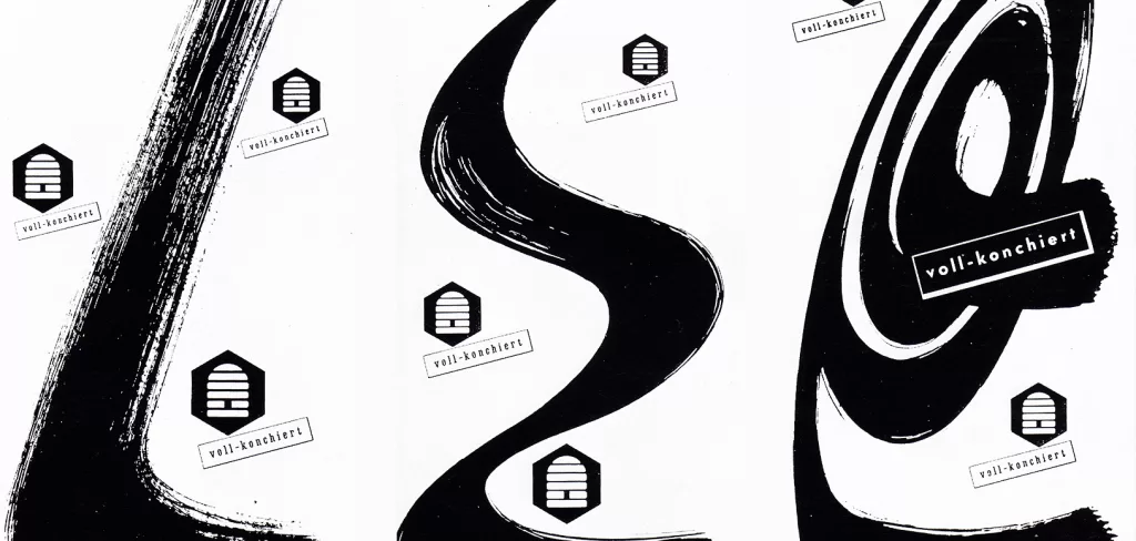
Sprengel, a Comparison of Advertisements from the 1950s

Advertising Design, Design Archive Feature, Members Only Content

Sprengel, a Comparison of Advertisements from the 1950s

When perusing vintage publications, I often stumble upon forgotten or undocumented gems. In this article, I compare two remarkable advertisements designed for Sprengel Ltd byHerbert Zumpe and Karl Otto Goetz

Read Article