




From the graphic design archive:
From the graphic design archive:

Design Archive Feature, Members Only Content, Poster Design, Regional Histories, Studios & Collectives
A total of 24 posters were created for the campaign during 1964, using the arrow symbol as a key features, representing power, motion and speed. The handmade lithographs use up to 19 colours, which were individually printed at large scale. The posters also utilise the brand colours red and yellow from Shells corporate identity.
Read Article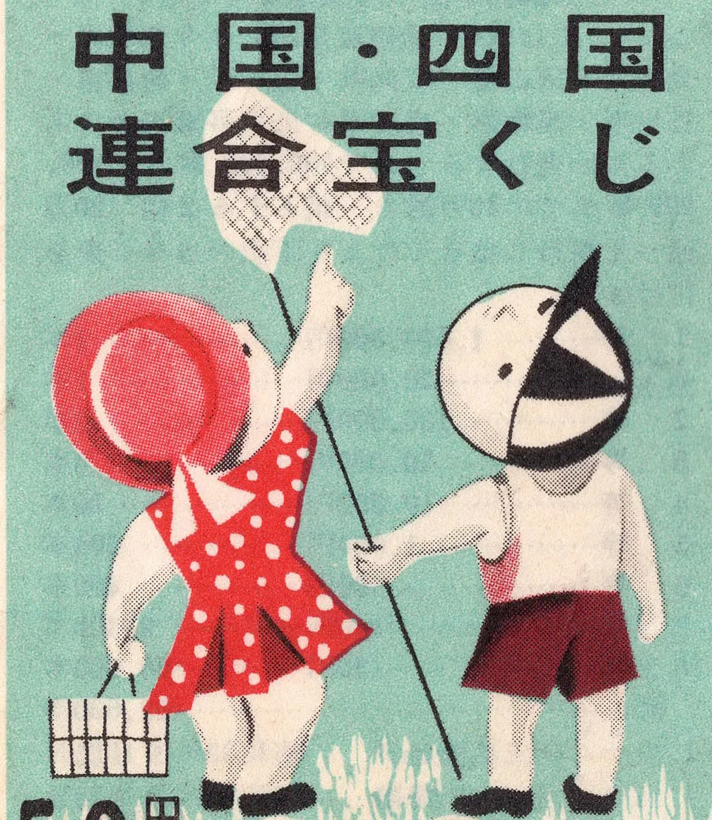
Regional Histories, Ephemera, Illustration, Members Only Content
A continuation of my last article: 50 tickets from Japan spanning nearly 50 years (1956–2004). This time it's another 50, spanning 50 years, 1956–2006.
Read Article
Advertising Design, Design Archive Feature
The transformation of Radio Free Berlin's publicity from dark and provincial to striking and imaginative. Cultural announcements and radio programs designed by Hans Förtsch, Sigrid von Baumgarten, and Reinhart Braun
Read Article