


From the graphic design archive:
From the graphic design archive:

From the graphic design archive:
From the graphic design archive:

Design Archive Feature, Ephemera, Members Only Content
I have a real passion for collecting Cinderella stamps and other ephemera and love the artistic and historical value of these items. The scarcity of some Cinderella stamps, especially those associated with significant historical events or rare advertising campaigns, makes them highly sought after in the philatelic world.
Read Article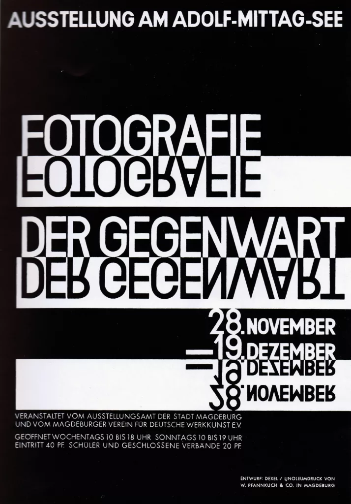
Design Archive Feature, Movements, Poster Design, Typography & Type Design
In minor printed matter we constantly meet the new typography, but it is relatively rare to find posters designed on the new lines. And yet poster-designing is a field where new typographical methods might be employed with great effect.
Read Article
Advertising Design, Design Archive Feature, Members Only Content, Studios & Collectives
The advertising has a certain contrast of hand-drawn and mechanical. Produced entirely in black, it reminds us that the absence of colour can be highly effective. Hans Michel and Günther Kieser's illustrations bring a sense of both playfulness and a stylistic approach to a corporate client.
Read Article