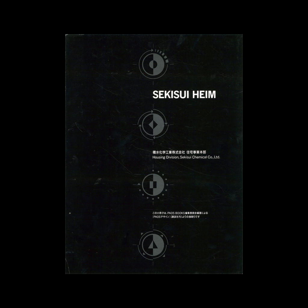
Rehouse – PAOS Design, [The World of Corporate Beauty], CI Design, (23 Book Set), 1989

Part of a 23 Book Set including books on:
① Mazda
② Daiei
③ Sekisui Heim
④ Koiwai Dairy Products
⑤ Asics
⑥ Matsuya
⑦ Mitsui’s Rehouse
⑧ Kenwood
⑨ Bridgestone
⑩ Kirin Beer
⑪ Tokio Marine
⑫ NTT
⑬ INAX
⑭ Toray
⑮ Yamato
⑯ Setagaya Shinkin Bank
⑰ Zojirushi
⑱ Sumitomo Bank
⑲ Nippon Life Insurance
⑳ Symbolic design message
㉑ Design system control
㉒ Key item kaleidoscope
㉓ PAOS design for PAOS

Details

  • Format Book
  • Designer/s PAOS
  • Year 1989
  • Client/Publisher PAOS BOOKS
  • Size 235mm x 315mm
PAOS
PAOS (Progressive Artists Open System) are a Japanese design studio. Motoo Nakanishi founded them and they became recognised as on of Japan's leading agencies specialising in corporate identity (CI) design and consulting. Their work was philosophy-driven and centred around flexible identity systems and solutions. The studio's most recognised design projects include the Visual Identity Systems of Asics, Mazda, Kenwood, Bridgestone and Kirin Beer. Explore related designers working in Japanese corporate identity. See also Rise of Corporate Identity and Japanese graphic design history.

Linked Information

Rehouse - PAOS Design, [The World of Corporate Beauty], CI Design, (23 Book Set), 1989
Rehouse – PAOS Design, [The World of Corporate Beauty], CI Design, (23 Book Set), 1989
More graphic design artefacts
More graphic design history articles
The Mid Century Graphic Design of IBM

Corporate Identity & Branding, Design Archive Feature, Members Only Content, Regional Histories

The Mid Century Graphic Design of IBM

Many designers played an important role in IBM's graphic identity and implementation including Arthur Boden, Clarence Lee, Charles Keddie and Mary Beresford.

Read Article
Yusaku Kamekura and his Design for Nikon

Design Archive Feature, Advertising Design, Designer Profiles, Members Only Content, Regional Histories

Yusaku Kamekura and his Design for Nikon

Nikon commissioned Yusaku Kamekura to design numerous posters, packaging designs and advertisements for Nikon. He used abstract forms, an impactful use of colours, along with his skilful reduction of messaging.

Read Article
The 1950s and 1960s Advertisements of Kast + Ehinger (K+E)

Advertising Design, Design Archive Feature, Members Only Content

The 1950s and 1960s Advertisements of Kast + Ehinger (K+E)

As part of their marketing strategy, Kast + Ehinger, commissioned a selection of German designers to produce advertisements aimed at the design industry. I have scanned in quite a lot of their advertising matter, all of which were back-page advertisements from three German design magazines. Der Druckspiegel, Gebrauchsgraphik and Graphik – Werbung + Formgebung.

Read Article