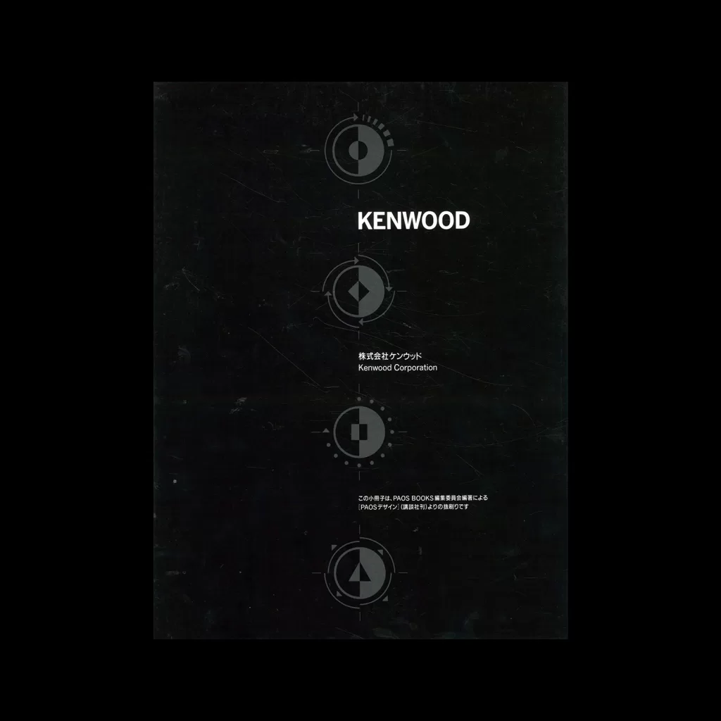
Sekisui Helm – PAOS Design, [The World of Corporate Beauty], CI Design, (23 Book Set), 1989

Part of a 23 Book Set including books on:
① Mazda
② Daiei
③ Sekisui Heim
④ Koiwai Dairy Products
⑤ Asics
⑥ Matsuya
⑦ Mitsui’s Rehouse
⑧ Kenwood
⑨ Bridgestone
⑩ Kirin Beer
⑪ Tokio Marine
⑫ NTT
⑬ INAX
⑭ Toray
⑮ Yamato
⑯ Setagaya Shinkin Bank
⑰ Zojirushi
⑱ Sumitomo Bank
⑲ Nippon Life Insurance
⑳ Symbolic design message
㉑ Design system control
㉒ Key item kaleidoscope
㉓ PAOS design for PAOS

Details

  • Format Book
  • Designer/s PAOS
  • Year 1989
  • Client/Publisher PAOS BOOKS
  • Size 235mm x 315mm
PAOS
PAOS (Progressive Artists Open System) are a Japanese design studio. Motoo Nakanishi founded them and they became recognised as on of Japan's leading agencies specialising in corporate identity (CI) design and consulting. Their work was philosophy-driven and centred around flexible identity systems and solutions. The studio's most recognised design projects include the Visual Identity Systems of Asics, Mazda, Kenwood, Bridgestone and Kirin Beer. Explore related designers working in Japanese corporate identity. See also Rise of Corporate Identity and Japanese graphic design history.

Linked Information

Sekisui Helm - PAOS Design, [The World of Corporate Beauty], CI Design, (23 Book Set), 1989
Sekisui Helm – PAOS Design, [The World of Corporate Beauty], CI Design, (23 Book Set), 1989
More graphic design artefacts
More graphic design history articles
Illustrating Science. Erwin Poell and naturwissenschaft+technik Magazine

Design Archive Feature, Illustration, Magazines & Publishing, Members Only Content

Illustrating Science. Erwin Poell and naturwissenschaft+technik Magazine

Last year (2024), I came across a selection of his design work for n+m: Naturwissenschaft und Medizin (Natural Science and Medicine) magazine. Erwin Poell's work for n+m magazine, which was published between 1964 and 1971 by C.F. Boehringer & Söhne, is a fantastic example of engaging and accessible data visualisation.

Read Article
Advertising Pharmaceuticals, A Comparison of German and American Advertising in 1950

Advertising Design, Design Archive Feature, Members Only Content, Regional Histories

Advertising Pharmaceuticals, A Comparison of German and American Advertising in 1950

As a chemist, I have an obligation to be curious – I grab a stack of our chemical journals and start with the advertising section. I start it, the walk through the sand. I don’t want to deny some oases. But soon I’m bored and tired.

Read Article
Erberto Carboni and his work for Radio Italiana, 1940s and 1950s

Advertising Design, Design Archive Feature, Members Only Content, Regional Histories

Erberto Carboni and his work for Radio Italiana, 1940s and 1950s

These one-colour forms have a playful but structured aesthetic through their geometric forms, they remind me of the abstract line drawings of Picasso blended with Jan Tschichold and the New Typography.

Read Article