

Advertising Design, Design Archive Feature, Ephemera, Members Only Content
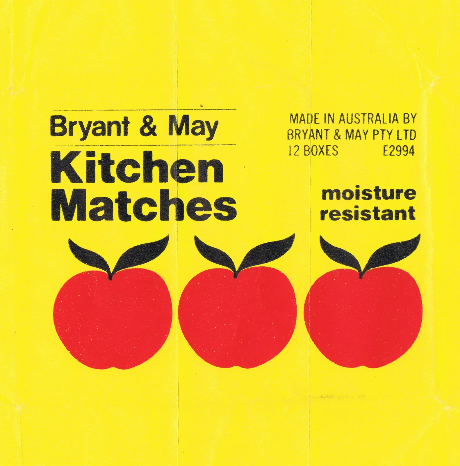
A collection of matchbox labels from around the world. Graphic design history of one of advertising's smallest and most overlooked formats.
Read Article
Design Archive Feature, Ephemera, Members Only Content, Regional Histories
The designer is unstated on these postcards, which were designed during the mid to late 1970s, but these playful illustrations alongside what looks to be Frankfurter Bold definitely fit the criteria of friendliness and efficiency
Read Article
Design Archive Feature, Design Education, Members Only Content, Regional Histories, Typography & Type Design
The August 1964 issue highlights the Typography class at the Pratt Institute in New York, a relatively new course at the time. Pratt, one of the most renowned art schools in the United States, had departments for graphic design, painting, art education, industrial design, and applied graphics in the 1960s. The typography course combined theoretical lectures with practical workshops, aimed at students beginning their journey into the discipline.
Read Article