
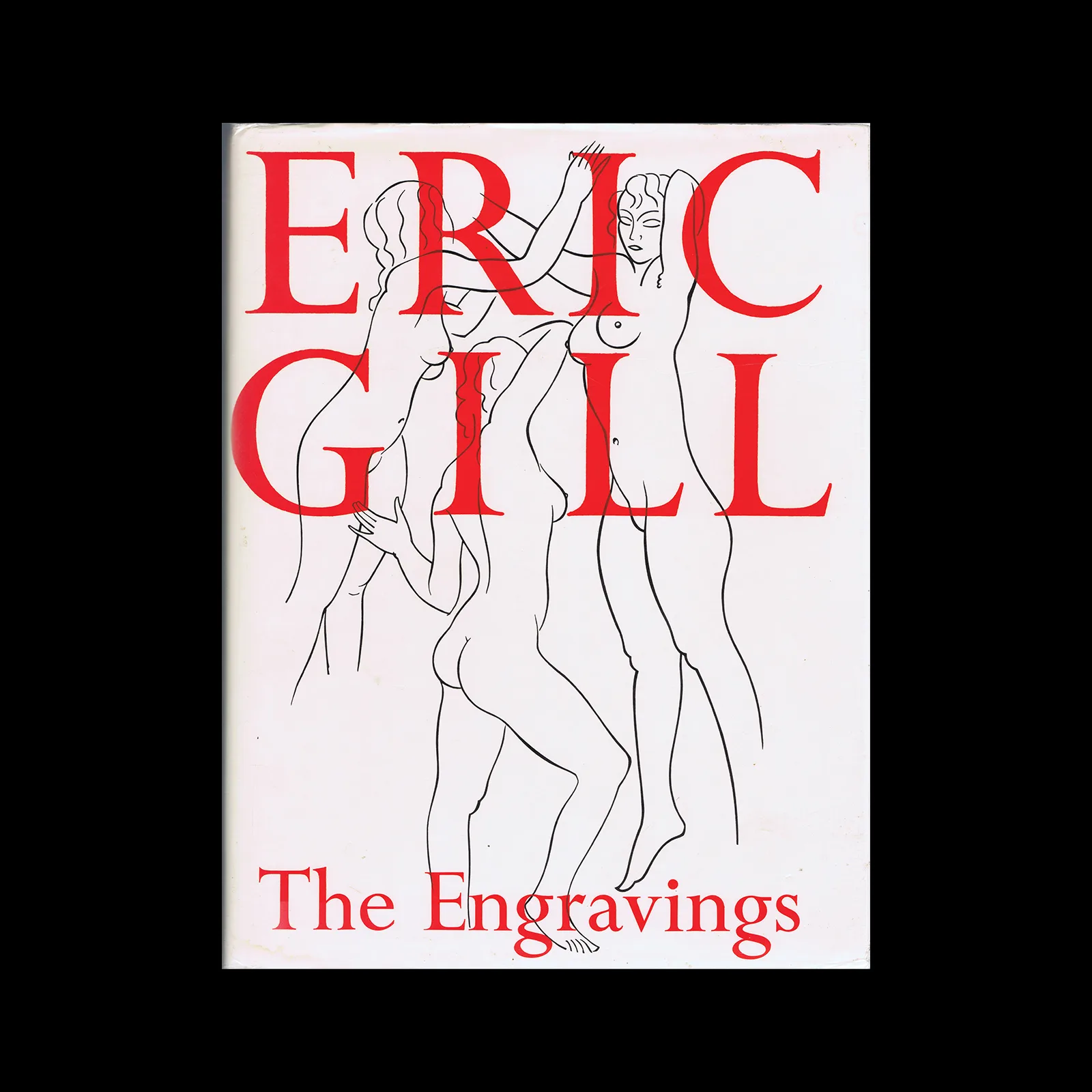
The Letter Forms and Type Designs of Eric Gill, Eva Svensson, 1976

(Preface) Although Eric Gill’s greater fame derived mainly from his sculpture, he was also the foremost inscriptional letter- cutter of his time. Under the aegis, first, of Robert Gibbings of the Golden Cockerel Press, and, later, of Stanley Morison of the Monotype Corporation, these lettering interests led to his work being commissioned for the design of types for printers and publishers. Two of these types – Gill Sans and Perpetua – became internationally renowned and are still extensively used. Yet two of his lesser-known type designs, those for Felicity and Joanna Italic, can offer serious claims to be considered as two of the most beautiful printing types available to twentieth-century printers. Robert Harling traces the story of Gill’s career – from his early days as a cutter of tombstones and memorials to his emergence as a type designer. Many examples of Gill’s lettering for inscriptions and for printing are reproduced in these pages, including two folding insets : one, in colour, shows inscriptional lettering typical of Gill’s earlier work as a letter-cutter, the other reproduces, in facsimile, Gill’s original designs for Joanna roman and italic.

Details

  • Format Book
  • Designer/s Eric Gill
  • Year 1976
  • Client/Publisher Eva Svensson
  • Size 190mm x 185mm
Eric Gill
Eric Gill (1882–1940) was a British sculptor, typographer, and printmaker. He designed typefaces including Gill Sans and Perpetua and worked on many early modern designs. Explore related designers including William Morris and Edward Johnston. See also Arts and Crafts and British graphic design history.

Linked Information

The Letter Forms and Type Designs of Eric Gill, Eva Svensson, 1976
More graphic design artefacts
More graphic design history articles
Bols. Advertising Matter from 1958 to 1961 by Engelmann, Mendell and Oberer

Advertising Design, Design Archive Feature, Members Only Content, Studios & Collectives

Bols. Advertising Matter from 1958 to 1961 by Engelmann, Mendell and Oberer

In the late 1950s, Hans W. Brose agency, with designers Pierre Mendell, Michael Engelmann, and Klaus Oberer, crafted a compelling, colourless campaign for Bols.

Read Article
Gottschalk + Ash by Bill Bantey, 1970

Corporate Identity & Branding, Design Archive Feature, Regional Histories, Studios & Collectives

Gottschalk + Ash by Bill Bantey, 1970

When Fritz Gottschalk and Stuart Ash joined forces in Montreal, it was a partnership ideally suited to the city's hybrid environment. Gottschalk's training in graphic design in Switzerland, Paris and London was rigid, his background European; Ash, Canadian born and educated, was trained in the North American fashion, though he was influenced by his work with European designers

Read Article
A Brand Evolution for KLM by Henrion Design Associates

Corporate Identity & Branding, Design Archive Feature, Members Only Content, Regional Histories

A Brand Evolution for KLM by Henrion Design Associates

KLM's brand evolution by Henrion Design Associates. Founded in 1919, KLM is the world's oldest operating airline. In 1961, Henrion Design Associates redesigned the iconic brand, overcoming challenges of standardisation and outdated aesthetics.

Read Article