Jan Tschichold

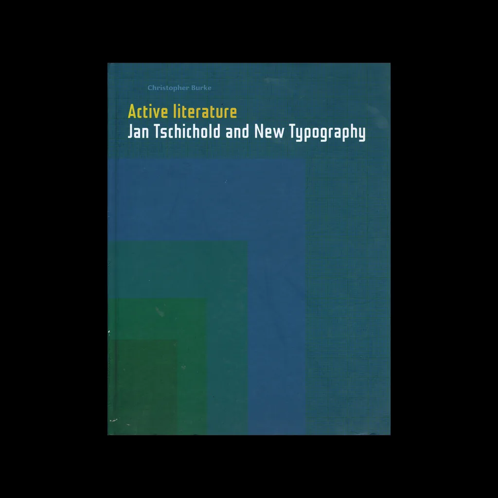
The New Typography, University of California Press, 1995

‘Since its initial publication in Berlin in 1928, Jan Tschichold’s “The New Typography” has been recognized as the definitive treatise on book and graphic design in the machine age. At once a key theoretical document of Central European modernism between the world wars and an invaluable source of working principles for the practicing designer, this classic work enjoys the reputation among book artists that Le Corbusier’s “Toward a New Architecture” has long held among architects. The book’s legendary renown is certain to increase with the long-overdue appearance of this first English translation, published in a form that reflects Tschichold’s original typography and design. Ranging from theoretical discussions of typography in the age of photography and mechanical standardization to practical considerations in the design of business forms, “The New Typography” remains essential reading for designers, art historians, and all those concerned with the evolution of visual communication in the twentieth century.’

Details

  • Format Book
  • Designer/s Jan Tschichold
  • Year 1995
  • Client/Publisher University of California Press
  • Size 135mm x 209mm
Jan Tschichold
Jan Tschichold was a German typographer, writer, and book designer born in Leipzig in 1902. He believed that design should emulate the dynamism and movement of modern life and held to the idea that design was a force for social change as well as a medium of aesthetic innovation. Tschichold was influenced by developments in avant-garde circles, in particular the constructivist style from Soviet Russia and the Netherlands. One of his mayor clients was Penguin Books, of whom he redesigned 500 paperback titles. Explore the Design Reviewed archive to discover artefacts that reflect the principles Jan Tschichold championed throughout his career. Browse the Swiss Modernism collection to see the typographic rigour he helped define, or explore the New Typography movement he named and theorised. The 1920s and 1930s decade pages capture the era in which his most radical ideas took shape, while the Germany and Switzerland collections reflect the two countries most central to his working life.

Linked Information

The New Typography, University of California Press, 1995
More graphic design artefacts
More graphic design history articles
Penrose 1964-73 – The Herbert Spencer Years

Book Reviews & Press Releases, Magazines & Publishing

Penrose 1964-73 – The Herbert Spencer Years

As a champion of graphic design history, I was thrilled to find the upcoming book "Penrose 1964-73: The Herbert Spencer Years," a captivating visual anthology dedicated to honouring Spencer's legacy as a trailblazer in modern typography. Spanning 288 pages, this book commemorates Spencer's influential editorship at the Penrose Annual from 1964 to 1973.

Read Article
Advertising that Sticks. Examples of 1950s Chewing Gum Advertising

Design Archive Feature, Advertising Design, Members Only Content

Advertising that Sticks. Examples of 1950s Chewing Gum Advertising

Advances in production and 1950s chewing gum marketing. From Wrigley's iconic "Spearman" ads to Hiroshi Ohchi's designs for Harris Chewing Gum.

Read Article
Max Huber

Designer Profiles, Members Only Content

Max Huber

Max Huber worked across advertising, packaging, design and industrial design. He had a distinctive style that skillfully blended bright hues with photomontage.

Read Article