

The Ten Commandments of Typography / Type Heresy: Breaking the Ten Commandments of Typography, Merrell Publishers, 2006

‘A humorous and incisive analysis of the basic tenets of typography and how to turn them on their heads, this book will appeal to the conformist and the non-conformist in everyone – not just the newcomer to design. One side of this sharp-witted, cleverly designed guide presents the ten main rules, or ‘commandments’, of type design, addressing such aspects of typographic doctrine as legibility, alignment and capitalization; the other shows how type can successfully subvert these rules, presenting ’sacrilegious’ visual alternatives. In support of the commandments Felton includes a list of twelve ‘disciples’, those internationally renowned graphic designers whom he identifies as abiding by the rules, including such figures as Eric Gill, Jan Tschichold and Erik Spiekermann. Confronting these are his ‘fallen angels’, which include such experimental typographers as David Carson, Jeffery Keedy, Phil Baines and Jonathan Barnbrook.’

Details

  • Format Book
  • Year 2006
  • Client/Publisher Merrell Publishers
  • Size 140mm x 215mm

Linked Information

The Ten Commandments of Typography / Type Heresy: Breaking the Ten Commandments of Typography, Merrell Publishers, 2006
More graphic design artefacts
More graphic design history articles
Collecting Graphic Design History and Design Reviewed

Design Archive Feature, Ephemera

Collecting Graphic Design History and Design Reviewed

Graphic design continues to be documented and an increase in individualised documentation and curated social media accounts are furthering our knowledge of design from a worldwide historic standpoint. I would not feel complete without the collected design that spans the shelves of my archive. It’s my identity, my passion and my hobby.

Read Article
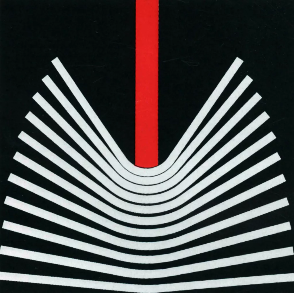
Abstract Publicity – Self-Advertisements of the Stuttgarter Nachrichten by Fritz Seitz, 1963

Advertising Design, Design Archive Feature, Members Only Content

Abstract Publicity – Self-Advertisements of the Stuttgarter Nachrichten by Fritz Seitz, 1963

The graphic designer had to create a series of ads whose new publicity effects were to confirm or accentuate the already existing • image • of the paper. In this case, the planning was not based on a would-be psychological analysis of the reading public.

Read Article
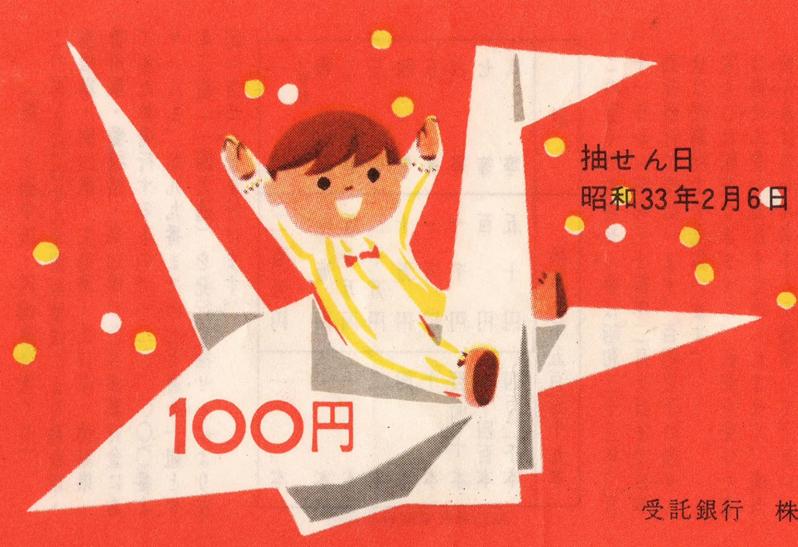
50 Japanese Lottery Tickets

Ephemera, Illustration, Members Only Content, Regional Histories

50 Japanese Lottery Tickets

50 tickets from Japan spanning nearly 50 years (1956–2004).

Read Article