





From the graphic design archive:

From the graphic design archive:
From the graphic design archive:
From the graphic design archive:
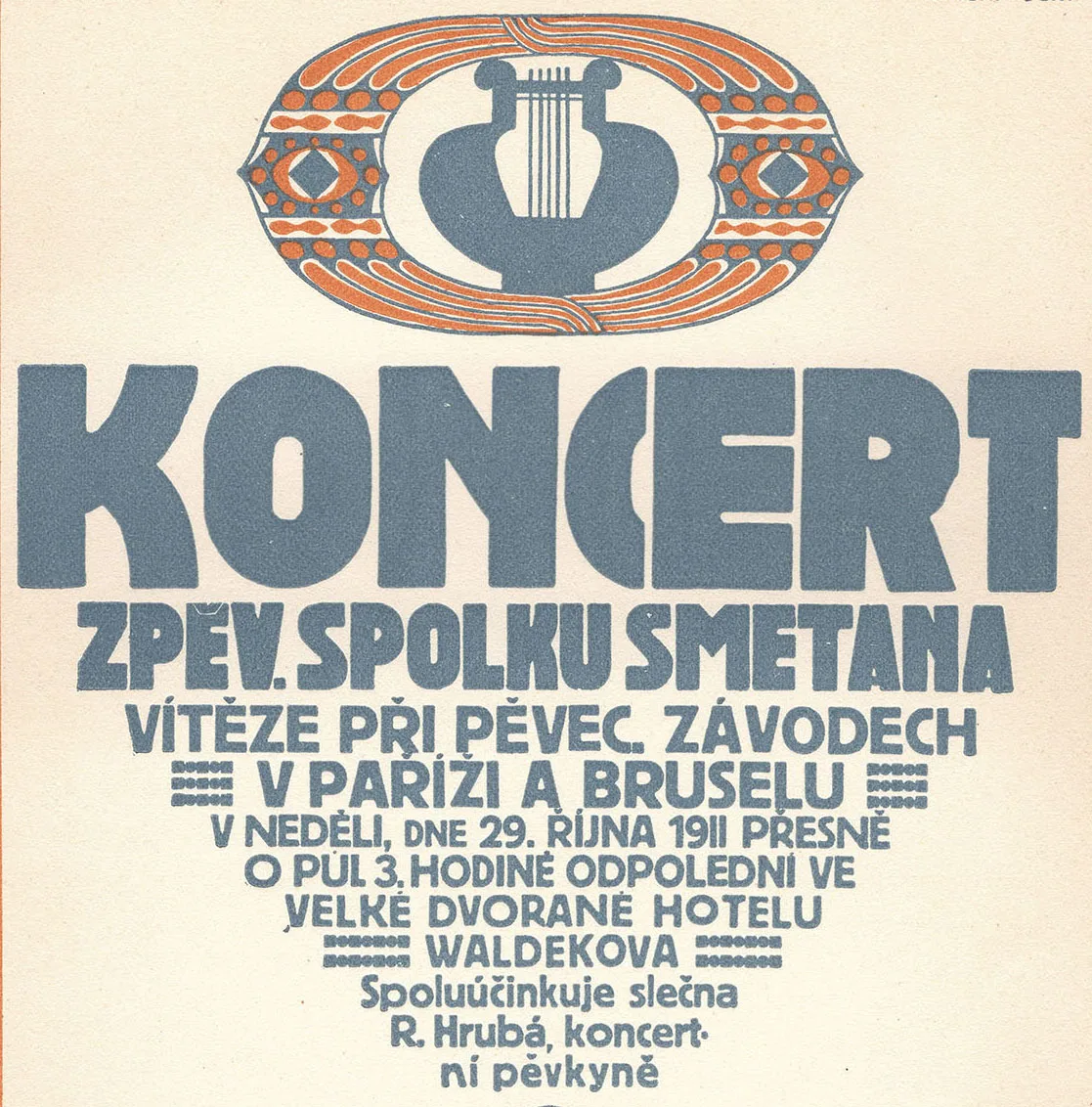
Typography & Type Design, Design Archive Feature, Members Only Content, Regional Histories
60 examples of Czech typography from Typografia Vol. 23 (1912). Czech commercial printing and book design as Secession ornament progressed to early modernist typography, with work by Jindra Dvořáček, Methoděj Kaláb, Alois Chvála and many more.
Read Article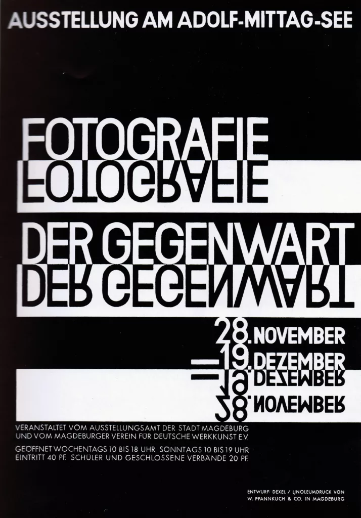
Design Archive Feature, Movements, Poster Design, Typography & Type Design
In minor printed matter we constantly meet the new typography, but it is relatively rare to find posters designed on the new lines. And yet poster-designing is a field where new typographical methods might be employed with great effect.
Read Article
Design Archive Feature, Design Education, Members Only Content, Regional Histories, Typography & Type Design
The August 1964 issue highlights the Typography class at the Pratt Institute in New York, a relatively new course at the time. Pratt, one of the most renowned art schools in the United States, had departments for graphic design, painting, art education, industrial design, and applied graphics in the 1960s. The typography course combined theoretical lectures with practical workshops, aimed at students beginning their journey into the discipline.
Read Article