
Olle Eksell

Tryckeri AB Björkmans Eftr (Olle Eksell), Stockholm, 1984

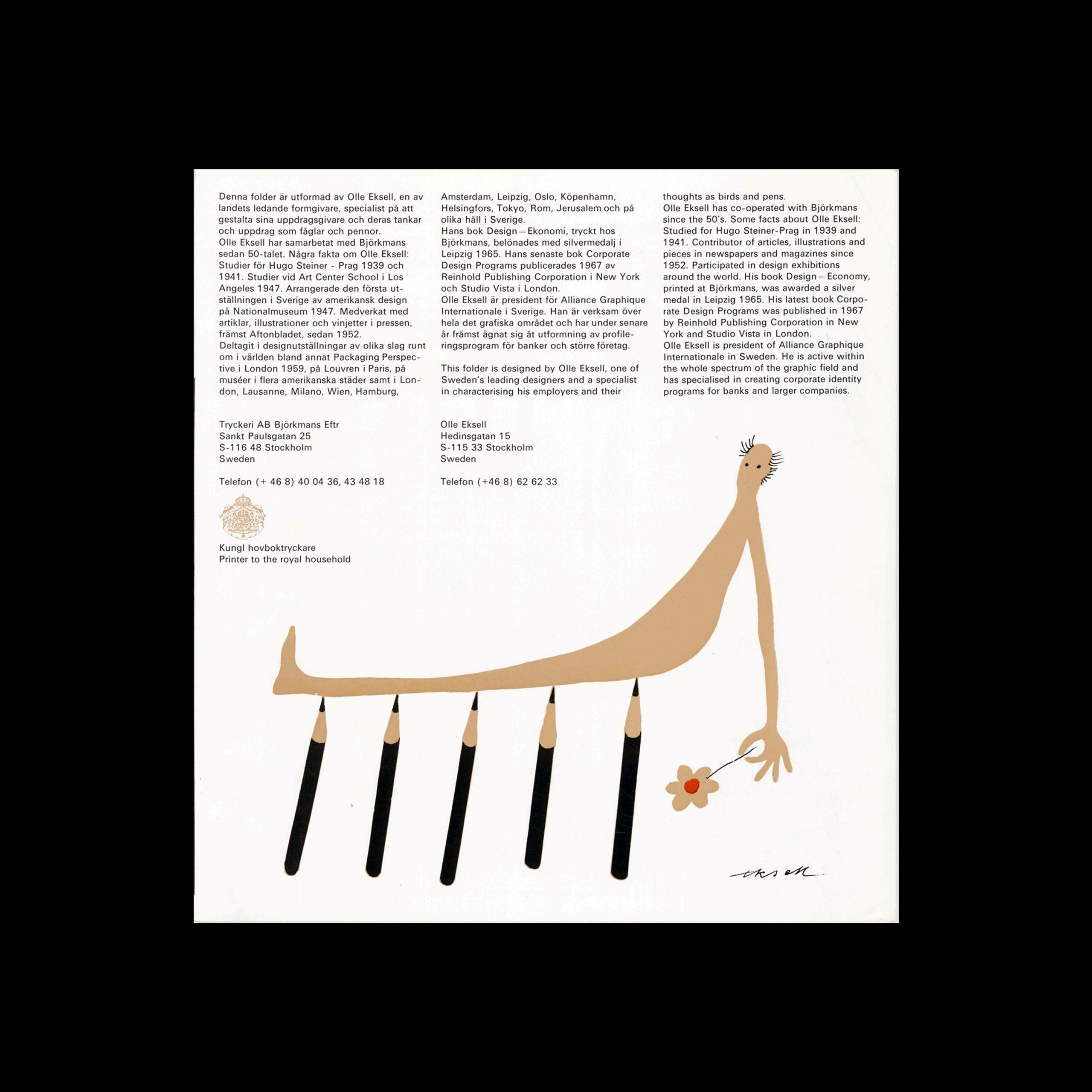
Presentation of the collaboration between Olle Eksell and Björkmans, designed by Olle Eksell. Folder with Swedish & English text.

“This folder is designed by Olle Eksell, one of Sweden’s leading designers and a specialist in characterising his employers and their thoughts as birds and pens. Ole Eksell has co-operated with Björkmans since the 50’s. Some facts about Olle Eksell: Studied for Hugo Steiner-Prag in 1939 and 1941. Contributor of articles, illustrations and pieces in newspapers and magazines since 1952. Participated in design exhibitions around the world. His book Design – Economy, printed at Björkmans, was awarded a silver medal in Leipzig 1965. His latest book Corporate Design Programs was published in 1967 by Reinhold Publishing Corporation in New York and Studio Vista in London.
Olle Eksell is president of Alliance Graphique Internationale in Sweden. He is active within the whole spectrum of the graphic field and has specialised in creating corporate identity programs for banks and larger companies.”

Details

Olle Eksell
Olle Eksell is well known for his advertising illustration, book jackets and playful packaging design. He first studied engineering and later decided to become a graphic artist. He began his career as a window decorator in 1935, and studied under Hugo Steiner between 1939 and 1941. Explore related designers including Stig Lindberg and Anders Beckman. See also Mid Century Modernism, Scandinavian graphic design, and 1950s graphic design history.

Linked Information

Tryckeri AB Björkmans Eftr, Stockholm, 1984. Designed by Olle Eksell


Tryckeri AB Björkmans Eftr, Stockholm, 1984. Designed by Olle Eksell
Brochure about the work of Olle Eksell and Björkmans. Published in 1984.
More graphic design artefacts
More graphic design history articles
Sprengel, a Comparison of Advertisements from the 1950s

Advertising Design, Design Archive Feature, Members Only Content

Sprengel, a Comparison of Advertisements from the 1950s

When perusing vintage publications, I often stumble upon forgotten or undocumented gems. In this article, I compare two remarkable advertisements designed for Sprengel Ltd byHerbert Zumpe and Karl Otto Goetz

Read Article
Arrows of Advertising – An Australian Shell Poster Campaign designed by Frank Eidlitz

Design Archive Feature, Members Only Content, Poster Design, Regional Histories, Studios & Collectives

Arrows of Advertising – An Australian Shell Poster Campaign designed by Frank Eidlitz

A total of 24 posters were created for the campaign during 1964, using the arrow symbol as a key features, representing power, motion and speed. The handmade lithographs use up to 19 colours, which were individually printed at large scale. The posters also utilise the brand colours red and yellow from Shells corporate identity.

Read Article
Geigy Chemical Corporation, USA. An Example of Integrated Advertising by William B. McDonald

Advertising Design, Corporate Identity & Branding, Design Archive Feature, Regional Histories

Geigy Chemical Corporation, USA. An Example of Integrated Advertising by William B. McDonald

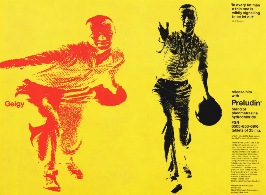
An advertising programme is fully integrated only when its effect is powerful enough to play a major part in determining a corporate image. Geigy advertising is an example of this successful integration.

Read Article