

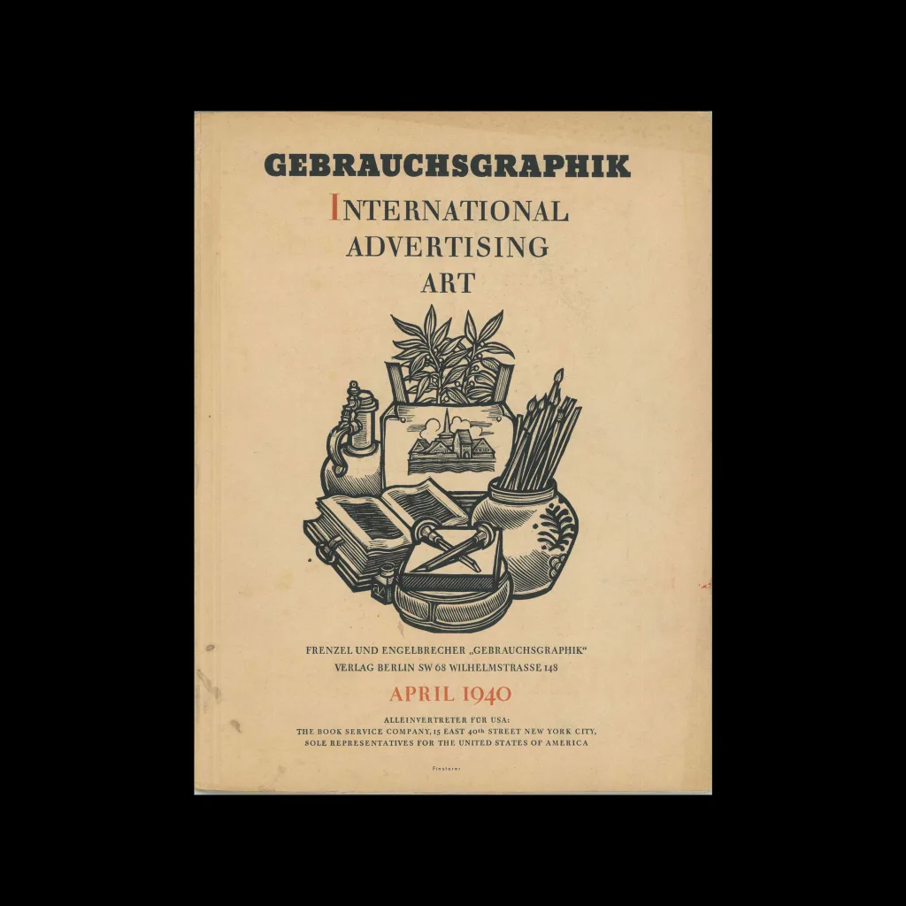
From the graphic design archive:

From the graphic design archive:
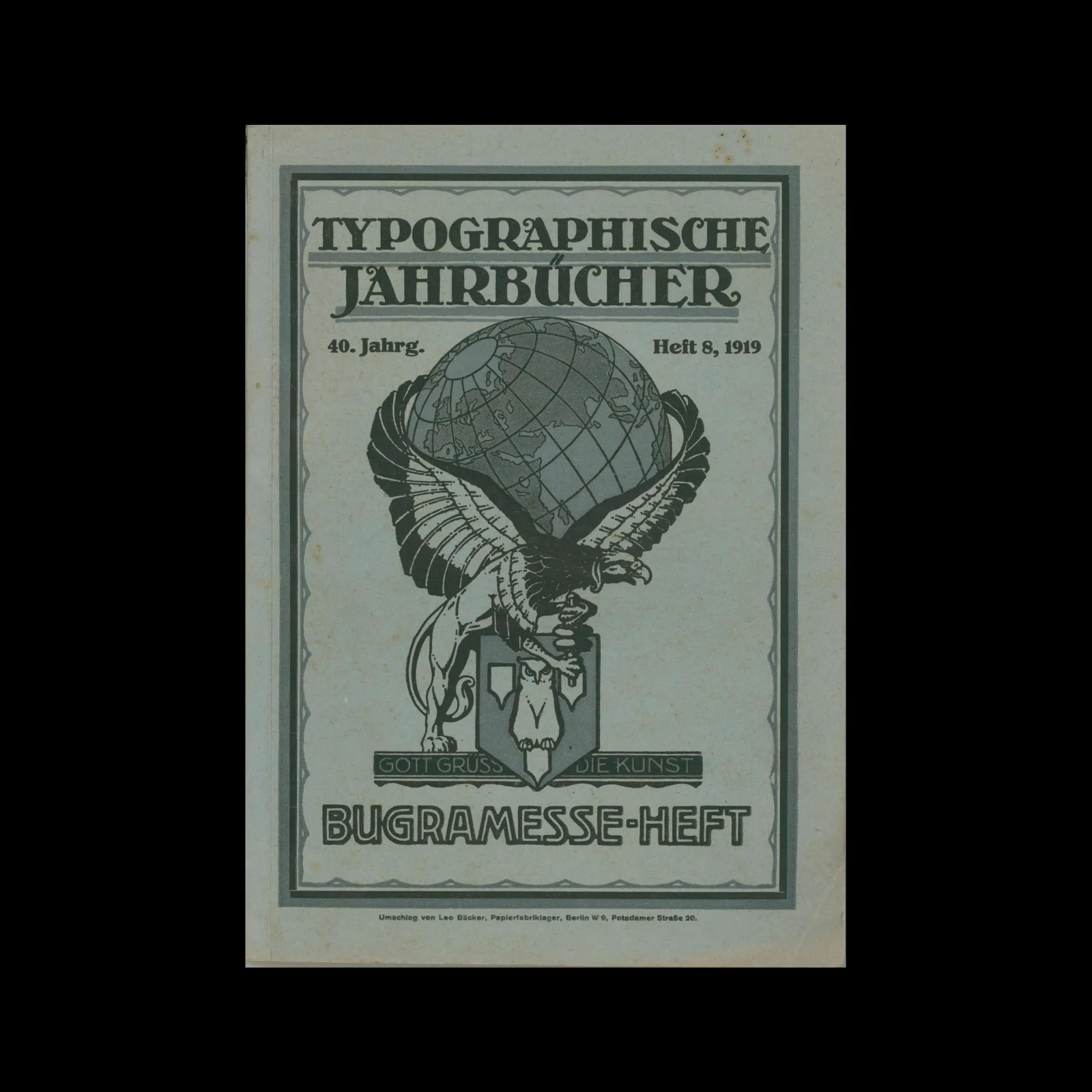
From the graphic design archive:

From the graphic design archive:

How design can transcend the logics, structures, and subjectivities of capitalism: a framework, theoretical grounding, and practical principles. A new book published by MIT Press written by Matthew Wizinsky.
Read Article
Design Archive Feature, Illustration, Members Only Content, Studios & Collectives
Winter + Bischoff’s work blends fine art and graphic design and is a fine example of commercial design featuring a heavy use of stylistic illustration. In fact a lot of German graphic design in the 1960s has this strong relationship of commercial and professional typographic layout with the roughness and organicness of art.
Read Article
Design Archive Feature, Advertising Design, Designer Profiles, Members Only Content, Regional Histories
Nikon commissioned Yusaku Kamekura to design numerous posters, packaging designs and advertisements for Nikon. He used abstract forms, an impactful use of colours, along with his skilful reduction of messaging.
Read Article