


Corporate Identity & Branding, Design Archive Feature, Designer Profiles, Members Only Content, Regional Histories
The typographic designs produced for the National Theatre by Ken Briggs are not only iconic and depict the Swiss typographic style of the time, but remain a key example of the creation of a cohesive brand style.
Read Article
Design Archive Feature, Illustration, Members Only Content, Regional Histories
A while back, I bought a set of around 14 French travel guides produced by Shell that came in a leather pouch, each bearing the signature ‘D. Hamot.’ Determining the designer's full name proved to be a challenge. Their aesthetic could reflect the shifting design trends of the late 1960s.
Read Article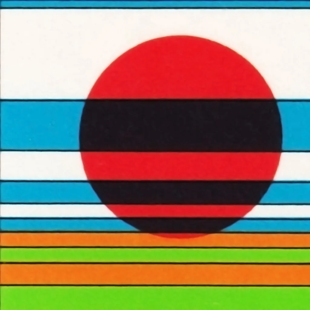
Design Archive Feature, Designer Profiles, Members Only Content, Regional Histories
Dick Elffers, had been the chosen designer for the printed matter of the Holland Festival for much of the festival's years, he used a painterly style for his work with the festival between 1954 and 1965 and later a more abstract style between 1969 and 1972. As well as publicity design, Elffers was commissioned to design the summer stamps to promote the Holland Festival in 1972.
Read Article