Jiří Rathouský

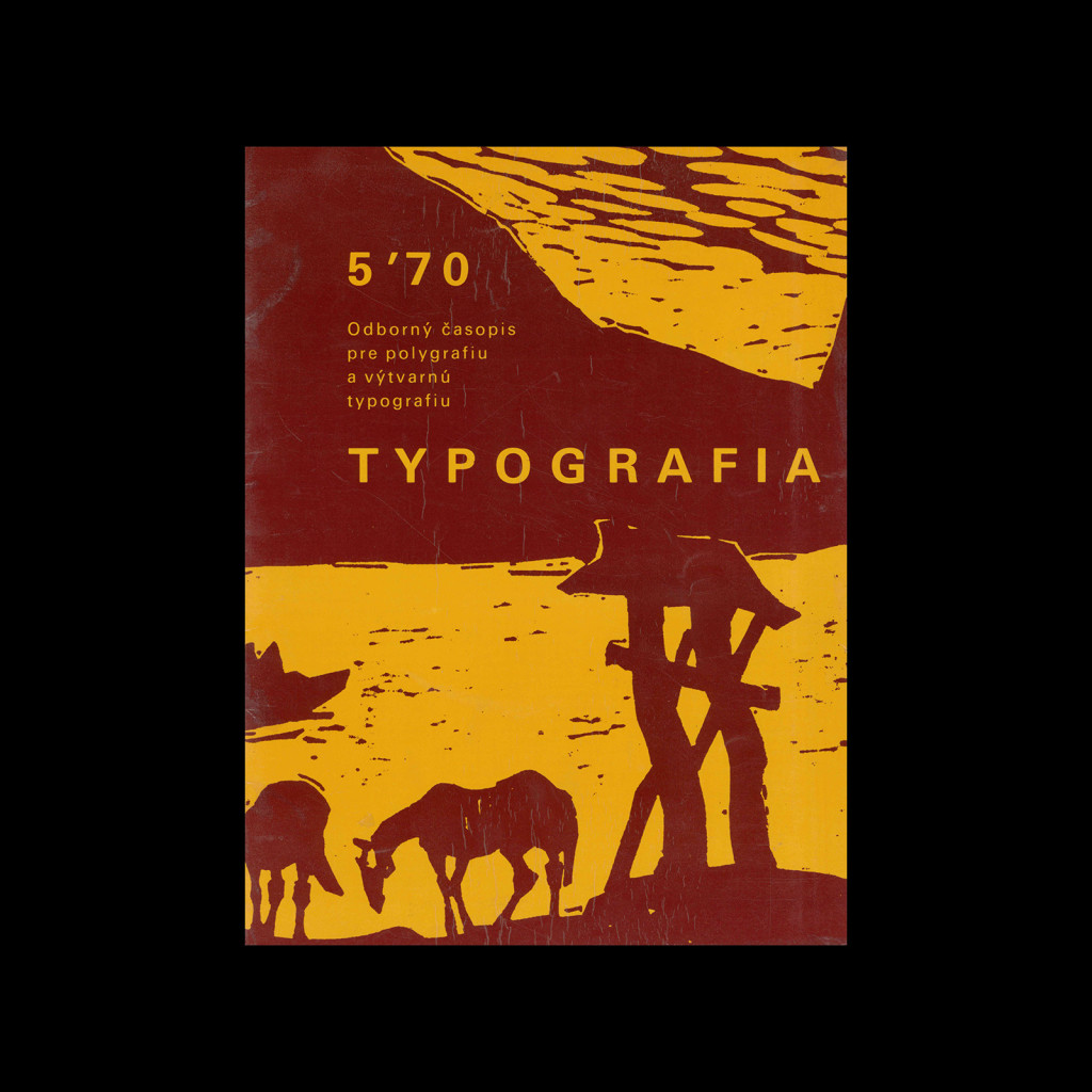
Typografia, ročník 71, 03, 1968

Published by the Polygraphic Research Institute, a specialized publishing and publishing center.
Chief editor: Ing. Vladimir Drbohlav.
Editor: PhDr. Bojka Benešová.
Graphic design of the cover and graphic editing (excluding advertisements) by Jiří Rathouský.
Graphic editing of the cover by Dušan Šulc, with the use of illustrations by Vincent Hložník.
Prepared for printing by F. Kunovsky and J. Bytčánek

Details

Dušan Šulc
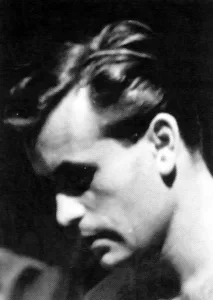
Jiří Rathouský studied pedagogics at the Charles University in Prague. In 1943 he started to work on various periodicals as an illustrator and designer. He also designed books and book jacket, exhibition displays and stage sets for puppet theatres. Explore related designers including Ladislav Sutnar and Karel Teige. See also Czech graphic design history, Magazines, 1950s graphic design history.
Typografia
Typografia is a Czech typography and printing journal featuring technical articles and historic design. The magazine was first released in 1888 in Prague.

Linked Information

Typografia, ročník 71, 03, 1968. Cover by Dušan Šulc, with the use of illustrations by Vincent Hložník.
More graphic design artefacts
More graphic design history articles
Ken Garland and the Industrial Magazine, Design

Design Archive Feature, Magazines & Publishing, Members Only Content, Regional Histories

Ken Garland and the Industrial Magazine, Design

Before setting up Ken Garland & Associates in Camden, London, Ken was art editor of Design magazine in 1956. The magazine was published by the Council of Industrial Design, which was set up in 1944 with the prime focus of supporting Britains economic recovery.

Read Article
Publicity for Higher Education in the USA by J. J. De Lucio-Meyer

Advertising Design, Regional Histories

Publicity for Higher Education in the USA by J. J. De Lucio-Meyer

The first American university to accept graphic designers as members of the faculty was the Massachusetts Institute of Technology, called M. I. T, for short. The work created by the design group reflects the high level of instruction, the realistic setting of the training and the progressive philosophy of this institute.

Read Article
Illustrated Journeys: The Designs of Eric Lancaster

Design Archive Feature, Illustration, Members Only Content, Regional Histories

Illustrated Journeys: The Designs of Eric Lancaster

As part of my ongoing series documenting publicity design in the tourism industry, here is my third piece. This time, I am showcasing my collected work of Eric Lancaster, a highly skilled graphic artist whose designs played a vital role in shaping the visual identity of mid-20th-century French tourism.

Read Article