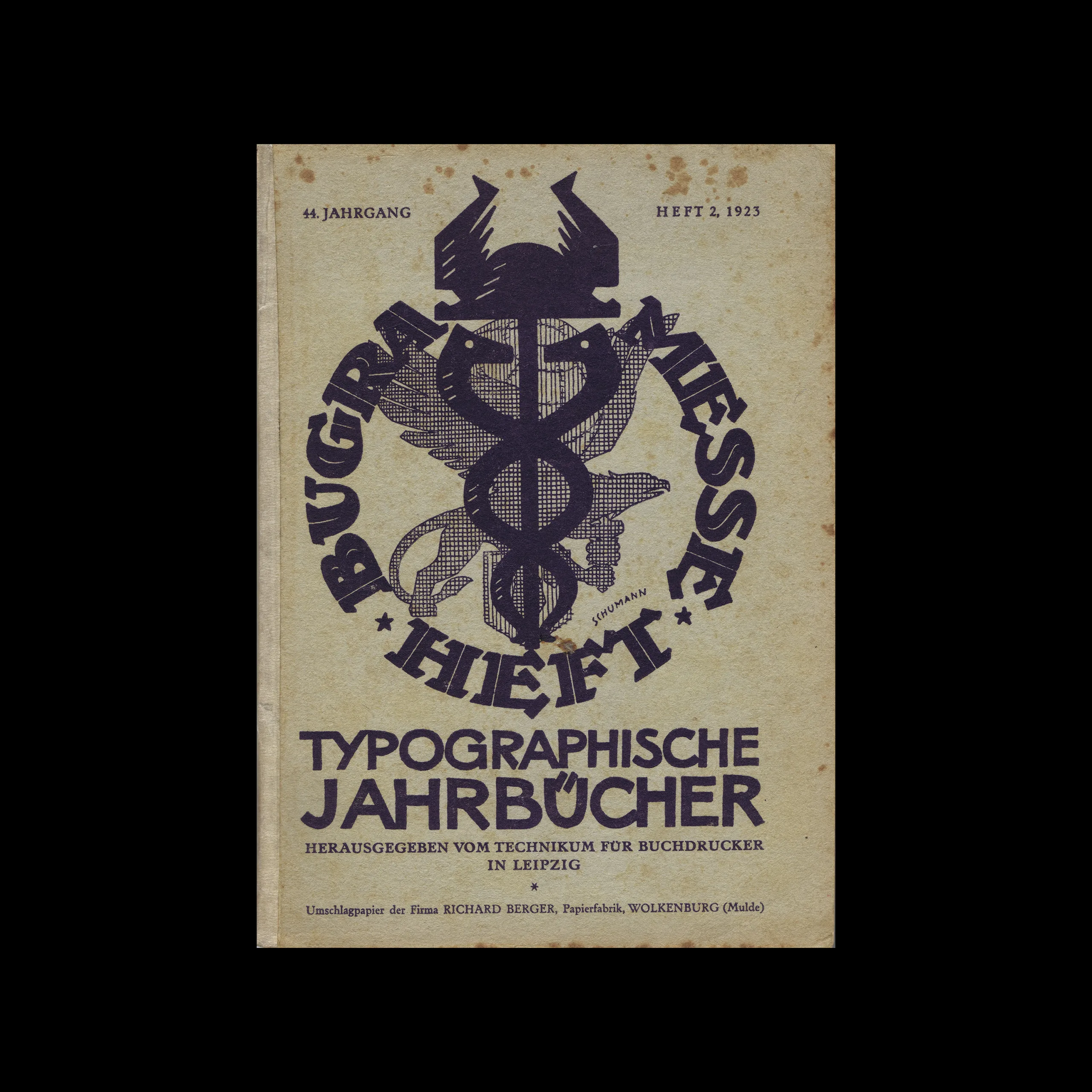


From the graphic design archive:
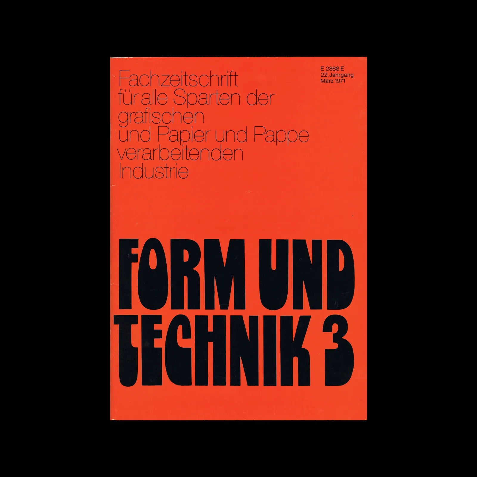
From the graphic design archive:
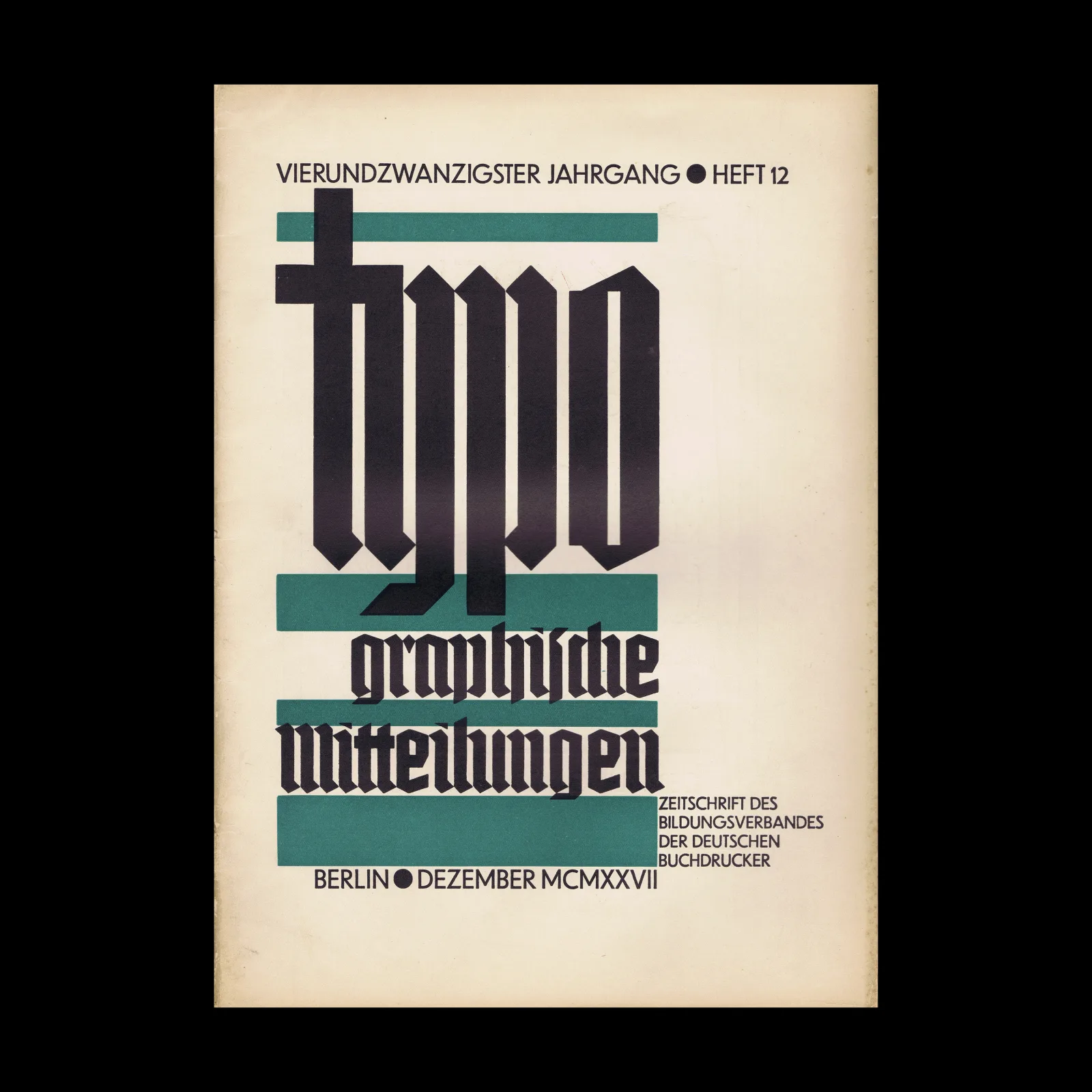
From the graphic design archive:
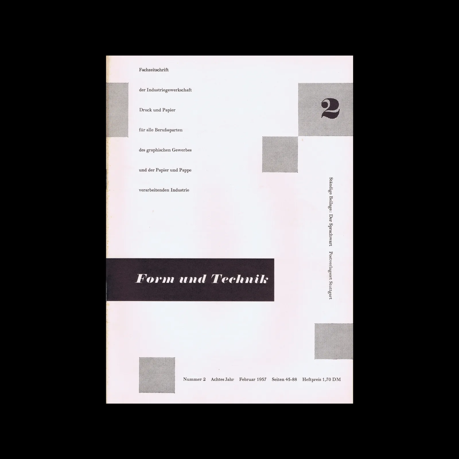
From the graphic design archive:

Design Archive Feature, Designer Profiles, Magazines & Publishing, Members Only Content, Regional Histories
Throughout the 1920s and 1930s, Paul Schuitema emerged as one of the Dutch pioneers of new typography. This article features a selection of the cover designs and a few inner spreads from my collected issues of De 8 en Opbouw.
Read Article
Design Archive Feature, Movements, Poster Design, Typography & Type Design
In minor printed matter we constantly meet the new typography, but it is relatively rare to find posters designed on the new lines. And yet poster-designing is a field where new typographical methods might be employed with great effect.
Read Article
Design Archive Feature, Members Only Content, Regional Histories, Typography & Type Design
60 examples of Czech typography from Typografia Vol. 20 (1909). Czech commercial printing at the crossroads of Art Nouveau and early modernism, with work by Methoděj Kaláb, Otokar Císař, Karel Dyrink and many more.
Read Article