

From the graphic design archive:
From the graphic design archive:
From the graphic design archive:

From the graphic design archive:
Book Reviews & Press Releases, Magazines & Publishing
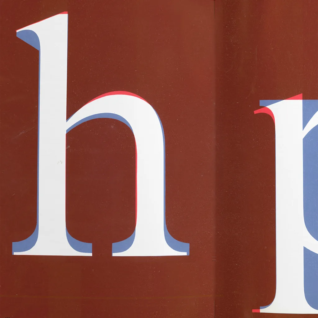
As a champion of graphic design history, I was thrilled to find the upcoming book "Penrose 1964-73: The Herbert Spencer Years," a captivating visual anthology dedicated to honouring Spencer's legacy as a trailblazer in modern typography. Spanning 288 pages, this book commemorates Spencer's influential editorship at the Penrose Annual from 1964 to 1973.
Read Article
Advertising Design, Design Archive Feature, Members Only Content
As part of their marketing strategy, Kast + Ehinger, commissioned a selection of German designers to produce advertisements aimed at the design industry. I have scanned in quite a lot of their advertising matter, all of which were back-page advertisements from three German design magazines. Der Druckspiegel, Gebrauchsgraphik and Graphik – Werbung + Formgebung.
Read Article
Design Archive Feature, Ephemera, Members Only Content, Regional Histories
The designer is unstated on these postcards, which were designed during the mid to late 1970s, but these playful illustrations alongside what looks to be Frankfurter Bold definitely fit the criteria of friendliness and efficiency
Read Article