


From the graphic design archive:

From the graphic design archive:
From the graphic design archive:

From the graphic design archive:

Design Archive Feature, Designer Profiles, Members Only Content, Poster Design, Regional Histories
In 1997 Tadanori Yokoo showcased 31 new silkscreens at the Ginza Graphic Gallery in Tokyo. Many of these works were previously unseen, and I was fortunate enough to discover a feature in a back issue of Idea magazine that showcased the full collection of silkscreen posters.
Read Article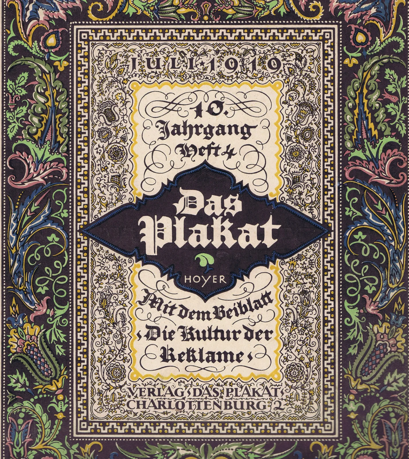
Design Translated, Designer Profiles, Members Only Content, Typography & Type Design
A 1919 article on Hanns Thaddäus Hoyer, originally in German, published in Das Plakat, Vol. 10, No. 4, July 1919.
Read Article
Corporate Identity & Branding, Design Archive Feature, Designer Profiles, Members Only Content, Regional Histories
Crouwel was the successor to Willem Sandberg who used an avant-garde approach in his work, utilising torn-paper montage, mixing of sans serif and old Egyptian typefaces and often off-center positioning. Crouwel steered away from this artistic approach and implemented a cohesive design system and a strong identity that emulated the corporate identity boom of the 1950s and 60s.
Read Article