
From the graphic design archive:
Design Archive Feature, Members Only Content, Poster Design, Regional Histories
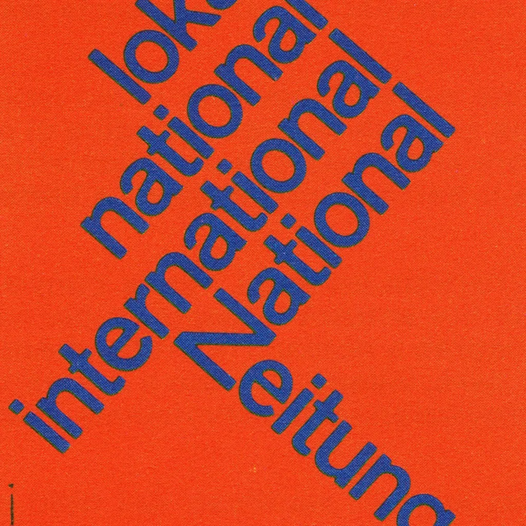
The 1960 awards presented 420 poster entries from Swiss designers. Notable winners included Robert Büchler's typographic poster for the Museum of Applied Arts Basel and J. Müller-Brockmann’s Der Film poster for the Museum of Applied Arts and Gerstner + Kutter's asymmetric typographic poster for National-Zeitung SA Basel.
Read Article
Design Archive Feature, Illustration, Magazines & Publishing, Members Only Content, Regional Histories
Publimondial was founded André Roulleaux in 1942 and remained in circulation until 1960. The French journal was published by Art et Publications and was subtitled ‘The Magazine of Graphic Arts and Advertising Technique’.
Read Article
Design Archive Feature, Corporate Identity & Branding, Members Only Content
Paul Rand, one of the most acclaimed American designers is known for his iconic corporate identities, playful illustration and commercial art. Paul wrote the preface for Yusaku Kamakura's book, Trademarks of the World, 1958. He states his influence of Japanese art and design, trademarks as a universal language and his struggles with English grammar.
Read Article